mirror of
https://github.com/Orasund/elm-ui-widgets.git
synced 2024-07-07 02:36:19 +03:00
1 line
88 KiB
JSON
1 line
88 KiB
JSON
[{"name":"Widget","comment":" This module contains different stateless view functions. No wiring required.\n\n Widget.button Material.primaryButton\n { text = \"disable me\"\n , icon =\n FeatherIcons.slash\n |> FeatherIcons.withSize 16\n |> FeatherIcons.toHtml []\n |> Element.html\n |> Element.el []\n , onPress =\n if isButtonEnabled then\n ChangedButtonStatus False\n |> Just\n\n else\n Nothing\n }\n\nEvery widgets comes with a type. You can think of the widgets as building blocks.\nYou can create you own widgets by sticking widgets types together.\n\n\n# Buttons\n\n\n\n@docs ButtonStyle, Button, TextButton, iconButton, textButton, button\n\n\n# Switch\n\n\n\n@docs SwitchStyle, Switch, switch\n\n\n# Select\n\n\n\n@docs Select, selectButton, select, toggleButton\n\n\n\n@docs MultiSelect, multiSelect\n\n\n# Modal\n\n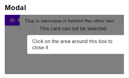\n\n@docs Modal, singleModal, multiModal\n\n\n# Dialog\n\n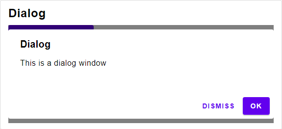\n\n@docs DialogStyle, Dialog, dialog\n\n\n# List\n\n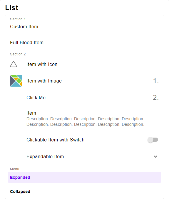\n\n\n## Row\n\n@docs RowStyle, row, buttonRow, toggleRow, wrappedButtonRow\n\n\n## Column\n\n@docs ColumnStyle, column, buttonColumn\n\n\n## Item\n\n@docs ItemStyle, Item\n@docs FullBleedItemStyle, fullBleedItem\n@docs InsetItem, InsetItemStyle, insetItem\n@docs ExpansionItemStyle, ExpansionItem, expansionItem\n@docs ImageItemStyle, ImageItem, imageItem\n@docs MultiLineItemStyle, MultiLineItem, multiLineItem\n@docs HeaderStyle, headerItem\n@docs DividerStyle, divider\n@docs selectItem, asItem\n@docs itemList\n\n\n# App Bar\n\n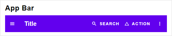\n\n@docs AppBarStyle, menuBar, tabBar\n\n\n# Sort Table\n\n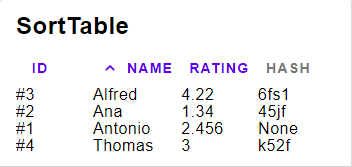\n\n@docs SortTableStyle, SortTable, Column, sortTable, floatColumn, intColumn, stringColumn, unsortableColumn\n\n\n# Sort Table V2\n\n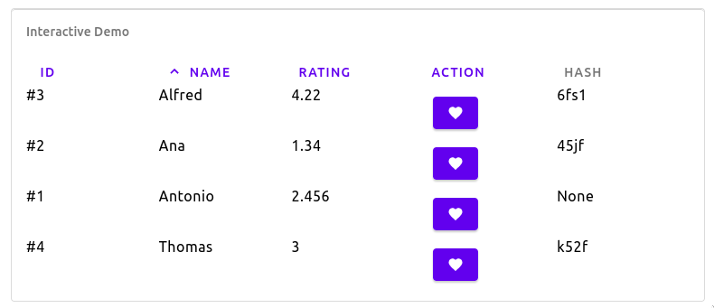\n\nLike [Sort Table](# Sort Table) but has supports custom elements in columns.\n\n@docs SortTableV2, ColumnV2, sortTableV2, floatColumnV2, intColumnV2, stringColumnV2, customColumnV2, unsortableColumnV2\n\n\n# Text Input\n\n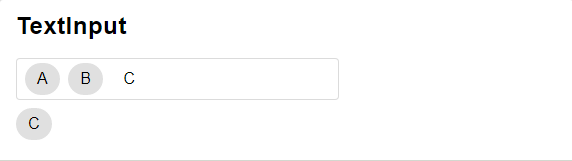\n\n@docs TextInputStyle, TextInput, textInput, usernameInput, emailInput, searchInput, spellCheckedInput\n@docs PasswordInputStyle, PasswordInput, newPasswordInputV2, currentPasswordInputV2\n\n\n# Tab\n\n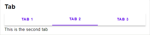\n\n@docs TabStyle, Tab, tab\n\n\n# Progress Indicator\n\n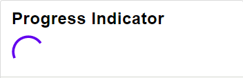\n\n@docs ProgressIndicatorStyle, ProgressIndicator, circularProgressIndicator\n\n\n# DEPRECATED\n\n@docs newPasswordInput, currentPasswordInput\n\n","unions":[],"aliases":[{"name":"AppBarStyle","comment":" ","args":["content","msg"],"type":"{ elementRow : List.List (Element.Attribute msg), content : { menu : { elementRow : List.List (Element.Attribute msg), content : content }, search : Widget.TextInputStyle msg, actions : { elementRow : List.List (Element.Attribute msg), content : { button : Widget.ButtonStyle msg, searchIcon : Widget.Icon msg, moreVerticalIcon : Widget.Icon msg } } } }"},{"name":"Button","comment":" Button widget type\n","args":["msg"],"type":"{ text : String.String, icon : Widget.Icon msg, onPress : Maybe.Maybe msg }"},{"name":"ButtonStyle","comment":" ","args":["msg"],"type":"{ elementButton : List.List (Element.Attribute msg), ifDisabled : List.List (Element.Attribute msg), ifActive : List.List (Element.Attribute msg), otherwise : List.List (Element.Attribute msg), content : { elementRow : List.List (Element.Attribute msg), content : { text : { contentText : List.List (Element.Attribute msg) }, icon : { ifDisabled : Widget.IconStyle, ifActive : Widget.IconStyle, otherwise : Widget.IconStyle } } } }"},{"name":"Column","comment":" Column for the Sort Table widget type\n","args":["a"],"type":"Internal.SortTable.Column a"},{"name":"ColumnStyle","comment":" ","args":["msg"],"type":"{ elementColumn : List.List (Element.Attribute msg), content : { element : List.List (Element.Attribute msg), ifFirst : List.List (Element.Attribute msg), ifLast : List.List (Element.Attribute msg), ifSingleton : List.List (Element.Attribute msg), otherwise : List.List (Element.Attribute msg) } }"},{"name":"ColumnV2","comment":" Column for the Sort Table V2 widget type\n","args":["a","msg"],"type":"Internal.SortTableV2.ColumnV2 a msg"},{"name":"Dialog","comment":" Dialog widget type\n","args":["msg"],"type":"{ title : Maybe.Maybe String.String, text : String.String, accept : Maybe.Maybe (Widget.TextButton msg), dismiss : Maybe.Maybe (Widget.TextButton msg) }"},{"name":"DialogStyle","comment":" ","args":["msg"],"type":"{ elementColumn : List.List (Element.Attribute msg), content : { title : { contentText : List.List (Element.Attribute msg) }, text : { contentText : List.List (Element.Attribute msg) }, buttons : { elementRow : List.List (Element.Attribute msg), content : { accept : Widget.ButtonStyle msg, dismiss : Widget.ButtonStyle msg } } } }"},{"name":"DividerStyle","comment":" ","args":["msg"],"type":"{ element : List.List (Element.Attribute msg) }"},{"name":"ExpansionItem","comment":" ","args":["msg"],"type":"{ icon : Widget.Icon msg, text : String.String, onToggle : Basics.Bool -> msg, content : List.List (Widget.Item msg), isExpanded : Basics.Bool }"},{"name":"ExpansionItemStyle","comment":" ","args":["msg"],"type":"{ item : Widget.ItemStyle (Widget.InsetItemStyle msg) msg, expandIcon : Widget.Icon msg, collapseIcon : Widget.Icon msg }"},{"name":"FullBleedItemStyle","comment":" ","args":["msg"],"type":"{ elementButton : List.List (Element.Attribute msg), ifDisabled : List.List (Element.Attribute msg), otherwise : List.List (Element.Attribute msg), content : { elementRow : List.List (Element.Attribute msg), content : { text : { elementText : List.List (Element.Attribute msg) }, icon : Widget.IconStyle } } }"},{"name":"HeaderStyle","comment":" ","args":["msg"],"type":"{ elementColumn : List.List (Element.Attribute msg), content : { divider : Widget.DividerStyle msg, title : List.List (Element.Attribute msg) } }"},{"name":"ImageItem","comment":" ","args":["msg"],"type":"{ text : String.String, onPress : Maybe.Maybe msg, image : Element.Element msg, content : Widget.Icon msg }"},{"name":"ImageItemStyle","comment":" ","args":["msg"],"type":"{ elementButton : List.List (Element.Attribute msg), ifDisabled : List.List (Element.Attribute msg), otherwise : List.List (Element.Attribute msg), content : { elementRow : List.List (Element.Attribute msg), content : { text : { elementText : List.List (Element.Attribute msg) }, image : { element : List.List (Element.Attribute msg) }, content : Widget.IconStyle } } }"},{"name":"InsetItem","comment":" ","args":["msg"],"type":"{ text : String.String, onPress : Maybe.Maybe msg, icon : Widget.Icon msg, content : Widget.Icon msg }"},{"name":"InsetItemStyle","comment":" ","args":["msg"],"type":"{ elementButton : List.List (Element.Attribute msg), ifDisabled : List.List (Element.Attribute msg), otherwise : List.List (Element.Attribute msg), content : { elementRow : List.List (Element.Attribute msg), content : { text : { elementText : List.List (Element.Attribute msg) }, icon : { element : List.List (Element.Attribute msg), content : Widget.IconStyle }, content : Widget.IconStyle } } }"},{"name":"Item","comment":" Item widget type.\n\nUse `Widget.asItem` if you want to turn a simple element into an item.\n\n","args":["msg"],"type":"List.List (Element.Attribute msg) -> Element.Element msg"},{"name":"ItemStyle","comment":" ","args":["content","msg"],"type":"{ element : List.List (Element.Attribute msg), content : content }"},{"name":"Modal","comment":" ","args":["msg"],"type":"{ onDismiss : Maybe.Maybe msg, content : Element.Element msg }"},{"name":"MultiLineItem","comment":" ","args":["msg"],"type":"{ title : String.String, text : String.String, onPress : Maybe.Maybe msg, icon : Widget.Icon msg, content : Widget.Icon msg }"},{"name":"MultiLineItemStyle","comment":" ","args":["msg"],"type":"{ elementButton : List.List (Element.Attribute msg), ifDisabled : List.List (Element.Attribute msg), otherwise : List.List (Element.Attribute msg), content : { elementRow : List.List (Element.Attribute msg), content : { description : { elementColumn : List.List (Element.Attribute msg), content : { title : { elementText : List.List (Element.Attribute msg) }, text : { elementText : List.List (Element.Attribute msg) } } }, icon : { element : List.List (Element.Attribute msg), content : Widget.IconStyle }, content : Widget.IconStyle } } }"},{"name":"MultiSelect","comment":" Multi Select widget type\n\nTechnical Remark:\n\n - A more suitable name would be \"Options\"\n\n","args":["msg"],"type":"{ selected : Set.Set Basics.Int, options : List.List { text : String.String, icon : Widget.Icon msg }, onSelect : Basics.Int -> Maybe.Maybe msg }"},{"name":"PasswordInput","comment":" Password Input widget type\n","args":["msg"],"type":"{ text : String.String, placeholder : Maybe.Maybe (Element.Input.Placeholder msg), label : String.String, onChange : String.String -> msg, show : Basics.Bool }"},{"name":"PasswordInputStyle","comment":" ","args":["msg"],"type":"{ elementRow : List.List (Element.Attribute msg), content : { password : { elementPasswordInput : List.List (Element.Attribute msg) } } }"},{"name":"ProgressIndicator","comment":" Progress Indicator widget type\n\nIf `maybeProgress` is set to `Nothing`, an indeterminate progress indicator (e.g. spinner) will display.\nIf `maybeProgress` is set to `Just Float` (where the `Float` is proportion of completeness between 0 and 1 inclusive), a determinate progress indicator will visualize the progress.\n\n","args":[],"type":"Maybe.Maybe Basics.Float"},{"name":"ProgressIndicatorStyle","comment":" ","args":["msg"],"type":"{ elementFunction : Maybe.Maybe Basics.Float -> Element.Element msg }"},{"name":"RowStyle","comment":" ","args":["msg"],"type":"{ elementRow : List.List (Element.Attribute msg), content : { element : List.List (Element.Attribute msg), ifFirst : List.List (Element.Attribute msg), ifLast : List.List (Element.Attribute msg), ifSingleton : List.List (Element.Attribute msg), otherwise : List.List (Element.Attribute msg) } }"},{"name":"Select","comment":" Select widget type\n\nTechnical Remark:\n\n - A more suitable name would be \"Choice\"\n\n","args":["msg"],"type":"{ selected : Maybe.Maybe Basics.Int, options : List.List { text : String.String, icon : Widget.Icon msg }, onSelect : Basics.Int -> Maybe.Maybe msg }"},{"name":"SortTable","comment":" Sort Table widget type\n","args":["a","msg"],"type":"{ content : List.List a, columns : List.List (Widget.Column a), sortBy : String.String, asc : Basics.Bool, onChange : String.String -> msg }"},{"name":"SortTableStyle","comment":" Technical Remark:\n\n - If icons are defined in Svg, they might not display correctly.\n To avoid that, make sure to wrap them in `Element.html >> Element.el []`\n\n","args":["msg"],"type":"{ elementTable : List.List (Element.Attribute msg), content : { header : Widget.ButtonStyle msg, ascIcon : Widget.Icon msg, descIcon : Widget.Icon msg, defaultIcon : Widget.Icon msg } }"},{"name":"SortTableV2","comment":" Sort Table V2 widget type\n","args":["a","msg"],"type":"{ content : List.List a, columns : List.List (Widget.ColumnV2 a msg), sortBy : String.String, asc : Basics.Bool, onChange : String.String -> msg }"},{"name":"Switch","comment":" Switch widget type\n","args":["msg"],"type":"{ description : String.String, onPress : Maybe.Maybe msg, active : Basics.Bool }"},{"name":"SwitchStyle","comment":" ","args":["msg"],"type":"{ elementButton : List.List (Element.Attribute msg), content : { element : List.List (Element.Attribute msg), ifDisabled : List.List (Element.Attribute msg), ifActive : List.List (Element.Attribute msg), otherwise : List.List (Element.Attribute msg) }, contentInFront : { element : List.List (Element.Attribute msg), ifDisabled : List.List (Element.Attribute msg), ifActive : List.List (Element.Attribute msg), otherwise : List.List (Element.Attribute msg), content : { element : List.List (Element.Attribute msg), ifDisabled : List.List (Element.Attribute msg), ifActive : List.List (Element.Attribute msg), otherwise : List.List (Element.Attribute msg) } } }"},{"name":"Tab","comment":" Tab widget type\n","args":["msg"],"type":"{ tabs : Widget.Select msg, content : Maybe.Maybe Basics.Int -> Element.Element msg }"},{"name":"TabStyle","comment":" ","args":["msg"],"type":"{ elementColumn : List.List (Element.Attribute msg), content : { tabs : { elementRow : List.List (Element.Attribute msg), content : Widget.ButtonStyle msg }, content : List.List (Element.Attribute msg) } }"},{"name":"TextButton","comment":" Button widget type with no icon\n","args":["msg"],"type":"{ text : String.String, onPress : Maybe.Maybe msg }"},{"name":"TextInput","comment":" Text Input widget type\n","args":["msg"],"type":"{ chips : List.List (Widget.Button msg), text : String.String, placeholder : Maybe.Maybe (Element.Input.Placeholder msg), label : String.String, onChange : String.String -> msg }"},{"name":"TextInputStyle","comment":" ","args":["msg"],"type":"{ elementRow : List.List (Element.Attribute msg), content : { chips : { elementRow : List.List (Element.Attribute msg), content : Widget.ButtonStyle msg }, text : { elementTextInput : List.List (Element.Attribute msg) } } }"}],"values":[{"name":"asItem","comment":" Turns a Element into an item. Only use if you want to take care of the styling yourself.\n\n import Element\n import Widget.Material as Material\n\n Element.text \"Just a text\"\n |> Widget.asItem\n |> List.singleton\n |> Widget.itemList (Material.cardColumn Material.defaultPalette)\n |> always \"Ignore this line\" --> \"Ignore this line\"\n\n","type":"Element.Element msg -> Widget.Item msg"},{"name":"button","comment":" A button containing a text and an icon.\n\n import Widget.Material as Material\n import Material.Icons as MaterialIcons\n import Material.Icons.Types exposing (Coloring(..))\n import Widget.Icon as Icon\n\n type Msg\n = Submit\n\n button (Material.containedButton Material.defaultPalette)\n { text = \"Submit\"\n , icon = MaterialIcons.favorite |> Icon.elmMaterialIcons Color\n , onPress = Just Submit\n }\n |> always \"Ignore this line\" --> \"Ignore this line\"\n\n","type":"Widget.ButtonStyle msg -> { text : String.String, icon : Widget.Icon msg, onPress : Maybe.Maybe msg } -> Element.Element msg"},{"name":"buttonColumn","comment":" A column of buttons\n\n import Element\n import Widget.Material as Material\n\n type Msg =\n Select Int\n\n selected : Maybe Int\n selected =\n Just 0\n\n Widget.select\n { selected = selected\n , options =\n [ 1, 2, 42 ]\n |> List.map\n (\\int ->\n { text = String.fromInt int\n , icon = always Element.none\n }\n )\n , onSelect = (\\i -> Just (Select i ))\n }\n |> Widget.buttonColumn\n { elementColumn = Material.column\n , content = Material.toggleButton Material.defaultPalette\n }\n |> always \"Ignore this line\" --> \"Ignore this line\"\n\n","type":"{ elementColumn : Widget.ColumnStyle msg, content : Widget.ButtonStyle msg } -> List.List ( Basics.Bool, Widget.Button msg ) -> Element.Element msg"},{"name":"buttonRow","comment":" A row of buttons\n\n import Element\n import Widget.Material as Material\n\n type Msg =\n Select Int\n\n selected : Maybe Int\n selected =\n Just 0\n\n Widget.select\n { selected = selected\n , options =\n [ 1, 2, 42 ]\n |> List.map\n (\\int ->\n { text = String.fromInt int\n , icon = always Element.none\n }\n )\n , onSelect = (\\i -> Just (Select i ))\n }\n |> Widget.buttonRow\n { elementRow = Material.row\n , content = Material.outlinedButton Material.defaultPalette\n }\n |> always \"Ignore this line\" --> \"Ignore this line\"\n\n","type":"{ elementRow : Widget.RowStyle msg, content : Widget.ButtonStyle msg } -> List.List ( Basics.Bool, Widget.Button msg ) -> Element.Element msg"},{"name":"circularProgressIndicator","comment":" Displays a circular progress indicator\n\n import Widget.Material as Material\n\n Just 0.75\n |> Widget.circularProgressIndicator (Material.progressIndicator Material.defaultPalette)\n |> always \"Ignore this line\" --> \"Ignore this line\"\n\n","type":"Widget.ProgressIndicatorStyle msg -> Maybe.Maybe Basics.Float -> Element.Element msg"},{"name":"column","comment":" Replacement of `Element.column`\n\n import Element\n import Widget.Material as Material\n\n [ Element.text \"Text 1\"\n , Element.text \"Text 2\"\n ]\n |> Widget.column Material.column\n |> always \"Ignore this line\" --> \"Ignore this line\"\n\n","type":"Widget.ColumnStyle msg -> List.List (Element.Element msg) -> Element.Element msg"},{"name":"currentPasswordInput","comment":" An input field that supports auto filling the current password\n","type":"Widget.PasswordInputStyle msg -> Widget.PasswordInput msg -> Element.Element msg"},{"name":"currentPasswordInputV2","comment":" An input field that supports auto filling the current password\n","type":"Widget.PasswordInputStyle msg -> { text : String.String, placeholder : Maybe.Maybe (Element.Input.Placeholder msg), label : String.String, onChange : String.String -> msg, show : Basics.Bool } -> Element.Element msg"},{"name":"customColumnV2","comment":" A ColumnV2 containing an Element\n\n`value` will be used for displaying content.\n\nThis column is not sortable.\n","type":"{ title : String.String, value : a -> Element.Element msg, width : Element.Length } -> Widget.ColumnV2 a msg"},{"name":"dialog","comment":" A Dialog Window.\n\n import Widget.Material as Material\n import Element\n\n type Msg\n = Submit\n | Close\n\n Element.layout\n (dialog (Material.alertDialog Material.defaultPalette)\n { title = Just \"Accept\"\n , text = \"Are you sure?\"\n , accept =\n { text = \"Accept\"\n , onPress = Just Submit\n }\n |> Just\n , dismiss =\n { text = \"Cancel\"\n , onPress = Just Close\n }\n |> Just\n }\n |> List.singleton\n |> singleModal\n )\n |> always \"Ignore this line\" --> \"Ignore this line\"\n\n","type":"Widget.DialogStyle msg -> { title : Maybe.Maybe String.String, text : String.String, accept : Maybe.Maybe (Widget.TextButton msg), dismiss : Maybe.Maybe (Widget.TextButton msg) } -> Widget.Modal msg"},{"name":"divider","comment":" A divider.\n\n import Element\n import Widget.Material as Material\n\n [ Widget.fullBleedItem (Material.fullBleedItem Material.defaultPalette)\n { onPress = Nothing\n , icon = always Element.none\n , text = \"Item\"\n }\n , Widget.divider (Material.insetDivider Material.defaultPalette )\n , Widget.fullBleedItem (Material.fullBleedItem Material.defaultPalette)\n { onPress = Nothing\n , icon = always Element.none\n , text = \"Item\"\n }\n ]\n |> Widget.itemList (Material.cardColumn Material.defaultPalette)\n |> always \"Ignore this line\" --> \"Ignore this line\"\n\n","type":"Widget.ItemStyle (Widget.DividerStyle msg) msg -> Widget.Item msg"},{"name":"emailInput","comment":" An input field that supports auto filling the email\n","type":"Widget.TextInputStyle msg -> { chips : List.List (Widget.Button msg), text : String.String, placeholder : Maybe.Maybe (Element.Input.Placeholder msg), label : String.String, onChange : String.String -> msg } -> Element.Element msg"},{"name":"expansionItem","comment":" An expandable Item\n\n import Element\n import Widget.Material as Material\n\n type Msg =\n Toggle Bool\n\n let\n isExpanded : Bool\n isExpanded =\n True\n in\n ( ( Widget.fullBleedItem (Material.fullBleedItem Material.defaultPalette)\n { onPress = Nothing\n , icon = always Element.none\n , text = \"Item with Icon\"\n }\n )\n :: Widget.expansionItem (Material.expansionItem Material.defaultPalette )\n { onToggle = Toggle\n , isExpanded = isExpanded\n , icon = always Element.none\n , text = \"Expandable Item\"\n , content =\n [ Widget.fullBleedItem (Material.fullBleedItem Material.defaultPalette)\n { onPress = Nothing\n , icon = always Element.none\n , text = \"Item with Icon\"\n }\n ]\n }\n )\n |> Widget.itemList (Material.cardColumn Material.defaultPalette)\n |> always \"Ignore this line\" --> \"Ignore this line\"\n\n","type":"Widget.ExpansionItemStyle msg -> { icon : Widget.Icon msg, text : String.String, onToggle : Basics.Bool -> msg, content : List.List (Widget.Item msg), isExpanded : Basics.Bool } -> List.List (Widget.Item msg)"},{"name":"floatColumn","comment":" A Column containing a Float\n","type":"{ title : String.String, value : a -> Basics.Float, toString : Basics.Float -> String.String, width : Element.Length } -> Widget.Column a"},{"name":"floatColumnV2","comment":" A ColumnV2 containing a Float\n","type":"{ title : String.String, value : a -> Basics.Float, toString : Basics.Float -> String.String, width : Element.Length } -> Widget.ColumnV2 a msg"},{"name":"fullBleedItem","comment":" A text item spanning the full width.\n\n import Element\n import Widget.Material as Material\n\n [ Widget.fullBleedItem (Material.fullBleedItem Material.defaultPalette)\n { onPress = Nothing\n , icon = always Element.none\n , text = \"Item\"\n }\n , Widget.divider (Material.fullBleedDivider Material.defaultPalette )\n , Widget.fullBleedItem (Material.fullBleedItem Material.defaultPalette)\n { onPress = Nothing\n , icon = always Element.none\n , text = \"Item\"\n }\n ]\n |> Widget.itemList (Material.cardColumn Material.defaultPalette)\n |> always \"Ignore this line\" --> \"Ignore this line\"\n\n","type":"Widget.ItemStyle (Widget.FullBleedItemStyle msg) msg -> { text : String.String, onPress : Maybe.Maybe msg, icon : Widget.Icon msg } -> Widget.Item msg"},{"name":"headerItem","comment":" A header for a part of a list.\n\n import Element\n import Widget.Material as Material\n\n [ Widget.fullBleedItem (Material.fullBleedItem Material.defaultPalette)\n { onPress = Nothing\n , icon = always Element.none\n , text = \"Item\"\n }\n , \"Header\"\n |> Widget.headerItem (Material.insetHeader Material.defaultPalette )\n , Widget.fullBleedItem (Material.fullBleedItem Material.defaultPalette)\n { onPress = Nothing\n , icon = always Element.none\n , text = \"Item\"\n }\n ]\n |> Widget.itemList (Material.cardColumn Material.defaultPalette)\n |> always \"Ignore this line\" --> \"Ignore this line\"\n\n","type":"Widget.ItemStyle (Widget.HeaderStyle msg) msg -> String.String -> Widget.Item msg"},{"name":"iconButton","comment":" A button containing only an icon, the text is used for screen readers.\n\n import Widget.Material as Material\n import Material.Icons as MaterialIcons\n import Material.Icons.Types exposing (Coloring(..))\n import Widget.Icon as Icon\n\n type Msg\n = Like\n\n iconButton (Material.iconButton Material.defaultPalette)\n { text = \"Like\"\n , icon = MaterialIcons.favorite |> Icon.elmMaterialIcons Color\n , onPress = Just Like\n }\n |> always \"Ignore this line\" --> \"Ignore this line\"\n\n","type":"Widget.ButtonStyle msg -> { text : String.String, icon : Widget.Icon msg, onPress : Maybe.Maybe msg } -> Element.Element msg"},{"name":"imageItem","comment":" A clickable item that contains a image , a line of text and some additional information\n\n import Element\n import Widget.Material as Material\n import Widget.Material.Color as MaterialColor\n import Element.Font as Font\n\n [ Widget.imageItem (Material.imageItem Material.defaultPalette)\n { onPress = Nothing\n , image =\n Element.image [ Element.width <| Element.px <| 40, Element.height <| Element.px <| 40 ]\n { src = \"https://upload.wikimedia.org/wikipedia/commons/thumb/f/f3/Elm_logo.svg/1024px-Elm_logo.svg.png\"\n , description = \"Elm logo\"\n }\n , text = \"Item with Image\"\n , content =\n \\{ size, color } ->\n \"1.\"\n |> Element.text\n |> Element.el\n [ Font.color <| MaterialColor.fromColor color\n , Font.size size\n ]\n }\n ]\n |> Widget.itemList (Material.cardColumn Material.defaultPalette)\n |> always \"Ignore this line\" --> \"Ignore this line\"\n\n","type":"Widget.ItemStyle (Widget.ImageItemStyle msg) msg -> { text : String.String, onPress : Maybe.Maybe msg, image : Element.Element msg, content : Widget.Icon msg } -> Widget.Item msg"},{"name":"insetItem","comment":" A clickable item that contains two spots for icons or additional information and a single line of text.\n\n import Element\n import Widget.Material as Material\n\n [ Widget.insetItem (Material.insetItem Material.defaultPalette)\n { onPress = Nothing\n , icon = always Element.none\n , text = \"Item\"\n , content = always Element.none\n }\n , Widget.divider (Material.insetDivider Material.defaultPalette )\n , Widget.insetItem (Material.insetItem Material.defaultPalette)\n { onPress = Nothing\n , icon = always Element.none\n , text = \"Item\"\n , content = always Element.none\n }\n ]\n |> Widget.itemList (Material.cardColumn Material.defaultPalette)\n |> always \"Ignore this line\" --> \"Ignore this line\"\n\n","type":"Widget.ItemStyle (Widget.InsetItemStyle msg) msg -> { text : String.String, onPress : Maybe.Maybe msg, icon : Widget.Icon msg, content : Widget.Icon msg } -> Widget.Item msg"},{"name":"intColumn","comment":" A Column containing a Int\n","type":"{ title : String.String, value : a -> Basics.Int, toString : Basics.Int -> String.String, width : Element.Length } -> Widget.Column a"},{"name":"intColumnV2","comment":" A ColumnV2 containing a Int\n","type":"{ title : String.String, value : a -> Basics.Int, toString : Basics.Int -> String.String, width : Element.Length } -> Widget.ColumnV2 a msg"},{"name":"itemList","comment":" Implementation of the Material design list\n\n import Element\n import Widget.Material as Material\n\n [ Widget.fullBleedItem (Material.fullBleedItem Material.defaultPalette)\n { onPress = Nothing\n , icon = always Element.none\n , text = \"Item\"\n }\n , \"Header\"\n |> Widget.headerItem (Material.insetHeader Material.defaultPalette )\n , Widget.fullBleedItem (Material.fullBleedItem Material.defaultPalette)\n { onPress = Nothing\n , icon = always Element.none\n , text = \"Item\"\n }\n ]\n |> Widget.itemList (Material.cardColumn Material.defaultPalette)\n |> always \"Ignore this line\" --> \"Ignore this line\"\n\n","type":"Widget.ColumnStyle msg -> List.List (Widget.Item msg) -> Element.Element msg"},{"name":"menuBar","comment":" A app bar with a menu button on the left side.\n\nThis should be the default way to display the app bar. Specially for Phone users.\n\n import Element exposing (DeviceClass(..))\n import Widget.Material as Material\n\n type Msg =\n Select Int\n\n selected : Int\n selected = 0\n\n Widget.menuBar style.tabBar\n { title =\n \"Title\"\n |> Element.text\n |> Element.el Typography.h6\n , deviceClass = Phone\n , openRightSheet = Nothing\n , openTopSheet = Nothing\n , primaryActions =\n [ { icon =\n Material.Icons.change_history\n |> Icon.elmMaterialIcons Color\n , text = \"Action\"\n , onPress = Nothing\n }\n ]\n , search = Nothing\n }\n\n","type":"Widget.AppBarStyle { menuIcon : Widget.Icon msg, title : List.List (Element.Attribute msg) } msg -> { title : Element.Element msg, deviceClass : Element.DeviceClass, openLeftSheet : Maybe.Maybe msg, openRightSheet : Maybe.Maybe msg, openTopSheet : Maybe.Maybe msg, primaryActions : List.List (Widget.Button msg), search : Maybe.Maybe (Widget.TextInput msg) } -> Element.Element msg"},{"name":"multiLineItem","comment":" A item containing a text running over multiple lines.\n\n import Element\n import Widget.Material as Material\n\n [ Widget.multiLineItem (Material.multiLineItem Material.defaultPalette)\n { title = \"Title\"\n , onPress = Nothing\n , icon = always Element.none\n , text = \"Item\"\n , content = always Element.none\n }\n ]\n |> Widget.itemList (Material.cardColumn Material.defaultPalette)\n |> always \"Ignore this line\" --> \"Ignore this line\"\n\n","type":"Widget.ItemStyle (Widget.MultiLineItemStyle msg) msg -> { title : String.String, text : String.String, onPress : Maybe.Maybe msg, icon : Widget.Icon msg, content : Widget.Icon msg } -> Widget.Item msg"},{"name":"multiModal","comment":" Same implementation as `singleModal` but also displays the \"queued\" modals.\n\n import Element\n\n type Msg\n = Close\n\n Element.layout\n (multiModal\n [ { onDismiss = Just Close\n , content =\n Element.text \"Click outside this window to close it.\"\n }\n ]\n )\n |> always \"Ignore this line\" --> \"Ignore this line\"\n\n","type":"List.List { onDismiss : Maybe.Maybe msg, content : Element.Element msg } -> List.List (Element.Attribute msg)"},{"name":"multiSelect","comment":" Selects multiple options. This can be used for checkboxes.\n\n import Widget.Material as Material\n import Set\n import Element\n\n type Msg\n = ChangedSelected Int\n\n { selected = [1,2] |> Set.fromList\n , options =\n [ 1, 2, 42 ]\n |> List.map\n (\\int ->\n { text = String.fromInt int\n , icon = always Element.none\n }\n )\n , onSelect = (\\i -> Just <| ChangedSelected i)\n }\n |> Widget.multiSelect\n |> Widget.buttonRow\n { elementRow = Material.buttonRow\n , content = Material.toggleButton Material.defaultPalette\n }\n |> always \"Ignore this line\" --> \"Ignore this line\"\n\n","type":"Widget.MultiSelect msg -> List.List ( Basics.Bool, Widget.Button msg )"},{"name":"newPasswordInput","comment":" An input field that supports auto filling the new password\n","type":"Widget.PasswordInputStyle msg -> Widget.PasswordInput msg -> Element.Element msg"},{"name":"newPasswordInputV2","comment":" An input field that supports auto filling the new password\n","type":"Widget.PasswordInputStyle msg -> { text : String.String, placeholder : Maybe.Maybe (Element.Input.Placeholder msg), label : String.String, onChange : String.String -> msg, show : Basics.Bool } -> Element.Element msg"},{"name":"row","comment":" Replacement of `Element.row`\n\n import Element\n import Widget.Material as Material\n\n [ Element.text \"Text 1\"\n , Element.text \"Text 2\"\n ]\n |> Widget.row Material.row\n |> always \"Ignore this line\" --> \"Ignore this line\"\n\n","type":"Widget.RowStyle msg -> List.List (Element.Element msg) -> Element.Element msg"},{"name":"searchInput","comment":" An input field that supports searching\n","type":"Widget.TextInputStyle msg -> { chips : List.List (Widget.Button msg), text : String.String, placeholder : Maybe.Maybe (Element.Input.Placeholder msg), label : String.String, onChange : String.String -> msg } -> Element.Element msg"},{"name":"select","comment":" Selects one out of multiple options. This can be used for radio buttons or Menus.\n\n import Widget.Material as Material\n import Element\n\n type Msg\n = ChangedSelected Int\n\n { selected = Just 1\n , options =\n [ 1, 2, 42 ]\n |> List.map\n (\\int ->\n { text = String.fromInt int\n , icon = always Element.none\n }\n )\n , onSelect = (\\i -> Just <| ChangedSelected i)\n }\n |> Widget.select\n |> Widget.buttonRow\n { elementRow = Material.buttonRow\n , content = Material.toggleButton Material.defaultPalette\n }\n |> always \"Ignore this line\" --> \"Ignore this line\"\n\n","type":"Widget.Select msg -> List.List ( Basics.Bool, Widget.Button msg )"},{"name":"selectButton","comment":" A simple button that can be selected.\n\n import Widget.Material as Material\n import Element\n\n type Msg\n = ChangedSelected Int\n\n { selected = Just 1\n , options =\n [ 1, 2, 42 ]\n |> List.map\n (\\int ->\n { text = String.fromInt int\n , icon = always Element.none\n }\n )\n , onSelect = (\\i -> Just <| ChangedSelected i)\n }\n |> Widget.select\n |> Widget.buttonRow\n { elementRow = Material.buttonRow\n , content = Material.outlinedButton Material.defaultPalette\n }\n |> always \"Ignore this line\" --> \"Ignore this line\"\n\n","type":"Widget.ButtonStyle msg -> ( Basics.Bool, Widget.Button msg ) -> Element.Element msg"},{"name":"selectItem","comment":" Displays a selection of Buttons as a item list. This is intended to be used as a menu.\n\n import Element\n import Widget.Material as Material\n\n type Msg =\n Select Int\n\n ( { selected = Just 1\n , options =\n [ \"Option 1\", \"Option 2\" ]\n |> List.map\n (\\text ->\n { text = text\n , icon = always Element.none\n }\n )\n , onSelect = (\\int ->\n int\n |> Select\n |> Just\n )\n }\n |> Widget.selectItem (Material.selectItem Material.defaultPalette)\n )\n |> Widget.itemList (Material.cardColumn Material.defaultPalette)\n |> always \"Ignore this line\" --> \"Ignore this line\"\n\n","type":"Widget.ItemStyle (Widget.ButtonStyle msg) msg -> Widget.Select msg -> List.List (Widget.Item msg)"},{"name":"singleModal","comment":" A modal showing a single element.\n\nMaterial design only allows one element at a time to be viewed as a modal.\nTo make things easier, this widget only views the first element of the list.\nThis way you can see the list as a queue of modals.\n\n import Element\n\n type Msg\n = Close\n\n Element.layout\n (singleModal\n [ { onDismiss = Just Close\n , content =\n Element.text \"Click outside this window to close it.\"\n }\n ]\n )\n |> always \"Ignore this line\" --> \"Ignore this line\"\n\nTechnical Remark:\n\n - To stop the screen from scrolling, set the height of the layout to the height of the screen.\n\n","type":"List.List { onDismiss : Maybe.Maybe msg, content : Element.Element msg } -> List.List (Element.Attribute msg)"},{"name":"sortTable","comment":" A table where the rows can be sorted by columns\n\n import Widget.Material as Material\n import Element\n\n type Msg =\n ChangedSorting String\n\n sortBy : String\n sortBy =\n \"Id\"\n\n asc : Bool\n asc =\n True\n\n Widget.sortTable (Material.sortTable Material.defaultPalette)\n { content =\n [ { id = 1, name = \"Antonio\", rating = 2.456, hash = Nothing }\n , { id = 2, name = \"Ana\", rating = 1.34, hash = Just \"45jf\" }\n , { id = 3, name = \"Alfred\", rating = 4.22, hash = Just \"6fs1\" }\n , { id = 4, name = \"Thomas\", rating = 3, hash = Just \"k52f\" }\n ]\n , columns =\n [ Widget.intColumn\n { title = \"Id\"\n , value = .id\n , toString = \\int -> \"#\" ++ String.fromInt int\n , width = Element.fill\n }\n , Widget.stringColumn\n { title = \"Name\"\n , value = .name\n , toString = identity\n , width = Element.fill\n }\n , Widget.floatColumn\n { title = \"Rating\"\n , value = .rating\n , toString = String.fromFloat\n , width = Element.fill\n }\n , Widget.unsortableColumn\n { title = \"Hash\"\n , toString = (\\{hash} -> hash |> Maybe.withDefault \"None\")\n , width = Element.fill\n }\n ]\n , asc = asc\n , sortBy = sortBy\n , onChange = ChangedSorting\n }\n |> always \"Ignore this line\" --> \"Ignore this line\"\n\n","type":"Widget.SortTableStyle msg -> { content : List.List a, columns : List.List (Widget.Column a), sortBy : String.String, asc : Basics.Bool, onChange : String.String -> msg } -> Element.Element msg"},{"name":"sortTableV2","comment":" A table where the rows can be sorted by columns\n\n import Widget.Material as Material\n import Element\n\n type Msg\n = ChangedSorting String\n | PressedButton String\n\n sortBy : String\n sortBy =\n \"Id\"\n\n asc : Bool\n asc =\n True\n\n Widget.sortTableV2 (Material.sortTable Material.defaultPalette)\n { content =\n [ { id = 1, name = \"Antonio\", rating = 2.456, hash = Nothing }\n , { id = 2, name = \"Ana\", rating = 1.34, hash = Just \"45jf\" }\n , { id = 3, name = \"Alfred\", rating = 4.22, hash = Just \"6fs1\" }\n , { id = 4, name = \"Thomas\", rating = 3, hash = Just \"k52f\" }\n ]\n , columns =\n [ Widget.intColumnV2\n { title = \"Id\"\n , value = .id\n , toString = \\int -> \"#\" ++ String.fromInt int\n , width = Element.fill\n }\n , Widget.stringColumnV2\n { title = \"Name\"\n , value = .name\n , toString = identity\n , width = Element.fill\n }\n , Widget.floatColumnV2\n { title = \"Rating\"\n , value = .rating\n , toString = String.fromFloat\n , width = Element.fill\n }\n , Widget.customColumnV2\n { title = \"Action\"\n , value =\n \\{name} ->\n Widget.textButton\n (Material.textButton Material.defaultPalette)\n { text = name\n , onPress = Just <| PressedButton name\n }\n , width = Element.fill\n }\n , Widget.unsortableColumnV2\n { title = \"Hash\"\n , toString = (\\{hash} -> hash |> Maybe.withDefault \"None\")\n , width = Element.fill\n }\n ]\n , asc = asc\n , sortBy = sortBy\n , onChange = ChangedSorting\n }\n |> always \"Ignore this line\" --> \"Ignore this line\"\n\n","type":"Widget.SortTableStyle msg -> { content : List.List a, columns : List.List (Widget.ColumnV2 a msg), sortBy : String.String, asc : Basics.Bool, onChange : String.String -> msg } -> Element.Element msg"},{"name":"spellCheckedInput","comment":" An input field that supports spell checking\n","type":"Widget.TextInputStyle msg -> { chips : List.List (Widget.Button msg), text : String.String, placeholder : Maybe.Maybe (Element.Input.Placeholder msg), label : String.String, onChange : String.String -> msg } -> Element.Element msg"},{"name":"stringColumn","comment":" A Column containing a String\n\n`value >> toString` field will be used for displaying the content.\n\n`value` will be used for comparing the content\n\nFor example `value = String.toLower` will make the sorting case-insensitive.\n\n","type":"{ title : String.String, value : a -> String.String, toString : String.String -> String.String, width : Element.Length } -> Widget.Column a"},{"name":"stringColumnV2","comment":" A ColumnV2 containing a String\n\n`value >> toString` field will be used for displaying the content.\n\n`value` will be used for comparing the content\n\nFor example `value = String.toLower` will make the sorting case-insensitive.\n\n","type":"{ title : String.String, value : a -> String.String, toString : String.String -> String.String, width : Element.Length } -> Widget.ColumnV2 a msg"},{"name":"switch","comment":" A boolean switch\n\n import Widget.Material as Material\n\n type Msg\n = Activate\n\n switch (Material.switch Material.defaultPalette)\n { description = \"Activate Dark Mode\"\n , onPress = Just Activate\n , active = False\n }\n |> always \"Ignore this line\" --> \"Ignore this line\"\n\n","type":"Widget.SwitchStyle msg -> { description : String.String, onPress : Maybe.Maybe msg, active : Basics.Bool } -> Element.Element msg"},{"name":"tab","comment":" Displays a list of contents in a tab\n\n import Element\n import Widget.Material as Material\n\n type Msg =\n ChangedTab Int\n\n selected : Maybe Int\n selected =\n Just 0\n\n Widget.tab (Material.tab Material.defaultPalette)\n { tabs =\n { selected = selected\n , options =\n [ 1, 2, 3 ]\n |> List.map\n (\\int ->\n { text = \"Tab \" ++ (int |> String.fromInt)\n , icon = always Element.none\n }\n )\n , onSelect =\n (\\s ->\n if s >= 0 && s <= 2 then\n Just (ChangedTab s)\n else\n Nothing\n )\n }\n , content =\n (\\s ->\n case s of\n Just 0 ->\n \"This is Tab 1\" |> Element.text\n Just 1 ->\n \"This is the second tab\" |> Element.text\n Just 2 ->\n \"The third and last tab\" |> Element.text\n _ ->\n \"Please select a tab\" |> Element.text\n )\n }\n |> always \"Ignore this line\" --> \"Ignore this line\"\n\n","type":"Widget.TabStyle msg -> { tabs : Widget.Select msg, content : Maybe.Maybe Basics.Int -> Element.Element msg } -> Element.Element msg"},{"name":"tabBar","comment":" A app bar with tabs instead of a menu.\n\nThis is should be used for big screens.\n\nIt should be avoided for smaller screens or if you have more then 4 tabs\n\n import Element exposing (DeviceClass(..))\n import Widget.Material as Material\n\n type Msg =\n Select Int\n\n selected : Int\n selected = 0\n\n Widget.tabBar style.tabBar\n { title =\n \"Title\"\n |> Element.text\n |> Element.el Typography.h6\n , menu =\n { selected = Just selected\n , options =\n [ \"Home\", \"About\" ]\n |> List.map\n (\\string ->\n { text = string\n , icon = always Element.none\n }\n )\n , onSelect = \\int -> int |> Select |> Just\n }\n , deviceClass = Phone\n , openRightSheet = Nothing\n , openTopSheet = Nothing\n , primaryActions =\n [ { icon =\n Material.Icons.change_history\n |> Icon.elmMaterialIcons Color\n , text = \"Action\"\n , onPress = Nothing\n }\n ]\n , search = Nothing\n }\n\n","type":"Widget.AppBarStyle { menuTabButton : Widget.ButtonStyle msg, title : List.List (Element.Attribute msg) } msg -> { title : Element.Element msg, menu : Widget.Select msg, deviceClass : Element.DeviceClass, openRightSheet : Maybe.Maybe msg, openTopSheet : Maybe.Maybe msg, primaryActions : List.List (Widget.Button msg), search : Maybe.Maybe (Widget.TextInput msg) } -> Element.Element msg"},{"name":"textButton","comment":" A button with just text and not icon.\n\n import Widget.Material as Material\n\n type Msg\n = Like\n\n textButton (Material.textButton Material.defaultPalette)\n { text = \"Like\"\n , onPress = Just Like\n }\n |> always \"Ignore this line\" --> \"Ignore this line\"\n\n","type":"Widget.ButtonStyle msg -> { textButton | text : String.String, onPress : Maybe.Maybe msg } -> Element.Element msg"},{"name":"textInput","comment":" A text Input that allows to include chips.\n\n import Element\n import Widget.Material as Material\n\n type Msg =\n ToggleTextInputChip String\n | SetTextInput String\n\n {text = \"Hello World\"}\n |> (\\model ->\n { chips =\n [ \"Cat\", \"Fish\", \"Dog\"]\n |> List.map\n (\\string ->\n { icon = always Element.none\n , text = string\n , onPress =\n string\n |> ToggleTextInputChip\n |> Just\n }\n )\n , text = model.text\n , placeholder = Nothing\n , label = \"Chips\"\n , onChange = SetTextInput\n }\n )\n |> Widget.textInput (Material.textInput Material.defaultPalette)\n |> always \"Ignore this line\" --> \"Ignore this line\"\n\n","type":"Widget.TextInputStyle msg -> { chips : List.List (Widget.Button msg), text : String.String, placeholder : Maybe.Maybe (Element.Input.Placeholder msg), label : String.String, onChange : String.String -> msg } -> Element.Element msg"},{"name":"toggleButton","comment":" A icon button that can be selected. Should be used together with Material.toggleButton\n\n import Widget.Material as Material\n import Element\n\n type Msg\n = ChangedSelected Int\n\n { selected = Just 1\n , options =\n [ 1, 2, 42 ]\n |> List.map\n (\\int ->\n { text = String.fromInt int\n , icon = always Element.none\n }\n )\n , onSelect = (\\i -> Just <| ChangedSelected i)\n }\n |> Widget.select\n |> Widget.toggleRow\n { elementRow = Material.toggleRow\n , content = Material.toggleButton Material.defaultPalette\n }\n |> always \"Ignore this line\" --> \"Ignore this line\"\n\n","type":"Widget.ButtonStyle msg -> ( Basics.Bool, Widget.Button msg ) -> Element.Element msg"},{"name":"toggleRow","comment":" A row of icon buttons use this in combination with Material.toggleButton\n\n import Element\n import Widget.Material as Material\n\n type Msg =\n Select Int\n\n selected : Maybe Int\n selected =\n Just 0\n\n Widget.select\n { selected = selected\n , options =\n [ 1, 2, 42 ]\n |> List.map\n (\\int ->\n { text = String.fromInt int\n , icon = always Element.none\n }\n )\n , onSelect = (\\i -> Just (Select i ))\n }\n |> Widget.buttonRow\n { elementRow = Material.row\n , content = Material.toggleButton Material.defaultPalette\n }\n |> always \"Ignore this line\" --> \"Ignore this line\"\n\n","type":"{ elementRow : Widget.RowStyle msg, content : Widget.ButtonStyle msg } -> List.List ( Basics.Bool, Widget.Button msg ) -> Element.Element msg"},{"name":"unsortableColumn","comment":" An unsortable Column, when trying to sort by this column, nothing will change.\n","type":"{ title : String.String, toString : a -> String.String, width : Element.Length } -> Widget.Column a"},{"name":"unsortableColumnV2","comment":" An unsortable ColumnV2, when trying to sort by this column, nothing will change.\n","type":"{ title : String.String, toString : a -> String.String, width : Element.Length } -> Widget.ColumnV2 a msg"},{"name":"usernameInput","comment":" An input field that supports auto filling the username\n","type":"Widget.TextInputStyle msg -> { chips : List.List (Widget.Button msg), text : String.String, placeholder : Maybe.Maybe (Element.Input.Placeholder msg), label : String.String, onChange : String.String -> msg } -> Element.Element msg"},{"name":"wrappedButtonRow","comment":" A wrapped row of buttons\n\n import Element\n import Widget.Material as Material\n\n type Msg =\n Select Int\n\n selected : Maybe Int\n selected =\n Just 0\n\n Widget.select\n { selected = selected\n , options =\n [ 1, 2, 42 ]\n |> List.map\n (\\int ->\n { text = String.fromInt int\n , icon = always Element.none\n }\n )\n , onSelect = (\\i -> Just (Select i ))\n }\n |> Widget.wrappedButtonRow\n { elementRow = Material.row\n , content = Material.outlinedButton Material.defaultPalette\n }\n |> always \"Ignore this line\" --> \"Ignore this line\"\n\n","type":"{ elementRow : Widget.RowStyle msg, content : Widget.ButtonStyle msg } -> List.List ( Basics.Bool, Widget.Button msg ) -> Element.Element msg"}],"binops":[]},{"name":"Widget.Customize","comment":" Each and every widget can be customized by modifying the Style Type.\n\n {- Make a button fill the full width -}\n Widget.textButton\n ( Material.containedButton\n |> Customize.element [Element.width Element.fill]\n )\n { onPress = Just PressedButton\n , text = \"Press Button\"\n }\n\n\n# Element\n\nA simple style type would be the following:\n\n type alias MyStyle =\n { element : List (Attribute msg) }\n\n myWidget : MyStyle -> Element msg\n myWidget style =\n Element.el style.element <| Element.none\n\n@docs element, mapElement\n\nA styling for a simple Elm-Ui button would be like this:\n\n type alias MyStyle =\n { elementButton : List (Attribute msg) }\n\n myWidget : MyStyle -> Element msg\n myWidget style =\n Element.button style.elementButton\n { onPress = Just Something\n , label = Element.none\n }\n\n@docs elementButton, mapElementButton\n\n@docs elementColumn, mapElementColumn\n\n@docs elementRow, mapElementRow\n\n@docs elementTable, mapElementTable\n\n@docs elementPasswordInput, mapElementPasswordInput\n\n@docs elementTextInput, mapElementTextInput\n\n\n# Content\n\nWe can also style the content of an element.\n\n type alias MyStyle =\n { element : List (Attribute msg)\n , content : List (Attribute msg)\n }\n\n myWidget : MyStyle -> Element msg\n myWidget style =\n Element.el style.element <|\n Element.el style.content <|\n Element.none\n\n@docs content, mapContent\n\nIf the content is just a text (or paragraph), then we use `contentText` instead:\n\n type alias MyStyle =\n { element : List (Attribute msg)\n , contentText : List (Attribute msg)\n }\n\n myWidget : MyStyle -> Element msg\n myWidget style =\n Element.el style.element <|\n Element.text style.contentText <|\n \"Hello World\"\n\n@docs contentText, mapContentText\n\nIf some content is in front, we use `contentInFront`:\n\n type alias MyStyle =\n { element : List (Attribute msg)\n , content : List (Attribute msg)\n , contentInFront : List (Attribute msg)\n }\n\n myWidget : MyStyle -> Element msg\n myWidget style =\n Element.el\n (style.element\n ++ [ Element.contentInFront <|\n Element.el style.contentInFront <|\n Element.none\n ]\n )\n <|\n Element.el style.contentInFront <|\n Element.none\n\n@docs contentInFront, mapContentInFront\n\n\n# Conditional Styling\n\nWe can include styling that depends on some state.\n\n type alias MyStyle =\n { element : List (Attribute msg)\n , ifDisabled : List (Attribute msg)\n , otherwise : List (Attribute msg)\n }\n\n myWidget : MyStyle -> Bool -> Element msg\n myWidget style isDisabled =\n Element.el\n (style.element\n ++ (if isDisabled then\n style.ifDisabled\n\n else\n style.otherwise\n )\n )\n <|\n Element.none\n\n@docs otherwise, mapOtherwise\n\n@docs ifActive, mapIfActive\n\n@docs ifDisabled, mapIfDisabled\n\n@docs ifFirst, mapIfFirst\n\n@docs ifLast, mapIfLast\n\n","unions":[],"aliases":[],"values":[{"name":"content","comment":" ","type":"List.List b -> { a | content : List.List b } -> { a | content : List.List b }"},{"name":"contentInFront","comment":" ","type":"List.List b -> { a | contentInFront : List.List b } -> { a | contentInFront : List.List b }"},{"name":"contentText","comment":" ","type":"List.List b -> { a | contentText : List.List b } -> { a | contentText : List.List b }"},{"name":"element","comment":" ","type":"List.List b -> { a | element : List.List b } -> { a | element : List.List b }"},{"name":"elementButton","comment":" ","type":"List.List b -> { a | elementButton : List.List b } -> { a | elementButton : List.List b }"},{"name":"elementColumn","comment":" ","type":"List.List b -> { a | elementColumn : List.List b } -> { a | elementColumn : List.List b }"},{"name":"elementPasswordInput","comment":" ","type":"List.List b -> { a | elementPasswordInput : List.List b } -> { a | elementPasswordInput : List.List b }"},{"name":"elementRow","comment":" ","type":"List.List b -> { a | elementRow : List.List b } -> { a | elementRow : List.List b }"},{"name":"elementTable","comment":" ","type":"List.List b -> { a | elementTable : List.List b } -> { a | elementTable : List.List b }"},{"name":"elementTextInput","comment":" ","type":"List.List b -> { a | elementTextInput : List.List b } -> { a | elementTextInput : List.List b }"},{"name":"ifActive","comment":" ","type":"List.List b -> { a | ifActive : List.List b } -> { a | ifActive : List.List b }"},{"name":"ifDisabled","comment":" ","type":"List.List b -> { a | ifDisabled : List.List b } -> { a | ifDisabled : List.List b }"},{"name":"ifFirst","comment":" ","type":"List.List b -> { a | ifFirst : List.List b } -> { a | ifFirst : List.List b }"},{"name":"ifLast","comment":" ","type":"List.List b -> { a | ifLast : List.List b } -> { a | ifLast : List.List b }"},{"name":"mapContent","comment":" ","type":"(b -> b) -> { a | content : b } -> { a | content : b }"},{"name":"mapContentInFront","comment":" ","type":"(b -> b) -> { a | contentInFront : b } -> { a | contentInFront : b }"},{"name":"mapContentText","comment":" ","type":"(b -> b) -> { a | contentText : b } -> { a | contentText : b }"},{"name":"mapElement","comment":" ","type":"(b -> b) -> { a | element : b } -> { a | element : b }"},{"name":"mapElementButton","comment":" ","type":"(b -> b) -> { a | elementButton : b } -> { a | elementButton : b }"},{"name":"mapElementColumn","comment":" ","type":"(b -> b) -> { a | elementColumn : b } -> { a | elementColumn : b }"},{"name":"mapElementPasswordInput","comment":" ","type":"(b -> b) -> { a | elementPasswordInput : b } -> { a | elementPasswordInput : b }"},{"name":"mapElementRow","comment":" ","type":"(b -> b) -> { a | elementRow : b } -> { a | elementRow : b }"},{"name":"mapElementTable","comment":" ","type":"(b -> b) -> { a | elementTable : b } -> { a | elementTable : b }"},{"name":"mapElementTextInput","comment":" ","type":"(b -> b) -> { a | elementTextInput : b } -> { a | elementTextInput : b }"},{"name":"mapIfActive","comment":" ","type":"(b -> b) -> { a | ifActive : b } -> { a | ifActive : b }"},{"name":"mapIfDisabled","comment":" ","type":"(b -> b) -> { a | ifDisabled : b } -> { a | ifDisabled : b }"},{"name":"mapIfFirst","comment":" ","type":"(b -> b) -> { a | ifFirst : b } -> { a | ifFirst : b }"},{"name":"mapIfLast","comment":" ","type":"(b -> b) -> { a | ifLast : b } -> { a | ifLast : b }"},{"name":"mapOtherwise","comment":" ","type":"(b -> b) -> { a | otherwise : b } -> { a | otherwise : b }"},{"name":"otherwise","comment":" ","type":"List.List b -> { a | otherwise : List.List b } -> { a | otherwise : List.List b }"}],"binops":[]},{"name":"Widget.Icon","comment":" This module ensures that every icon package on package.elm-lang.org is supported.\n\nJust look for the function with the name of the package and copy&paste the respective example.\n\n@docs IconStyle, Icon\n\n@docs antDesignIconsElm, elmFeather, elmFontawesome, elmHeroicons, elmIonicons, elmMaterialIcons, elmOcticons, elmZondicons, materialIcons\n\n","unions":[],"aliases":[{"name":"Icon","comment":" ","args":["msg"],"type":"{ size : Basics.Int, color : Color.Color } -> Element.Element msg"},{"name":"IconStyle","comment":" ","args":[],"type":"{ size : Basics.Int, color : Color.Color }"}],"values":[{"name":"antDesignIconsElm","comment":" For using [lemol/ant-design-icons-elm](https://dark.elm.dmy.fr/packages/lemol/ant-design-icons-elm/latest)\n\n import Ant.Icons.Svg\n import Widget.Icon exposing (Icon)\n\n check : Widget.Icon\n check =\n Ant.Icons.Svg.checkOutlined\n |> Widget.Icon.antDesignIconsElm\n\n","type":"(List.List (Svg.Attribute msg) -> Html.Html msg) -> Widget.Icon.Icon msg"},{"name":"elmFeather","comment":" For using [feathericons/elm-feather](https://dark.elm.dmy.fr/packages/feathericons/elm-feather/latest/)\n\n import FeatherIcons\n import Widget.Icon exposing (Icon)\n\n check : Widget.Icon\n check =\n FeatherIcons.check\n |> Widget.Icon.elmFeather FeatherIcons.toHtml\n\n","type":"(List.List (Svg.Attribute msg) -> icon -> Html.Html msg) -> icon -> Widget.Icon.Icon msg"},{"name":"elmFontawesome","comment":" For using [lattyware/elm-fontawesome](https://dark.elm.dmy.fr/packages/lattyware/elm-fontawesome/latest)\n\n import FontAwesome.Icon\n import FontAwesome.Solid\n import FontAwesome.Svg\n import Widget.Icon exposing (Icon)\n\n check : Widget.Icon\n check =\n FontAwesome.Solid.check\n |> Widget.Icon.elmFontawesome FontAwesome.Svg.viewIcon\n\n","type":"(icon -> Svg.Svg msg) -> icon -> Widget.Icon.Icon msg"},{"name":"elmHeroicons","comment":" For using [jasonliang-dev/elm-heroicons](https://dark.elm.dmy.fr/packages/jasonliang-dev/elm-heroicons/latest)\n\n import Heroicons.Solid\n import Widget.Icon exposing (Icon)\n\n check : Widget.Icon\n check =\n Heroicons.Solid.check\n |> Widget.Icon.elmHeroicons\n\n","type":"(List.List (Svg.Attribute msg) -> Html.Html msg) -> Widget.Icon.Icon msg"},{"name":"elmIonicons","comment":" For using [j-panasiuk/elm-ionicons](https://dark.elm.dmy.fr/packages/j-panasiuk/elm-ionicons/latest/)\n\n import Ionicon\n import Widget.Icon exposing (Icon)\n\n check : Widget.Icon\n check =\n Ionicon.checkmark\n |> Widget.Icon.elmIonicons\n\n","type":"(Basics.Int -> { red : Basics.Float, green : Basics.Float, blue : Basics.Float, alpha : Basics.Float } -> Html.Html msg) -> Widget.Icon.Icon msg"},{"name":"elmMaterialIcons","comment":" For using [icidasset/elm-material-icons](https://dark.elm.dmy.fr/packages/icidasset/elm-material-icons/latest/)\n\n import Material.Icons exposing (offline_bolt)\n import Material.Icons.Types exposing (Coloring(..))\n import Widget.Icon exposing (Icon)\n\n check : Widget.Icon\n check =\n Material.Icons.done\n |> Widget.Icon.elmMaterialIcons Color\n\n","type":"(Color.Color -> coloring) -> (Basics.Int -> coloring -> Html.Html msg) -> Widget.Icon.Icon msg"},{"name":"elmOcticons","comment":" For using [capitalist/elm-octicons](https://dark.elm.dmy.fr/packages/capitalist/elm-octicons/latest)\n\n import Octicons\n import Widget.Icon exposing (Icon)\n\n check : Widget.Icon\n check =\n Octicons.check\n |> Widget.Icon.elmOcticons\n { withSize = Octicons.size\n , withColor = Octicons.color\n , defaultOptions = Octicons.defaultOptions\n }\n\n","type":"{ withSize : Basics.Int -> options -> options, withColor : String.String -> options -> options, defaultOptions : options } -> (options -> Html.Html msg) -> Widget.Icon.Icon msg"},{"name":"elmZondicons","comment":" For using [pehota/elm-zondicons](https://dark.elm.dmy.fr/packages/pehota/elm-zondicons/latest)\n\n import Widget.Icon exposing (Icon)\n import Zondicons\n\n check : Widget.Icon\n check =\n Zondicons.checkmark\n |> Widget.Icon.elmZondicons\n\n","type":"(List.List (Svg.Attribute msg) -> Html.Html msg) -> Widget.Icon.Icon msg"},{"name":"materialIcons","comment":" For using [danmarcab/material-icons](https://dark.elm.dmy.fr/packages/danmarcab/material-icons/latest/)\n\n import Material.Icons.Action\n import Widget.Icon exposing (Icon)\n\n check : Widget.Icon\n check =\n Material.Icons.Action.done\n |> Widget.Icon.materialIcons\n\n","type":"(Color.Color -> Basics.Int -> Svg.Svg msg) -> Widget.Icon.Icon msg"}],"binops":[]},{"name":"Widget.Layout","comment":" Combines multiple concepts from the [Material Design specification](https://material.io/components/), namely:\n\n - Top App Bar\n - Navigation Draw\n - Side Panel\n - Dialog\n - Snackbar\n\nIt is responsive and changes view to apply to the [Material Design guidelines](https://material.io/components/app-bars-top).\n\n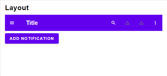\n\n\n# Sheets\n\n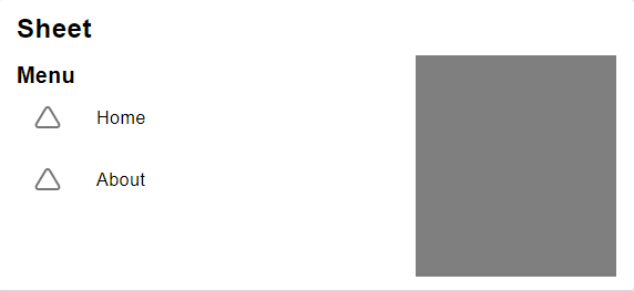\n\n@docs leftSheet, rightSheet, searchSheet\n\n\n# Utility Functions\n\n@docs getDeviceClass, partitionActions, orderModals\n\n","unions":[],"aliases":[],"values":[{"name":"getDeviceClass","comment":" Obtain the device class from a given window.\n\nCheckout [Element.classifyDevice](https://package.elm-lang.org/packages/mdgriffith/elm-ui/latest/Element#classifyDevice) for more information.\n\n","type":"{ height : Basics.Int, width : Basics.Int } -> Element.DeviceClass"},{"name":"leftSheet","comment":" Left sheet containing a title and a menu.\n","type":"{ button : Internal.Item.ItemStyle (Internal.Button.ButtonStyle msg) msg, sheet : Internal.List.ColumnStyle msg } -> { title : Element.Element msg, menu : Internal.Select.Select msg, onDismiss : msg } -> Internal.Modal.Modal msg"},{"name":"orderModals","comment":" Material design only allows one element at a time to be visible as modal.\n\nThe order from most important to least important is as follows:\n\n1. dialog\n2. top sheet\n3. bottom sheet\n4. left sheet\n5. right sheet\n\n","type":"{ dialog : Maybe.Maybe (Internal.Modal.Modal msg), topSheet : Maybe.Maybe (Internal.Modal.Modal msg), bottomSheet : Maybe.Maybe (Internal.Modal.Modal msg), leftSheet : Maybe.Maybe (Internal.Modal.Modal msg), rightSheet : Maybe.Maybe (Internal.Modal.Modal msg) } -> List.List (Internal.Modal.Modal msg)"},{"name":"partitionActions","comment":" Partitions actions into primary and additional actions.\n\nIt is intended to hide the additional actions in a side menu.\n\n","type":"List.List (Internal.Button.Button msg) -> { primaryActions : List.List (Internal.Button.Button msg), moreActions : List.List (Internal.Button.Button msg) }"},{"name":"rightSheet","comment":" Right sheet containing a simple list of buttons\n","type":"{ sheet : Internal.List.ColumnStyle msg, insetItem : Internal.Item.ItemStyle (Internal.Item.InsetItemStyle msg) msg } -> { onDismiss : msg, moreActions : List.List (Internal.Button.Button msg) } -> Internal.Modal.Modal msg"},{"name":"searchSheet","comment":" Top sheet containing a searchbar spanning the full width\n","type":"Internal.TextInput.TextInputStyle msg -> { onDismiss : msg, search : Internal.TextInput.TextInput msg } -> Internal.Modal.Modal msg"}],"binops":[]},{"name":"Widget.Material","comment":" This module implements a Material design theme for all widgets.\n\nThe stylings are following [the official Material Design guidelines](https://material.io/components) as close as possible.\nPlease use these widgets in combination with the official guidelines.\n\nThe typography is taken from [the Material Design guidelines](https://material.io/design/typography/the-type-system.html#type-scale).\nIts recommended to use a font size of 16px width and the [Roboto Font](https://fonts.google.com/specimen/Roboto?query=Ro).\n\nThe style are not opaque, so you can change every styling to your needs.\n\nIf you have any suggestions or improvements, be sure to leave a [PR or a Issue](https://github.com/Orasund/elm-ui-widgets/issues) over at the github repos.\n\n\n# Palette\n\n@docs Palette, defaultPalette, darkPalette, swapColor, gray, lightGray, textGray\n\n\n# Button\n\nDifferent styles for buttons have different meanings.\n\n - Use `textButton` as your default button\n - Use `containedButton` for any important action\n - Use `outlinedButton` if you have more then one important action.\n Use `containedButton` for **the most** important action of the group.\n\n@docs containedButton, outlinedButton, textButton\n@docs iconButton, toggleButton, toggleRow\n\n\n# Switch\n\n@docs switch\n\n\n# Card\n\n@docs cardColumn, cardAttributes\n\n\n# Chip\n\n@docs chip,textInputAttributes, textInput, passwordInput\n\n\n# Dialog\n\n@docs alertDialog\n\n\n# List\n\n@docs row, column\n\n\n# App Bar\n\n@docs menuBar, tabBar\n\n\n# Sheet\n\n@docs sideSheet, bottomSheet\n\n\n# Item\n\nA List is build from items.\nYou way want to use special items to visually organize the content of your list.\n\n@docs fullBleedItem, insetItem, multiLineItem, imageItem, expansionItem, selectItem\n@docs fullBleedDivider, insetDivider, middleDivider\n@docs fullBleedHeader, insetHeader\n\n\n# Progress Indicator\n\n@docs progressIndicator\n\n\n# Sort Table\n\n@docs sortTable\n\n\n# Snackbar\n\n@docs snackbar\n\n\n# Tab\n\n@docs tab, tabButton\n\n\n# DEPRECATED\n\n@docs buttonRow\n\n","unions":[],"aliases":[{"name":"Palette","comment":" The material design comes with customizable color palettes.\n\nCheck out [the official documentation about the color system](https://material.io/design/color/the-color-system.html#color-theme-creation) to see how these colors are used.\n\nFor the `-on` colors you can use white, for transitions into white, or black,for transitions into black. Other colors are also possible, but i've not seen any website actually using a different color.\n\n","args":[],"type":"{ primary : Color.Color, secondary : Color.Color, background : Color.Color, surface : Color.Color, error : Color.Color, on : { primary : Color.Color, secondary : Color.Color, background : Color.Color, surface : Color.Color, error : Color.Color } }"}],"values":[{"name":"alertDialog","comment":" An alert dialog for important decisions. Use a snackbar for less important notification.\n\n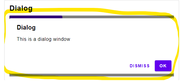\n\n","type":"Widget.Material.Palette -> Internal.Dialog.DialogStyle msg"},{"name":"bottomSheet","comment":" A bottom sheet. Has a maximal width of 360.\nShould be align to the bottom right corner of the screen.\n","type":"Widget.Material.Palette -> Internal.List.ColumnStyle msg"},{"name":"buttonRow","comment":" DEPRECATED\n\nUse Material.toggleRow instead\n\n","type":"Internal.List.RowStyle msg"},{"name":"cardAttributes","comment":" A variant of cardColumn designed for a single item.\n\nUse this with a normal `Element.column`, `Element.row` or even a `Element.el`.\n","type":"Widget.Material.Palette -> List.List (Element.Attribute msg)"},{"name":"cardColumn","comment":" A List styled like a card.\n\n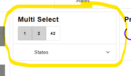\n\nTechnical Remark:\n\nThis is a simplification of the [Material Design Card\n](https://material.io/components/cards) and might get replaced at a later date.\n\n","type":"Widget.Material.Palette -> Internal.List.ColumnStyle msg"},{"name":"chip","comment":" Chips have the same behavior as buttons but are visually less important.\n\nIn the [official documentation](https://material.io/components/chips#types) chips have different names depending on where they are used:\n\n - **Input Chips** are used inside a text field. Use `textInput` for this feature.\n - **Choice Chips** are used for selecting an option.\n The material design guidelines recommend using `toggleButton` for icons with no text and chips for text with no icons.\n - **Filter Chips** are used for selecting multiple options. They typically have a done-icon when selected.\n - **Action chips** are like button. Make sure to include an icon when using action chips.\n\n\n\nTechnical Remark:\n\n - Decided against the implementation of an outlined chip.\n Please open a new issue or a PR if you want to have it implemented.\n\n","type":"Widget.Material.Palette -> Internal.Button.ButtonStyle msg"},{"name":"column","comment":" A simple styling for a column.\n","type":"Internal.List.ColumnStyle msg"},{"name":"containedButton","comment":" A contained button representing the most important action of a group.\n\n\n\n","type":"Widget.Material.Palette -> Internal.Button.ButtonStyle msg"},{"name":"darkPalette","comment":" The official dark theme of google.\n\n\n\n_Image take from [material.io](https://material.io/design/color/dark-theme.html#ui-application)_\n\n","type":"Widget.Material.Palette"},{"name":"defaultPalette","comment":" The default color theme.\n\n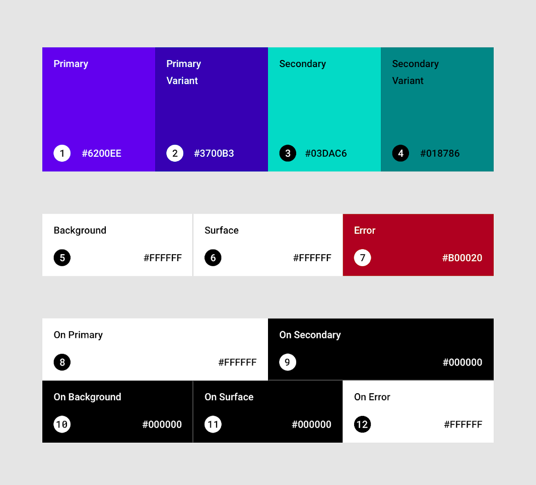\n\n_Image take from [material.io](https://material.io/design/color/the-color-system.html#color-theme-creation)_\n\n","type":"Widget.Material.Palette"},{"name":"expansionItem","comment":" An expandable item.\n\n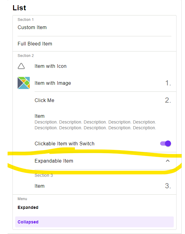\n\nTechnical Remarks:\n\n - The Icons are taken from [danmarcab/material-icons](https://dark.elm.dmy.fr/packages/danmarcab/material-icons/latest/).\n\n","type":"Widget.Material.Palette -> Internal.Item.ExpansionItemStyle msg"},{"name":"fullBleedDivider","comment":" A divider covering the full length\n\n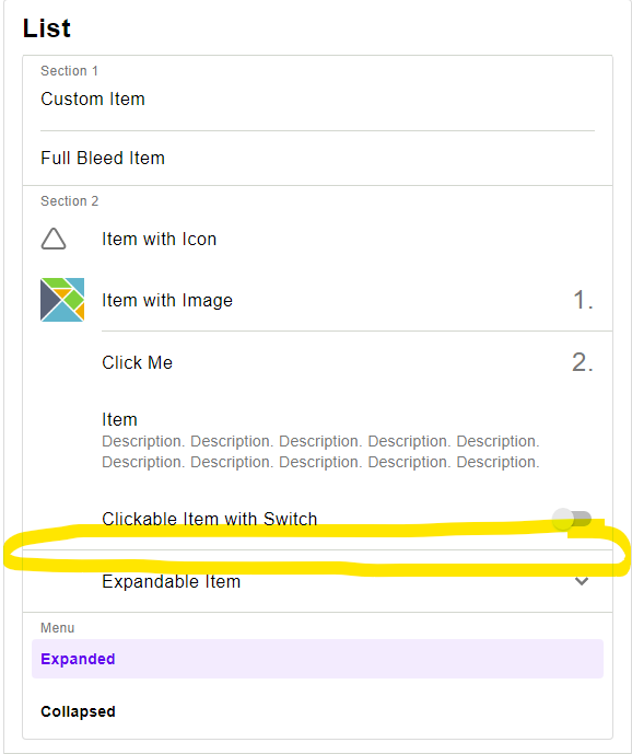\n\n","type":"Widget.Material.Palette -> Internal.Item.ItemStyle (Internal.Item.DividerStyle msg) msg"},{"name":"fullBleedHeader","comment":" A header of a section of a list. Comes with a full bleed divider.\n\n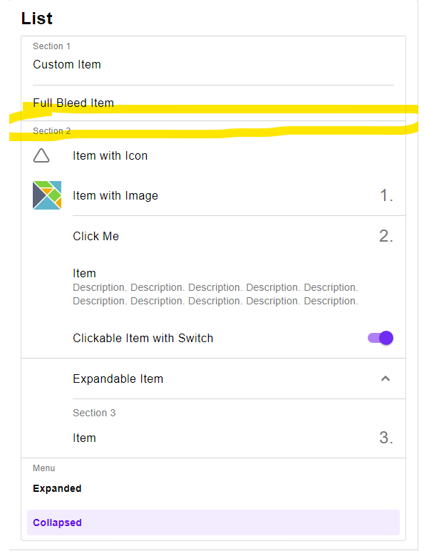\n\n","type":"Widget.Material.Palette -> Internal.Item.ItemStyle (Internal.Item.HeaderStyle msg) msg"},{"name":"fullBleedItem","comment":" A basic item containing some text, a button. Spans the full width.\n\n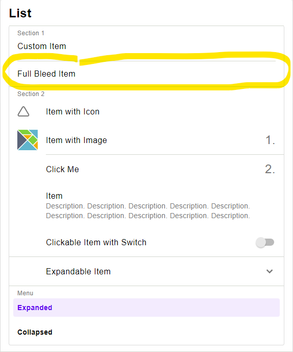\n\n","type":"Widget.Material.Palette -> Internal.Item.ItemStyle (Internal.Item.FullBleedItemStyle msg) msg"},{"name":"gray","comment":" generates a \"grayish 50%\" color that matches the on-surface color.\n","type":"Widget.Material.Palette -> Color.Color"},{"name":"iconButton","comment":" An single selectable icon.\n\n\n\nTechnical Remark:\n\n - Could not find any specification details\n\n","type":"Widget.Material.Palette -> Internal.Button.ButtonStyle msg"},{"name":"imageItem","comment":" Similar to a textItem but with an image instead of the icon.\n\nIf the image is bigger then 40x40, the size of the item will change.\n\n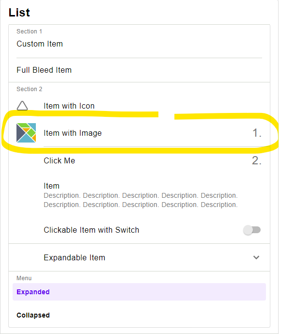\n\n","type":"Widget.Material.Palette -> Internal.Item.ItemStyle (Internal.Item.ImageItemStyle msg) msg"},{"name":"insetDivider","comment":" A divider covering only parts of the width\n\n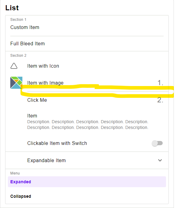\n\n","type":"Widget.Material.Palette -> Internal.Item.ItemStyle (Internal.Item.DividerStyle msg) msg"},{"name":"insetHeader","comment":" A header of a section of a list. Comes with a inset divider.\n\n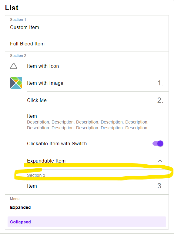\n\n","type":"Widget.Material.Palette -> Internal.Item.ItemStyle (Internal.Item.HeaderStyle msg) msg"},{"name":"insetItem","comment":" A basic item containing some text, a button and some additional information.\n\n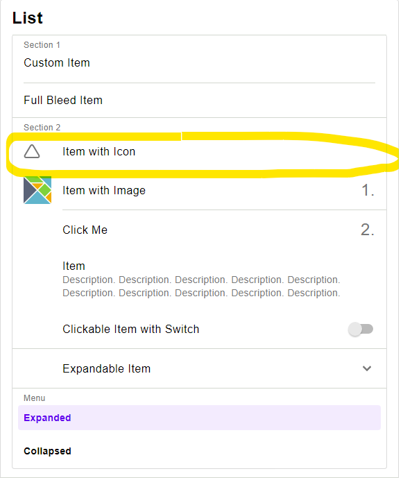\n\n","type":"Widget.Material.Palette -> Internal.Item.ItemStyle (Internal.Item.InsetItemStyle msg) msg"},{"name":"lightGray","comment":" generates a \"grayish 14%\" color that matches the on-surface color.\n","type":"Widget.Material.Palette -> Color.Color"},{"name":"menuBar","comment":" An app bar with a menu on the left side\n\n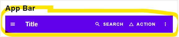\n\n","type":"Widget.Material.Palette -> Internal.AppBar.AppBarStyle { menuIcon : Widget.Icon.Icon msg, title : List.List (Element.Attribute msg) } msg"},{"name":"middleDivider","comment":" A divider in the center\n\n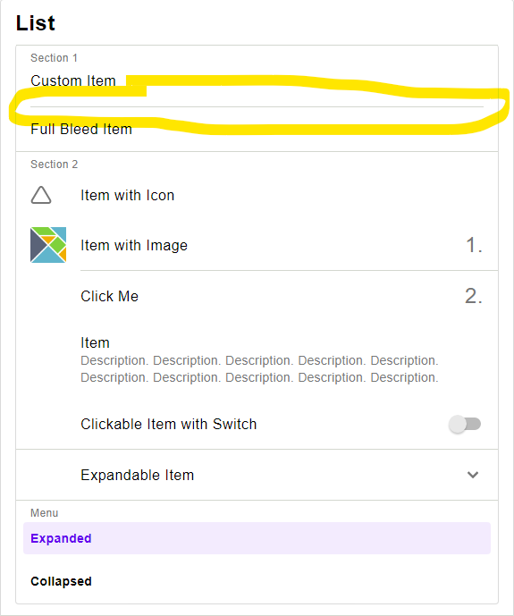\n\n","type":"Widget.Material.Palette -> Internal.Item.ItemStyle (Internal.Item.DividerStyle msg) msg"},{"name":"multiLineItem","comment":" A text item allowing for more text.\n\n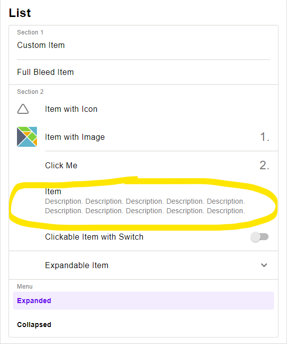\n\n","type":"Widget.Material.Palette -> Internal.Item.ItemStyle (Internal.Item.MultiLineItemStyle msg) msg"},{"name":"outlinedButton","comment":" A outlined button representing an important action within a group.\n\n\n\n","type":"Widget.Material.Palette -> Internal.Button.ButtonStyle msg"},{"name":"passwordInput","comment":" A text input style for the password Input.\n","type":"Widget.Material.Palette -> Internal.PasswordInput.PasswordInputStyle msg"},{"name":"progressIndicator","comment":" A circular progress indicator\n\n\n\n","type":"Widget.Material.Palette -> Internal.ProgressIndicator.ProgressIndicatorStyle msg"},{"name":"row","comment":" A simple styling for a row.\n","type":"Internal.List.RowStyle msg"},{"name":"selectItem","comment":" Displays a selection. This should be combined with Widget.selectItem\n\n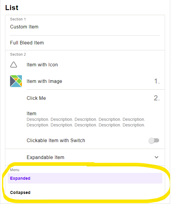\n\n","type":"Widget.Material.Palette -> Internal.Item.ItemStyle (Internal.Button.ButtonStyle msg) msg"},{"name":"sideSheet","comment":" A side sheet. Has a maximal width of 360.\n\n\n\n","type":"Widget.Material.Palette -> Internal.List.ColumnStyle msg"},{"name":"snackbar","comment":" A typical snackbar\n\n\n\nTechnical Remark:\n\n - The text color of the button was not given in the specification. This implementation\n adjusts the luminance of the color to fit the [w3 accessability standard](https://www.w3.org/TR/WCAG20/#Contrast)\n\n","type":"Widget.Material.Palette -> Widget.Snackbar.SnackbarStyle msg"},{"name":"sortTable","comment":" A sortable table\n\n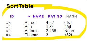\n\n","type":"Widget.Material.Palette -> Internal.SortTable.SortTableStyle msg"},{"name":"swapColor","comment":" Swaps the primary and secondary color.\n\nWhy is this needed? See the [material design specification](https://material.io/design/color/applying-color-to-ui.html) for details.\n\n","type":"Widget.Material.Palette -> Widget.Material.Palette"},{"name":"switch","comment":" A boolean switch\n\n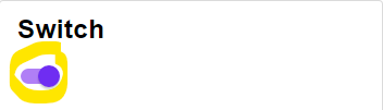\n\nTechnical Remark:\n\n - The specification states that the disabled switch should have a color dependent on its activeness. This is not implemented.\n\n","type":"Widget.Material.Palette -> Internal.Switch.SwitchStyle msg"},{"name":"tab","comment":" A Tab bar meant for only the upper most level. Do not use a tab within a tab.\n\n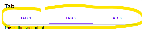\n\n","type":"Widget.Material.Palette -> Internal.Tab.TabStyle msg"},{"name":"tabBar","comment":" An app bar with tabs instead of a menu\n\n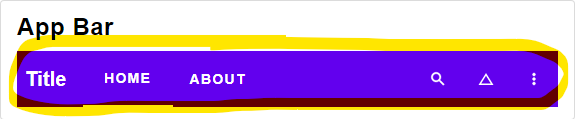\n\n","type":"Widget.Material.Palette -> Internal.AppBar.AppBarStyle { menuTabButton : Internal.Button.ButtonStyle msg, title : List.List (Element.Attribute msg) } msg"},{"name":"tabButton","comment":" A single Tab button.\n\n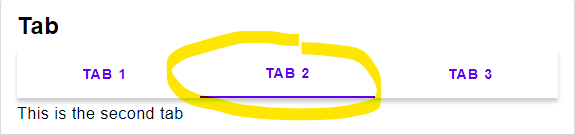\n\nTechnical Remark:\n\n - The official specification states that the background color should be the surface color,\n but the pictures and actual implementations all have no background color.\n So here the background color is also not set.\n\n","type":"Widget.Material.Palette -> Internal.Button.ButtonStyle msg"},{"name":"textButton","comment":" A text button representing a simple action within a group.\n\n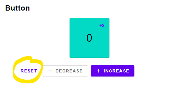\n\n","type":"Widget.Material.Palette -> Internal.Button.ButtonStyle msg"},{"name":"textGray","comment":" generates a grayer text color\n","type":"Widget.Material.Palette -> Color.Color"},{"name":"textInput","comment":" A text input style that is included only to support input chips.\n\n\n\nTechnical Remark:\n\n - This is just a temporary implementation. It will soon be replaced with the official implementation.\n\n","type":"Widget.Material.Palette -> Internal.TextInput.TextInputStyle msg"},{"name":"textInputAttributes","comment":" A variant of textInput designed for `Input.text`.\n","type":"Widget.Material.Palette -> List.List (Element.Attribute msg)"},{"name":"toggleButton","comment":" A ToggleButton. Only use as a group in combination with `buttonRow`.\n\nToggle buttons should only be used with the `iconButton` widget, else use chips instead.\n\n\n\nTechnical Remark:\n\n - Border color was not defined in the [specification](https://material.io/components/buttons#toggle-button)\n - There are two different versions, one where the selected color is gray and another where the color is primary.\n I noticed the gray version was used more often, so i went with that one.\n\n","type":"Widget.Material.Palette -> Internal.Button.ButtonStyle msg"},{"name":"toggleRow","comment":" a Row of buttons.\n\nOnly use in combination with `toggleButton`\n\n\n\n","type":"Internal.List.RowStyle msg"}],"binops":[]},{"name":"Widget.Material.Color","comment":" This module contains functions to adapt color in various ways.\n\nWe use the CIELCH color space, while the material design on chrome uses sRGB.\nCIELCH colors ensure that the result of mixing colors looks natural, where as\nsRGB is optimized to mix images together.\n\nIn practice this means that in edge-cases our package will produce better results,\nthen the javascript material design implementation.\n\n\n## Opacity Constants for Buttons\n\n@docs buttonHoverOpacity, buttonFocusOpacity, buttonPressedOpacity, buttonDisabledOpacity, buttonSelectedOpacity\n\n\n## Accessibility\n\n@docs accessibleTextColor, accessibleWithTextColor\n\n\n## Shades\n\n@docs withShade, scaleOpacity\n\n\n## Predefined Colors\n\n@docs dark\n\n\n## Utility Functions\n\n@docs toCIELCH, fromCIELCH, shadow, fromColor, textAndBackground\n\n\n## DEPRECATED\n\n@docs gray\n\n","unions":[],"aliases":[],"values":[{"name":"accessibleTextColor","comment":" Returns either Black or White, depending of the input color.\n","type":"Color.Color -> Color.Color"},{"name":"accessibleWithTextColor","comment":" Returns the first color, adapted to ensure accessibility rules.\n\n accessibleTextColor bgColor =\n accessibleWithTextColor (Color.rgb255 255 255 255) bgColor\n\n","type":"Color.Color -> Color.Color -> Color.Color"},{"name":"buttonDisabledOpacity","comment":" Opacity value for a disabled button\n","type":"Basics.Float"},{"name":"buttonFocusOpacity","comment":" Opacity value for a focused button\n","type":"Basics.Float"},{"name":"buttonHoverOpacity","comment":" Opacity value for hovering over a button\n","type":"Basics.Float"},{"name":"buttonPressedOpacity","comment":" Opacity value for a pressed button\n","type":"Basics.Float"},{"name":"buttonSelectedOpacity","comment":" Opacity value for a selected button\n","type":"Basics.Float"},{"name":"dark","comment":" dark gray\n","type":"Color.Color"},{"name":"fromCIELCH","comment":" Utility function to convert CIELCH color space back to a color\n","type":"{ l : Basics.Float, c : Basics.Float, h : Basics.Float } -> Color.Color"},{"name":"fromColor","comment":" Utility function to convert from Color to Element.Color\n","type":"Color.Color -> Element.Color"},{"name":"gray","comment":" DEPRECATED use Material.gray instead.\n","type":"Color.Color"},{"name":"scaleOpacity","comment":" Multiply the opacity value by a given value\n\n scaleOpacity (0.25 \\* 2) ==\n scaleOpacity 0.25 >> scaleOpacity 2\n\n","type":"Basics.Float -> Color.Color -> Color.Color"},{"name":"shadow","comment":" Returns a Material Design shadow\n","type":"Basics.Float -> { offset : ( Basics.Float, Basics.Float ), size : Basics.Float, blur : Basics.Float, color : Element.Color }"},{"name":"textAndBackground","comment":" applies a color the background and ensures that the font color is accessible.\n","type":"Color.Color -> List.List (Element.Attr decorative msg)"},{"name":"toCIELCH","comment":" Utility function to convert a color to CIELCH color space\n","type":"Color.Color -> { l : Basics.Float, c : Basics.Float, h : Basics.Float }"},{"name":"withShade","comment":" Simulates adding a color in front (subtractive color mixing).\n\n --Darkens the color by 50%\n withShade (Color.rgb255 255 255 255) 0.5\n\n --Makes the color 50% more red\n withShade (Color.rgb255 255 0 0) 0.5\n\n","type":"Color.Color -> Basics.Float -> Color.Color -> Color.Color"}],"binops":[]},{"name":"Widget.Material.Typography","comment":" An implementation of the Material design typography.\n\nIt is optimized for the _Roboto_ font\n\n\n## Headline\n\n@docs h1, h2, h3, h4, h5, h6\n\n\n## Subtitle\n\n@docs subtitle1, subtitle2\n\n\n## Body\n\n@docs body1, body2\n\n\n## Miscellaneous\n\n@docs button, caption, overline\n\n","unions":[],"aliases":[],"values":[{"name":"body1","comment":" Variant 1 for the default font size: 16px\n","type":"List.List (Element.Attribute msg)"},{"name":"body2","comment":" Variant 2 for the default font size: 14px\n","type":"List.List (Element.Attribute msg)"},{"name":"button","comment":" Font for Material Design buttons. Size: 14px\n","type":"List.List (Element.Attribute msg)"},{"name":"caption","comment":" Captions for Material Design. Size: 12px\n","type":"List.List (Element.Attribute msg)"},{"name":"h1","comment":" Headline 1 for Material Design. Size: 96px\n","type":"List.List (Element.Attribute msg)"},{"name":"h2","comment":" Headline 2 for Material Design. Size: 60px\n","type":"List.List (Element.Attribute msg)"},{"name":"h3","comment":" Headline 3 for Material Design. Size: 48px\n","type":"List.List (Element.Attribute msg)"},{"name":"h4","comment":" Headline 3 for Material Design. Size: 34px\n","type":"List.List (Element.Attribute msg)"},{"name":"h5","comment":" Headline 3 for Material Design. Size: 24px\n","type":"List.List (Element.Attribute msg)"},{"name":"h6","comment":" Headline 3 for Material Design. Size: 20px\n","type":"List.List (Element.Attribute msg)"},{"name":"overline","comment":" overline for Material Design. Size: 10px\n","type":"List.List (Element.Attribute msg)"},{"name":"subtitle1","comment":" Variant 1 for subtitles for Material Design. Size: 16px\n","type":"List.List (Element.Attribute msg)"},{"name":"subtitle2","comment":" Variant 2 for subtitles for Material Design. Size: 14px\n","type":"List.List (Element.Attribute msg)"}],"binops":[]},{"name":"Widget.Snackbar","comment":" \n\nA [snackbar](https://material.io/components/snackbars/) shows notification, one at a time.\n\n\n# Basics\n\n@docs SnackbarStyle, Snackbar, Message, init, current, timePassed, view\n\n\n# Operations\n\n@docs insert, insertFor, dismiss\n\n","unions":[],"aliases":[{"name":"Message","comment":" A message with maybe some action button\n","args":["msg"],"type":"{ text : String.String, button : Maybe.Maybe (Internal.Button.TextButton msg) }"},{"name":"Snackbar","comment":" A snackbar has a queue of Notifications, each with the amount of ms the message should be displayed\n","args":["a"],"type":"{ queue : Queue.Queue ( a, Basics.Int ), current : Maybe.Maybe ( a, Basics.Int ) }"},{"name":"SnackbarStyle","comment":" ","args":["msg"],"type":"{ elementRow : List.List (Element.Attribute msg), content : { text : { elementText : List.List (Element.Attribute msg) }, button : Internal.Button.ButtonStyle msg } }"}],"values":[{"name":"current","comment":" Returns the current element.\n","type":"Widget.Snackbar.Snackbar a -> Maybe.Maybe a"},{"name":"dismiss","comment":" Dismiss the current message.\n","type":"Widget.Snackbar.Snackbar a -> Widget.Snackbar.Snackbar a"},{"name":"init","comment":" Initial state\n","type":"Widget.Snackbar.Snackbar a"},{"name":"insert","comment":" Insert a message that will last for 10 seconds.\n","type":"a -> Widget.Snackbar.Snackbar a -> Widget.Snackbar.Snackbar a"},{"name":"insertFor","comment":" Insert a message for a specific amount of milliseconds.\n","type":"Basics.Int -> a -> Widget.Snackbar.Snackbar a -> Widget.Snackbar.Snackbar a"},{"name":"timePassed","comment":" Updates the model. This functions should be called regularly.\nThe first argument is the milliseconds that passed since the last time the function was called.\n","type":"Basics.Int -> Widget.Snackbar.Snackbar a -> Widget.Snackbar.Snackbar a"},{"name":"view","comment":" Views the current Message. (only one at a time)\n","type":"Widget.Snackbar.SnackbarStyle msg -> (a -> Widget.Snackbar.Message msg) -> Widget.Snackbar.Snackbar a -> Maybe.Maybe (Element.Element msg)"}],"binops":[]}] |