| .github | ||
| docs | ||
| example | ||
| src | ||
| tests | ||
| .gitignore | ||
| build.sh | ||
| docs.json | ||
| elm-analyse.json | ||
| elm.json | ||
| LICENSE | ||
| README.md | ||
Elm-Ui-Widgets
This package contains independent widgets (no components) written for Elm-Ui. These widgets have no dependencies to other parts of this package. So you can just use as much as you need.
- It also supports custom themes and has a material design theme already ready to use.
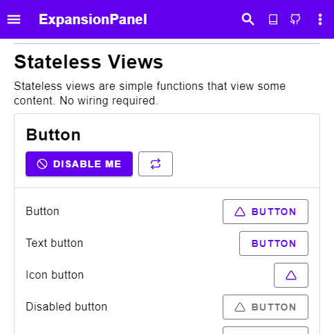
- Examples of all widgets can be found here.
- It is highly customizable. Checkout Widget.Customize for more information.
Feel free to start an issue on the repository if you have any questions.
Summary
- Each widget comes with a Widget Type and a Style Type. The Widget Type is an abstract representation of the widget and the Style Type has all styling attributes.
- Widget Types can be used as building Blocks for more complicated Widgets (Button -> Select Buttons -> Menu -> Layout)
Example
Let's look at the button widget.
** Style Type**
button: ButtonStyle msg
    ->
        { text : String
        , icon : Icon
        , onPress : Maybe msg
        }
    -> Element msg
In comparison to Elm-Ui's button, we see that List (Attribute msg) has changed into a Style Type. Furthermore, the Style type mirrors the implementation. element corresponds to Element.element, elementRow corresponds to Element.row and so on.
type alias ButtonStyle msg =
    { element : List (Attribute msg)
    , ifDisabled : List (Attribute msg)
    , ifActive : List (Attribute msg)
    , otherwise : List (Attribute msg)
    , content :
          { elementRow : List (Attribute msg)
          , content :
              { text : { contentText : List (Attribute msg) }
              , icon : IconStyle
              }
          }
      }
    }
** Style Implementation **
For actually displaying the button we have a few different implementations:
{-| Button with only an icon and no text -}
iconButton :
    ButtonStyle msg
    ->
        { text : String --for screen readers
        , icon : Icon
        , onPress : Maybe msg
        }
    -> Element msg

{-| Button with a text but no icon -}
textButton :
    ButtonStyle msg
    ->
        { textButton
            | text : String
            , onPress : Maybe msg
        }
    -> Element msg

{-| Button with both icon and text -}
button :
    ButtonStyle msg
    ->
        { text : String
        , icon : Icon
        , onPress : Maybe msg
        }
    -> Element msg
** Widget Type **
We also have a Widget Type for the button:
type alias Button msg =
    { text : String
    , icon : Icon
    , onPress : Maybe msg
    }
We can use it to build more complex widgets, for example a select button:
type alias Select msg =
    { selected : Maybe Int
    , options :
        List
            { text : String
            , icon : Icon
            }
    , onSelect : Int -> Maybe msg
    }

select :
    Select msg
    -> List ( Bool, Button msg )

selectButton :
    ButtonStyle msg
    -> ( Bool, Button msg )
    -> Element msg
Checkout the examples in Widget for more details.
Reusable Views vs. Components
In Elm we like to use reusable views instead of components. At first this packages had a few components, but they where more complicated in comparison. They got slowly turned into reusable views one by one. Most could be reduced even further into view functions: Reusable views without a model. All function in Widget are view functions.
Alternatives
For comparison, here are some alternative packages for creating UIs:
- Using Elm-Ui
- lucamug/style-framework - Full customization requires the cloning of the package.
- jxxcarlson/elm-widget - Uses a Builder pattern. Has some redefined customizations.
- QiTASC/hatchinq - Similar Arroach but still in experimental phase
- Using Elm/Html
- nathanjohnson320/elm-ui-components - Uses the elm/html way of styling.
- NoRedInk/noredink-ui - Similar Approach but no customization options.
- peterszerzo/elm-natural-ui - Uses custom Attributes with some customization.
- Ui Frameworks
- aforemny/material-components-web-elm - Wrapper of Material design using custom elements.
- afidegnum/elm-tailwind - Wrapper of Tailwind by including the tailwind stylesheet.
- surprisetalk/elm-bulma - Wrapper for Bulma by including the bulma stylesheet.
- rundis/elm-bootstrap - Wrapper for Bootstrap by including the bootstrap stylesheet.
- supermacro/elm-antd - Implementation of Ant Design in Elm
Motivation
After looking at the current packages that implement various reusable views (and components) I noticed two things:
- There are (nearly) no widgets for Elm-Ui, and that's a problem because while going from
ElementtoHtmlis easy, the opposite is not always possible (as a lot of styling in Elm-Ui would not be adapted to theHtmlelement.) - There is no collection of widgets, all in one place. A lot of components get reimplemented over and over again. It's hard to keep track of what package is currently the best.
This package tries to solve both of these problems.
Changelog
- Version 3.0.0 - Reworked Style Types making it easier to customize. Added full icon support.
- Version 2.0.0 - Complete rewrite of the package. Now including a material design implementation.