mirror of
https://github.com/StanGirard/quivr.git
synced 2024-11-23 21:22:35 +03:00
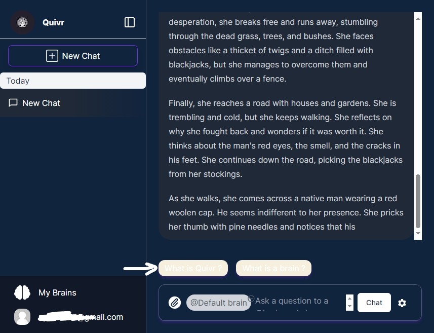
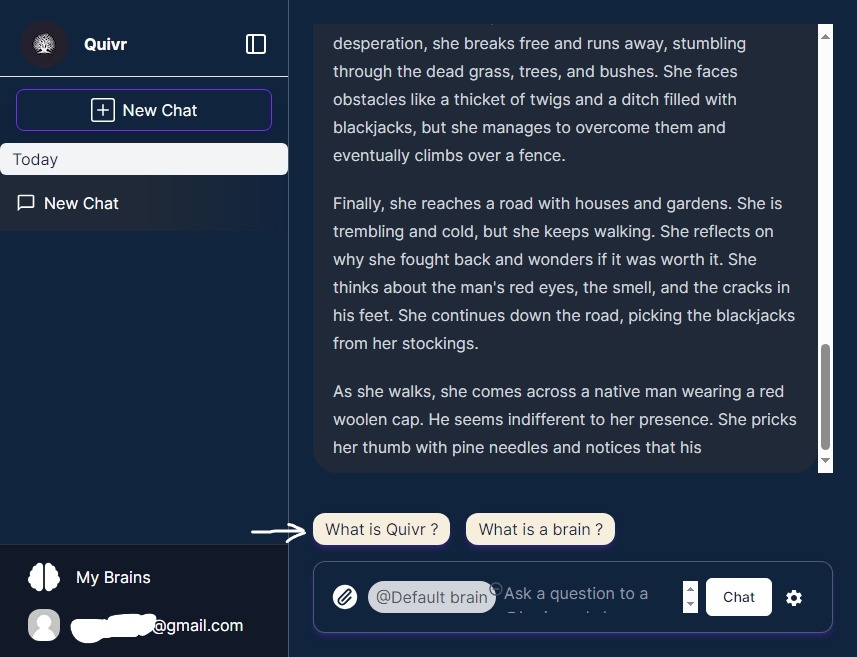
# Description In this pull request, I addressed an issue with text visibility in dark mode within the OnboardingQuestion component. The problem was resolved by modifying the class name. ## Changes Made I changed the class name in the OnboardingQuestion component from: ```Tailwind cursor-pointer shadow-md dark:shadow-primary/25 hover:shadow-xl transition-shadow bg-onboarding-yellow-bg px-3 py-1 rounded-xl border-black/10 dark:border-white/25 ``` to: ```Tailwind cursor-pointer shadow-md dark:shadow-primary/25 hover:shadow-xl transition-shadow bg-onboarding-yellow-bg px-3 py-1 rounded-xl border-black/10 dark:border-white/25 dark:text-black ``` ## Motivation The motivation for this change is to improve the visibility of text in dark mode, making the user experience better and ensuring that the UI remains consistent. ## Checklist before requesting a review - [ ] My code follows the style guidelines of this project. - [ ] I have performed a self-review of my code. - [ ] I have added comments to explain any hard-to-understand areas. - [ ] I have not added tests in this specific pull request, as this change primarily deals with CSS class modification. - [ ] New and existing unit tests pass locally with my changes. - [ ] No dependent changes are required for this fix. ## Screenshots (if appropriate) ### Problem Before Fix  ### Fix Applied 
108 KiB
857x657px
108 KiB
857x657px
