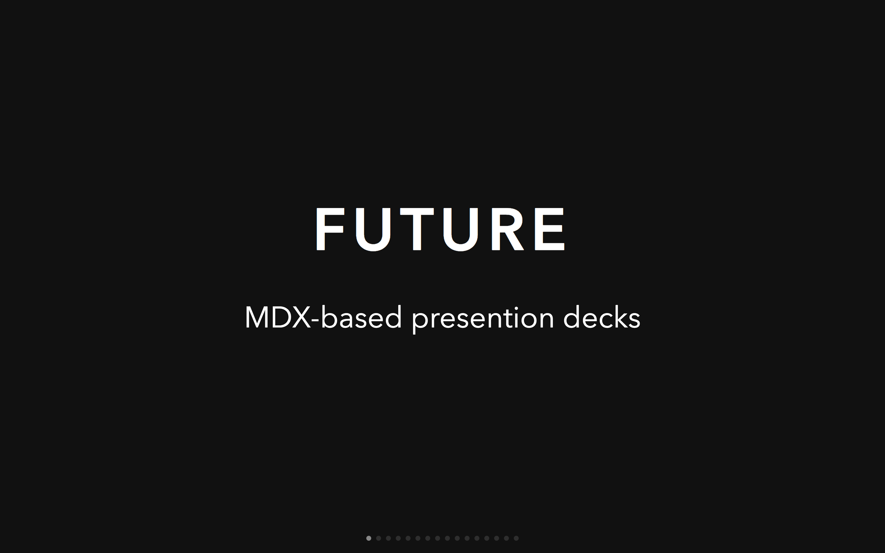
# mdx-deck

[MDX][]-based presentation decks
[![Build Status][badge]][travis]
[![Version][version-badge]][npm]
[![Downloads][downloads-badge]][npm]
[badge]: https://img.shields.io/travis/jxnblk/mdx-deck.svg?style=flat-square
[travis]: https://travis-ci.org/jxnblk/mdx-deck
[version-badge]: https://img.shields.io/npm/v/mdx-deck.svg?style=flat-square
[downloads-badge]: https://img.shields.io/npm/dw/mdx-deck.svg?style=flat-square
[npm]: https://npmjs.com/package/mdx-deck
```sh
npm i -D mdx-deck
```
- :memo: Write presentations in markdown
- :atom_symbol: Import and use [React components](#imports)
- :nail_care: Customizable [themes](#theming) and components
- :zero: Zero-config CLI
- :tipping_hand_woman: [Presenter mode](#presenter-mode)
- :notebook: [Speaker notes](#speaker-notes)
[View demo](https://jxnblk.com/mdx-deck)
## Getting Started
Create an [MDX][] file and separate each slide with `---`.
````mdx
# This is the title of my deck
---
# About Me
---
```jsx
```
---
import Demo from './components/Demo'
---
# The end
````
Add a run script to your `package.json` with the mdx-deck CLI
pointing to the `.mdx` file to start the dev server:
```json
"scripts": {
"start": "mdx-deck deck.mdx"
}
```
Start the dev server:
```sh
npm start
```
### Video Tutorial
For a video introduction, see this [egghead tutorial][egghead] by [@andrewdelprete](https://github.com/andrewdelprete).
[egghead]: https://egghead.io/lessons/react-build-a-slide-deck-with-mdx-deck-using-markdown-react
## Usage
MDX can use Markdown syntax and render React components with JSX.
### Imports
To import components, use ES import syntax separated with empty lines from any markdown or JSX syntax.
```mdx
import { Box } from 'grid-styled'
Hello
```
### Theming
mdx-deck uses [styled-components][] for styling, making practically any part of the presentation themeable.
### Built-in Themes
mdx-deck includes several built-in themes to change the look and feel of the presentation.
Export `theme` from your MDX file to enable a theme.
```mdx
export { dark as theme } from 'mdx-deck/themes'
# Dark Theme
```
MDX uses [exports](https://github.com/mdx-js/mdx#exports) as a way for files to communicate with their parent components.
For a list of available themes see the [Themes Docs](docs/themes.md).
### Custom Themes
A custom theme can be provided by exporting `theme` from the MDX file.
```mdx
export { default as theme } from './theme'
# Hello
```
The theme should be an object with fields for fonts, colors, and CSS for individual components.
It's recommended that all custom themes extend the default theme as a base.
```js
// example theme.js
import { theme } from 'mdx-deck/themes'
export default {
// extends the default theme
...theme,
// add a custom font
font: 'Roboto, sans-serif',
// custom colors
colors: {
text: '#f0f',
background: 'black',
link: '#0ff',
}
}
```
Read more about theming in the [Theming docs](docs/theming.md)
### Components
mdx-deck includes built-in components to help with creating presentations, including a full screen Image component, the Appear component that allows stepping through parts of a single slide, and the Notes component for adding speaker notes.
Read more in the [components docs](docs/components.md).
### Layouts
Each slide can include a custom layout around its content.
This can be used as a substitute for slide templates found in other presentation apps and libraries.
```js
// example Layout.js
import React from 'react'
export default ({ children }) =>
{children}
```
```mdx
import Layout from './Layout'
# No Layout
---
export default Layout
# Custom Layout
```
The layout component will wrap the MDX elements within that slide,
which means you can use a nested ThemeProvider or target elements with CSS-in-JS.
### Built-in Layouts
mdx-deck includes some built-in layouts for inverting theme colors and changing the layout of a slide. Read more about [built-in layouts](docs/components.md#layouts).
## Presenter Mode
mdx-deck includes a built-in presenter mode, with a preview of the next slide and a timer.

To use presenter mode:
- Open two windows in the same browser, with the same URL on two different screens. (this should work in both development and exported presentations)
- In your window press the `Option + P` (`Alt + P`) key to enter presenter mode.
- Display the other window on the screen for the audience to see.
- Control the presentation from your window by using the left and right arrow keys; the other window should stay in sync
### Speaker Notes
Notes that only show in presenter mode can be added to any slide.
Speaker notes can be added in one of the following two ways:
**Markdown:** Use the `notes` language attribute in a fenced code block to add speaker notes.
````mdx
# Slide Content
```notes
These are only visible in presenter mode
```
````
**Notes Component:** Use the `Notes` component to create more complex speaker notes.
````mdx
import { Notes } from 'mdx-deck'
# Slide Content
Only visible in presenter mode
````
### Keyboard Shortcuts
Key | Description
---|---
Left Arrow | Go to previous slide
Right Arrow | Go to next slide
Space | Go to next slide
Option + P | Toggle [Presenter Mode](#presenter-mode)
Up Arrow | Hide current step in [Appear](#appear) component
Down Arrow | Show next step in [Appear](#appear) component
## Exporting
Add a `build` script to your `package.json` to export a presentation as HTML with a JS bundle.
```json
"scripts": {
"build": "mdx-deck build deck.mdx"
}
```
### PDF Export
Presentations can be exported as PDF using the CLI.
This works well as a backup option for any unforeseen technical difficulties.
```json
"script": {
"pdf": "mdx-deck pdf deck.mdx"
}
```
## CLI Options
```
-p --port Dev server port
--no-open Prevent from opening in default browser
-d --out-dir Output directory for exporting
--title Title for the HTML document
```
## Docs
- [Theming](docs/theming.md)
- [Built-in Themes](docs/themes.md)
- [Layouts](docs/layouts.md)
- [Components](docs/components.md)
- [Advanced Usage](docs/advanced.md)
- [React API](docs/react.md)
---
### Related
- [MDX][]
- [ok-mdx][]
- [ok-cli][]
- [Compositor x0][]
- [styled-components][]
- [styled-system][]
- [Spectacle][]
[MIT License](LICENSE.md)
[MDX]: https://github.com/mdx-js/mdx
[ok-mdx]: https://github.com/jxnblk/ok-mdx
[ok-cli]: https://github.com/jxnblk/ok-mdx/tree/master/packages/ok-cli
[Compositor x0]: https://github.com/c8r/x0
[styled-system]: https://github.com/jxnblk/styled-system
[styled-components]: https://github.com/styled-components/styled-components
[Spectacle]: https://github.com/FormidableLabs/spectacle


