|
|
||
|---|---|---|
| create-deck | ||
| docs | ||
| lib | ||
| src | ||
| templates/basic | ||
| test | ||
| .babelrc | ||
| .gitignore | ||
| .npmignore | ||
| .npmrc | ||
| .travis.yml | ||
| CHANGELOG.md | ||
| cli.js | ||
| CONTRIBUTING.md | ||
| layouts.js | ||
| LICENSE.md | ||
| loader.js | ||
| package-lock.json | ||
| package.json | ||
| README.md | ||
| themes.js | ||
mdx-deck
MDX-based presentation decks
npm i -D mdx-deck
- 📝 Write presentations in markdown
- ⚛️ Import and use React components
- 💅 Customizable themes and components
- 0️⃣ Zero-config CLI
- 💁♀️ Presenter mode
- 📓 Speaker notes
Getting Started
Create an MDX file and separate each slide with ---.
# This is the title of my deck
---
# About Me
---
```jsx
<CodeSnippet />
```
---
import Demo from './components/Demo'

<Demo />
---
# The end
Add a run script to your package.json with the mdx-deck CLI
pointing to the .mdx file to start the dev server:
"scripts": {
  "start": "mdx-deck deck.mdx"
}
Start the dev server:
npm start
Videos & Articles
- Egghead Tutorial by Andrew Del Prete.
- mdx-deck: slide decks powered by markdown and react by Kent C. Dodds
- Make Fast & Beautiful Presentations with MDX-Deck by Harry Wolff (Demo)
- What is MDX by Kent C. Dodds
Quick Start
To create a new presentation with zero-configuration, run the following command to generate a presentation deck in a new folder:
npm init deck my-presentation-name
Using MDX
MDX can use Markdown syntax and render React components with JSX.
Imports
To import components, use ES import syntax separated with empty lines from any markdown or JSX syntax.
import { Box } from 'grid-styled'

<Box color='tomato'>
  Hello
</Box>
Read more about MDX syntax in the MDX Docs.
Theming
mdx-deck uses styled-components for styling, making practically any part of the presentation themeable.
Built-in Themes
mdx-deck includes several built-in themes to change the look and feel of the presentation.
Export theme from your MDX file to enable a theme.
export { dark as theme } from 'mdx-deck/themes'

# Dark Theme
MDX uses exports as a way for files to communicate with their parent components. For a list of available themes see the Themes Docs.
Custom Themes
A custom theme can be provided by exporting theme from the MDX file.
export { default as theme } from './theme'

# Hello
The theme should be an object with fields for fonts, colors, and CSS for individual components. It's recommended that all custom themes extend the default theme as a base.
// example theme.js
import theme from 'mdx-deck/themes'

export default {
  // extends the default theme
  ...theme,
  // add a custom font
  font: 'Roboto, sans-serif',
  // custom colors
  colors: {
    text: '#f0f',
    background: 'black',
    link: '#0ff',
  }
}
Read more about theming in the Theming docs
Components
mdx-deck includes built-in components to help with creating presentations, including a full screen Image component, the Appear component that allows stepping through parts of a single slide, and the Notes component for adding speaker notes.
Read more in the components docs.
Libraries
These third-party libraries are great for use with mdx-deck.
- CodeSurfer: React component for scrolling, zooming and highlighting code.
Layouts
Each slide can include a custom layout around its content. This can be used as a substitute for slide templates found in other presentation apps and libraries.
// example Layout.js
import React from 'react'

export default ({ children }) => (
  <div
    style={{
      width: '100vw',
      height: '100vw',
      backgroundColor: 'tomato'
    }}>
    {children}
  </div>
)
import Layout from './Layout'

# No Layout

---
export default Layout

# Custom Layout
The layout component will wrap the MDX elements within that slide, which means you can use a nested ThemeProvider or target elements with CSS-in-JS.
Built-in Layouts
mdx-deck includes some built-in layouts for inverting theme colors and changing the layout of a slide. Read more about built-in layouts.
Presenter Mode
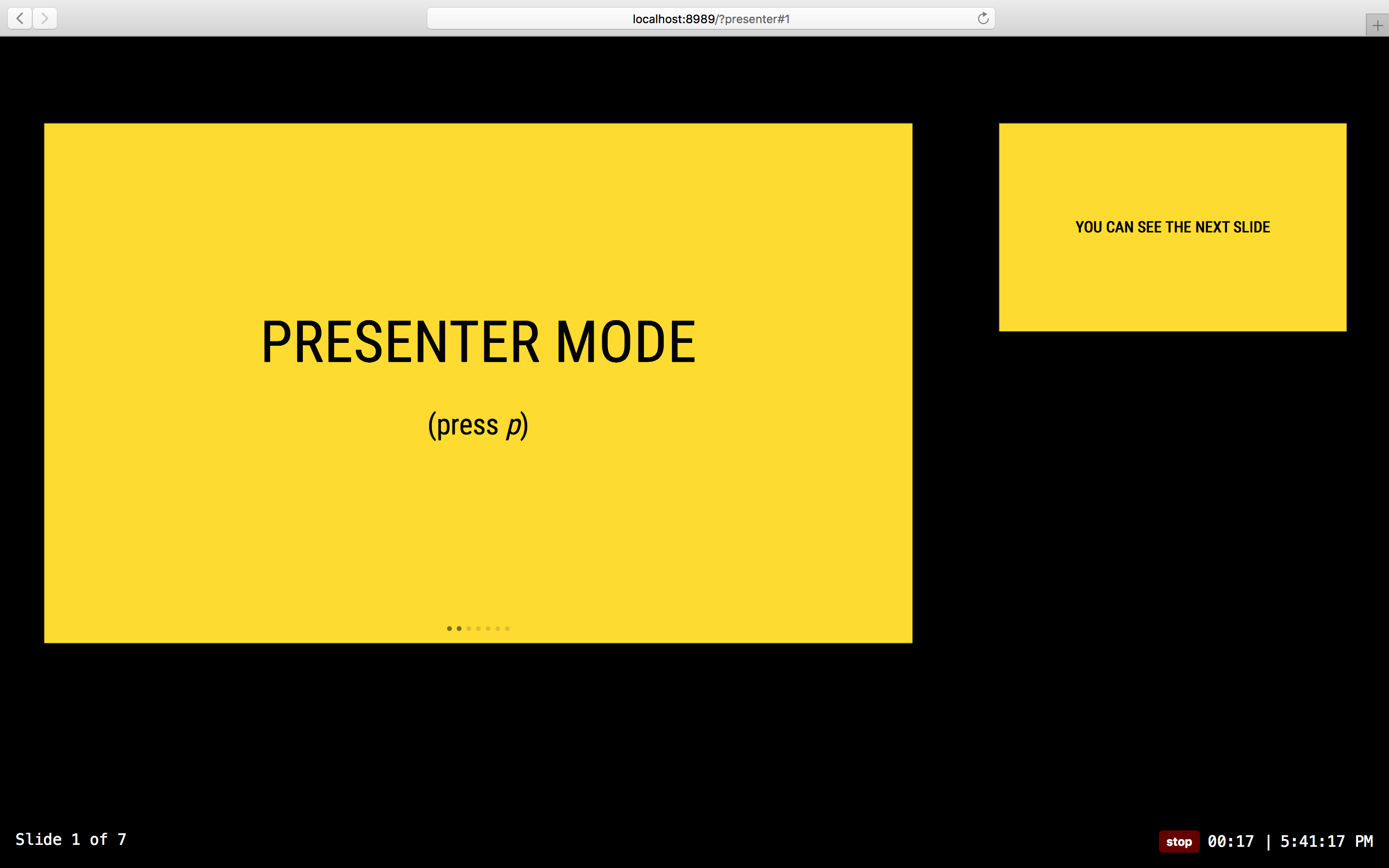
mdx-deck includes a built-in presenter mode, with a preview of the next slide and a timer.
To use presenter mode:
- Open two windows in the same browser, with the same URL on two different screens. (this should work in both development and exported presentations)
- In your window press the
Option + P(Alt + P) key to enter presenter mode. - Display the other window on the screen for the audience to see.
- Control the presentation from your window by using the left and right arrow keys; the other window should stay in sync
Speaker Notes
Notes that only show in presenter mode can be added to any slide. Speaker notes can be added in one of the following two ways:
Markdown: Use the notes language attribute in a fenced code block to add speaker notes.
# Slide Content

```notes
These are only visible in presenter mode
```
Notes Component: Use the Notes component to create more complex speaker notes.
import { Notes } from 'mdx-deck'

# Slide Content

<Notes>
  Only visible in presenter mode
</Notes>
Overview Mode
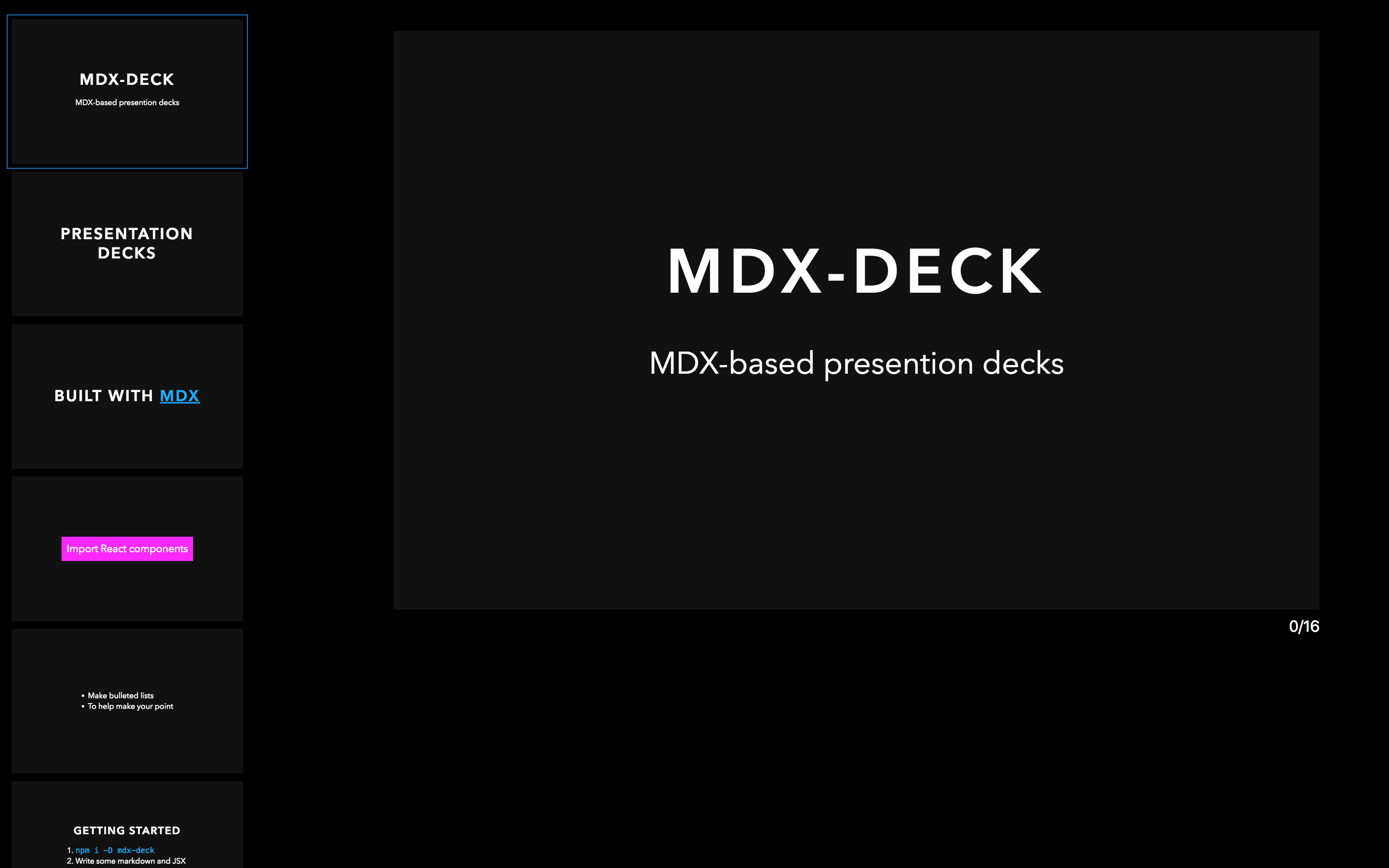
When editing a slide deck, toggle overview mode with Option + O.
This shows a list of all slides on the left and a preview of the current slide on the right.
Keyboard Shortcuts
| Key | Description |
|---|---|
| Left Arrow | Go to previous slide (or step in Appear) |
| Right Arrow | Go to next slide (or step in Appear) |
| Space | Go to next slide (or step in Appear) |
| Up Arrow | Hide current step in Appear component without navigating slides |
| Down Arrow | Show next step in Appear component without navigating slides |
| Option + P | Toggle Presenter Mode |
| Option + O | Toggle Overview Mode |
| Option + G | Toggle grid view mode |
Exporting
Add a build script to your package.json to export a presentation as HTML with a JS bundle.
"scripts": {
  "build": "mdx-deck build deck.mdx"
}
See more exporting options in the Exporting Documentation
CLI Options
-p --port     Dev server port
--no-open     Prevent from opening in default browser
-d --out-dir  Output directory for exporting
--no-html     Disable static HTML rendering
--out-file    Filename for screenshot or PDF export
--width       Width in pixels
--height      Height in pixels
--webpack     Path to webpack config file
Docs
Examples
- Design Systems & React by Diana Mount
- Bringing Brazil to the Cloud, Now by Guillermo Rauch
- Simplify React by Kent C. Dodds
- I Got 99 Problems but GraphQL Ain't One by Sara Vieira
- Stop de #divFest by Sara Vieira


