| docs | ||
| lib | ||
| src | ||
| .babelrc | ||
| .gitignore | ||
| .npmignore | ||
| .travis.yml | ||
| cli.js | ||
| LICENSE.md | ||
| loader.js | ||
| package.json | ||
| README.md | ||
| themes.js | ||
mdx-deck
MDX-based presention decks (Beta)
npm i -D mdx-deck
- 📝 Write presentations in markdown
- ⚛️ Import and use React components
- 💅 Customizable themes and components
- 0️⃣ Zero-config CLI
Getting Started
Create an MDX file and separate each slide with ---.
# This is the title of my deck
---
# About Me
---
```jsx
<CodeSnippet />
```
---
import Demo from './components/Demo'

<Demo />
---
# The end
Add a run script to your package.json with the mdx-deck CLI
pointing to the .mdx file to start the dev server:
"scripts": {
  "start": "mdx-deck deck.mdx"
}
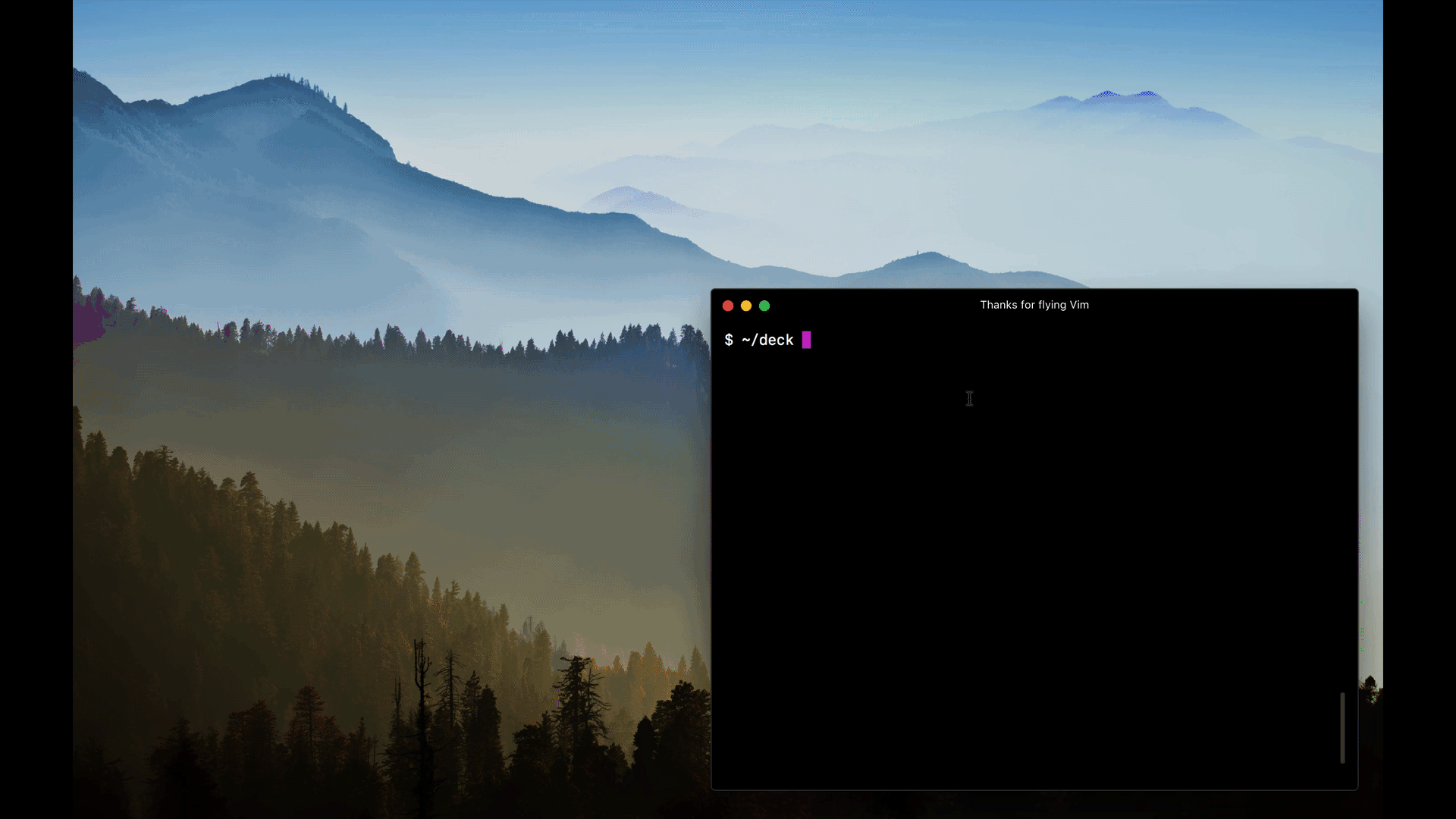
Start the dev server:
npm start
Usage
MDX can use Markdown syntax and render React components with JSX.
Imports
To import components, use ES import syntax separated with empty lines from any markdown or JSX syntax.
import { Box } from 'grid-styled'

<Box color='tomato'>
  Hello
</Box>
Theming
mdx-deck uses styled-components for styling.
Built-in Themes
mdx-deck includes several built-in themes to change the look and feel of the presentation.
export { dark as theme } from 'ok-cli/themes'

# Dark Theme
The following themes are available:
theme: default theme with white backgrounddark: black background dark themefuture: dark theme with Avenir Nextcondensed: dark theme with Roboto Condensed
Custom Themes
A custom theme can be provided by exporting theme from the MDX file.
export { default as theme } from './theme'

# Hello
The theme should be an object based on styled-system's theme schema.
// example theme.js
export default {
  font: 'Georgia',
  monospace: 'Menlo, monospace',
  fontSizes: [
    16, 24, 32, 48, 64, 96, 128
  ],
  colors: {
    text: '#000',
    background: 'transparent',
    link: '#07c',
    heading: '#000',
    quote: '#000',
    pre: '#f0f',
    preBackground: '#333',
    code: '#f0f',
    codeBackground: 'transparent',
  },
  css: {
    // apply any styles to the root element
  },
  // custom CSS can be provided to any of the default components:
  heading: {
    fontWeight: 400
  },
  link: {
    textDecoration: 'none',
    '&:hover': {
      textDecoration: 'underline',
    }
  }
}
Custom Components
mdx-deck includes default components for MDX, but to provide custom components to the MDXProvider, export a components object.
export { default as components } from './components'

# Custom Components
Layouts
Each slide can include a custom layout around its content.
import Layout from './Layout'

# No Layout

---
export default Layout

# Custom Layout
Custom Provider
A custom Provider component can be exported to wrap the entire application. This is useful for adding custom context providers, such as a ThemeProvider.
export { default as Provider } from './Provider'

# Hello
Exporting
Run the build command to export a presentation as HTML with a JS bundle.
mdx-deck build deck.mdx
React API
mdx-deck components can also be used in any React application, such as create-react-app or next.js.
Webpack Loader
mdx-deck uses a custom webpack loader to split MDX files into an array of slides. Use this loader to import mdx files in a webpack application.
// example webpack.config.js
module.exports = {
  module: {
    rules: [
      {
        test: /\.mdx$/,
        ignore: /node_modules/,
        use: [
          'babel-loader',
          'mdx-deck/loader'
        ]
      }
    ]
  }
}
SlideDeck Component
import React from 'react'
import { SlideDeck } from 'mdx-deck'
import slides from './deck.mdx'
import theme from './theme'
import components from './components'

export default () =>
  <SlideDeck
    slides={slides}
    theme={theme}
    components={components}
    width='100vw'
    height='100vh'
  />
View the source for other components available for use.