mirror of
https://github.com/material-components/material-web.git
synced 2024-10-27 22:17:25 +03:00
| .. | ||
| images | ||
| test | ||
| _index.scss | ||
| _linear-progress-theme.scss | ||
| _linear-progress.scss | ||
| .npmignore | ||
| mwc-linear-progress-base.ts | ||
| mwc-linear-progress.scss | ||
| mwc-linear-progress.ts | ||
| package.json | ||
| README.md | ||
| tsconfig.json | ||
<mwc-linear-progress> 
IMPORTANT: The Material Web Components are a work in progress and subject to major changes until 1.0 release.
Progress indicators express an unspecified wait time or display the length of a process.

Material Design Guidelines: Progress Indicators
Example usage
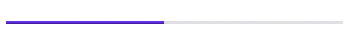
Determinate

<script type="module">
  import '@material/mwc-linear-progress';
</script>
<mwc-linear-progress progress="0.5"></mwc-linear-progress>
Indeterminate
<mwc-linear-progress indeterminate></mwc-linear-progress>
Determinate buffer

<mwc-linear-progress progress="0.25" buffer="0.5"></mwc-linear-progress>
Reversed

<mwc-linear-progress
    reverse
    progress="0.25"
    buffer="0.5">
</mwc-linear-progress>
Styled

<style>
  mwc-linear-progress {
    --mdc-theme-primary: red;
    --mdc-linear-progress-buffer-color: orange;
    /* Note: all that was changed from default was "fill='orange'" */
    --mdc-linear-progress-buffering-dots-image:
        url("data:image/svg+xml,%3Csvg version='1.1' xmlns='http://www.w3.org/2000/svg' xmlns:xlink='http://www.w3.org/1999/xlink' x='0px' y='0px' enable-background='new 0 0 5 2' xml:space='preserve' viewBox='0 0 5 2' preserveAspectRatio='none slice'%3E%3Ccircle cx='1' cy='1' r='1' fill='orange'/%3E%3C/svg%3E");
  }
</style>
<mwc-linear-progress progress="0.25" buffer="0.5"></mwc-linear-progress>
API
Slots
None
Properties/Attributes
| Name | Type | Default | Description |
|---|---|---|---|
indeterminate |
boolean |
false |
Sets the linear-progress into its indeterminate state. |
progress |
number |
0 |
Sets the primary progress bar's value. Value should be between [0, 1]. |
buffer |
number |
1 |
Sets the buffer progress bar's value. Value should be between [0, 1]. Setting this value to be less than 1 will reveal moving, buffering dots. |
reverse |
boolean |
false |
Reverses the direction of the linear progress indicator. |
closed |
boolean |
false |
Sets the progress indicator to the closed state. Sets content opactiy to 0. Typically should be set to true when loading has finished. |
Methods
| Name | Description |
|---|---|
open() => void |
Sets LinearProgress.closed to false; |
close() => void |
Sets LinearProgress.closed to true; |
Events
None
CSS Custom Properties
| Name | Default | Description |
|---|---|---|
--mdc-linear-progress-buffer-color |
 #E6E6E6 |
Sets the color of the buffer progress bar. NOTE: to change the color of the buffering dots, you must do so in the image of --mdc-linear-progress-buffering-dots-image. |
--mdc-linear-progress-buffering-dots-image |
url("<svg data url>") (see below for value) |
Sets the image to use as the buffering dots. This pattern is then repeated horizontally and animated. |
Default value for --mdc-linear-progress-buffering-dots-image:
data:image/svg+xml,%3Csvg version='1.1' xmlns='http://www.w3.org/2000/svg' xmlns:xlink='http://www.w3.org/1999/xlink' x='0px' y='0px' enable-background='new 0 0 5 2' xml:space='preserve' viewBox='0 0 5 2' preserveAspectRatio='none slice'%3E%3Ccircle cx='1' cy='1' r='1' fill='%23e6e6e6'/%3E%3C/svg%3E
If you paste that data url into your browser you can see and inspect the SVG.
You may also notice that it is simply a colored circle with some transparent
space to its right. If you would like to change the color of the circle, you can
simply change the fill="%23e6e6e6" to any valid color property (n.b. %23 is
the url-encoded equivalent of #).
Global Custom Properties
This component exposes the following global theming custom properties.
| Name | Description |
|---|---|
--mdc-theme-primary |
Sets the color of primary progress bar. |