mirror of
https://github.com/material-components/material-web.git
synced 2024-10-27 14:07:17 +03:00
| .. | ||
| images | ||
| src | ||
| .npmignore | ||
| package.json | ||
| README.md | ||
| tsconfig.json | ||
<mwc-textarea> 
IMPORTANT: The Material Web Components are a work in progress and subject to major changes until 1.0 release.
Textareas let users enter and edit text.
Material Design Guidelines: textareas
Installation
npm install @material/mwc-textarea
NOTE: The Material Web Components are distributed as ES2017 JavaScript Modules, and use the Custom Elements API. They are compatible with all modern browsers including Chrome, Firefox, Safari, Edge, and IE11, but an additional tooling step is required to resolve bare module specifiers, as well as transpilation and polyfills for Edge and IE11. See here for detailed instructions.
Example usage
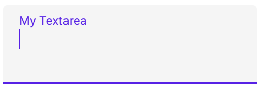
Standard
<mwc-textarea label="My Textarea"></mwc-textarea>

<script type="module">
  import '@material/mwc-textarea';
</script>
Helper Text

<mwc-textarea label="My Textarea" helper="Helper Text"></mwc-textarea>

<script type="module">
  import '@material/mwc-textarea';
</script>
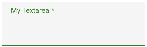
Primary Color
<style>
  mwc-textarea {
    --mdc-theme-primary: green;
  }
</style>

<mwc-textarea
    label="My Textarea"
    required>
</mwc-textarea>

<script type="module">
  import '@material/mwc-textarea';
</script>
Variants
Outlined
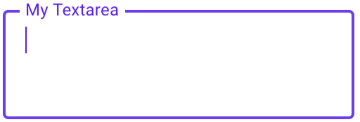
<mwc-textarea
    outlined
    label="My Textarea">
</mwc-textarea>

<script type="module">
  import '@material/mwc-textarea';
</script>
Shaping Outlined


<style>
  mwc-textarea.left {
    --mdc-notched-outline-leading-width: 28px;
    --mdc-notched-outline-leading-border-radius: 28px 0 0 28px;
  }

  mwc-textarea.right {
    --mdc-notched-outline-trailing-border-radius: 0 28px 28px 0;
  }
</style>

<mwc-textarea
    class="left";
    label="My Textarea"
    outlined>
</mwc-textarea>

<mwc-textarea
    class="right";
    label="My Textarea"
    outlined>
</mwc-textarea>

<mwc-textarea
    class="left right";
    label="My Textarea"
    outlined>
</mwc-textarea>

<script type="module">
  import '@material/mwc-textarea';
</script>
Fullwidth

<!-- Note: Fullwidth does not support label; only placeholder -->
<mwc-textarea outlined fullwidth placeholder="My Textarea"></mwc-textarea>

<script type="module">
  import '@material/mwc-textarea';
</script>
API
Properties/Attributes
| Name | Type | Description |
|---|---|---|
rows |
number |
Sets number of visible text lines. |
cols |
number |
Sets the visible width of the textarea. |
value |
string |
The input control's value. |
type |
TypeKeyword* |
A string specifying the type of control to render. |
label |
string |
Sets floating label value. |
placeholder |
string |
Sets disappearing input placeholder. |
icon |
string |
Leading icon to display in input. See mwc-icon. |
iconTrailing |
string |
Trailing icon to display in input. See mwc-icon. |
disabled |
boolean |
Whether or not the input should be disabled. |
required |
boolean |
Displays error state if value is empty and input is blurred. |
maxlength |
number |
Maximum length to accept input. |
charCounter |
boolean |
Note: requries maxlength to be set. Display character counter with max length. |
outlined |
boolean |
Whether or not to show the material outlined variant. |
fullwidth |
boolean |
Whether or not to make the input fullwidth. No longer displays label; only placeholder and helper. |
helper |
string |
Helper text to display below the input. Display default only when focused. |
helperPersistent |
boolean |
Always show the helper text despite focus. |
* TypeKeyword is exported by mwc-textarea and mwc-textarea-base.
type TypeKeyword =
    'hidden'|'text'|'search'|'tel'|'url'|'email'|'password'|'datetime'|'date'|
    'month'|'week'|'time'|'datetime-local'|'number'|'range'|'color'|'checkbox'|
    'radio'|'file'|'submit'|'image'|'reset'|'button';
CSS Custom Properties
Inherits CSS Custom properties from:
| Name | Default | Description |
|---|---|---|
--mdc-theme-primary |
#6200ee |
Color when active of the underline ripple, the outline, and the caret. |
--mdc-theme-error |
#b00020 |
Color when errored of the underline, the outline, the caret, and the icons. |
--mdc-text-area-filled-border-radius |
4px 4px 0 0 |
Border radius of the standard / filled textarea's background filling. |
--mdc-text-area-outlined-idle-border-color |
rgba(0, 0, 0, 0.38) |
Color of the outlined textarea's outline when idle. |
--mdc-text-area-outlined-hover-border-color |
rgba(0, 0, 0, 0.87) |
Color of the outlined textarea's outline when hovering. |
--mdc-text-area-outlined-disabled-border-color |
rgba(0, 0, 0, 0.06) |
Color of the outlined textarea's outline when disabled. |