| .github | ||
| docs | ||
| misc | ||
| src | ||
| .gitattributes | ||
| .gitignore | ||
| CODE_OF_CONDUCT.md | ||
| CONTRIBUTING.md | ||
| init.sh | ||
| LICENSE.txt | ||
| Makefile | ||
| Makefile_v1.make | ||
| README.md | ||
| requirements.txt | ||
| version.txt | ||
Inter
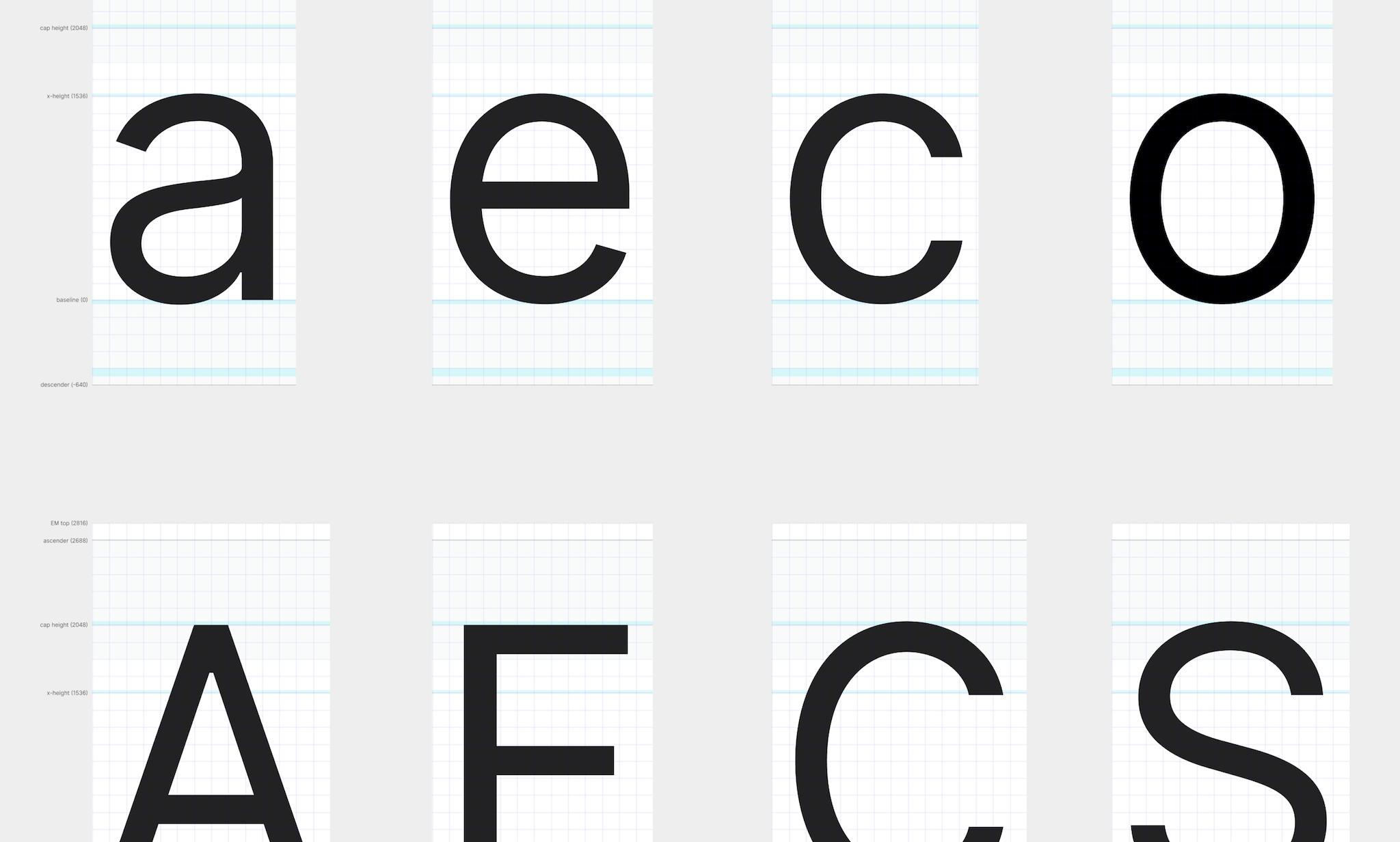
Inter is a typeface carefully crafted & designed for computer screens. Inter features a tall x-height to aid in readability of mixed-case and lower-case text. Inter is a variable font with several OpenType features, like contextual alternates that adjusts punctuation depending on the shape of surrounding glyphs, slashed zero for when you need to disambiguate "0" from "o", tabular numbers, etc.
Quick questions
- Where can I get Inter? Here
- I think I found a bug. How can I let you know? Open an issue here
- I have a question. Where can I get help? Post in Discussions Q&A
- Should I use Inter from Google Fonts? No, unless you have no other choice. (outdated, no italics)
- Can I legally use Inter for my purpose? Most likely yes! Inter is free and open source. (Read the license for details.)
Using & installing Inter
- Download the latest font files…
- To use Inter on a web page, use the official CDN distribution:
@import url('https://rsms.me/inter/inter.css');
html { font-family: 'Inter', sans-serif; }
@supports (font-variation-settings: normal) {
  html { font-family: 'Inter var', sans-serif; }
}
Alternate distributions
- NPM
inter-ui - Homebrew
font-inter - Ubuntu
fonts-inter - List of Inter available on various Linux distributions…
- Google Fonts (outdated version, no italics)
Disclaimer: Alternate distributions may not always be up-to-date.
Derivative versions
Notable projects using Inter
- Figma
- Unity
- ElementaryOS
- Zurich Airport
- Element software suite
- Mozilla brand
- GitHub brand and documentation
- Pixar Presto
- Minimalissimo magazine
Have you made something nice with Inter?
Please share in Show & Tell! →
Supporters & contributors
A wholehearted Thank You to everyone who supports the Inter project!
Special thanks to @thundernixon and @KatjaSchimmel who have put in significant effort into making Inter what it is through their contributions ♡
See graphs/contributors for a complete list of all contributors.
Contributing to this project
For instructions on how to work with the source files and how to compile & build font files, refer to CONTRIBUTING.md.
Inter is licensed under the SIL Open Font License
Design
This section discusses some of the design choices made for Inter.
Inter can be classified as a geometric neo-grotesque, similar in style to Roboto, Apple San Francisco, Akkurat, Asap, Lucida Grande and more. Some trade-offs were made in order to make this typeface work really well at small sizes:
-
Early versions of Inter were not suitable for very large sizes because of some small-scale glyph optimizations (like "pits" and "traps") that help rasterization at small sizes but stand out and interfere at large sizes. However today Inter works well at large sizes and a Display subfamily is in the works for really large "display" sizes.
-
Rasterized at sizes below 12px, some stems—like the horizontal center of "E", "F", or vertical center of "m"—are drawn with two semi-opaque pixels instead of one solid. This is because we "prioritize" (optimize for) higher-density rasterizations. If we move these stems to an off-center position—so that they can be drawn sharply at e.g. 11px—text will be less legible at higher resolutions.
Inter is a variable font and is in addition also distributed as a set of traditional distinct font files in the following styles:
| Roman (upright) name | Italic name | Weight |
|---|---|---|
| Thin | Thin Italic | 100 |
| Extra Light | Extra Light Italic | 200 |
| Light | Light Italic | 300 |
| Regular | Italic | 400 |
| Medium | Medium Italic | 500 |
| Semi Bold | Semi Bold Italic | 600 |
| Bold | Bold Italic | 700 |
| Extra Bold | Extra Bold Italic | 800 |
| Black | Black Italic | 900 |
Font metrics
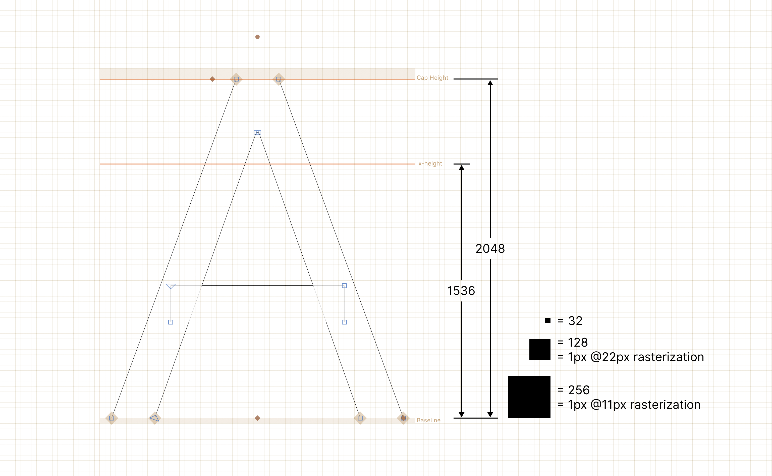
This font was originally designed to work at a specific size: 11px. Thus, the Units per EM (UPM) is defined in such a way that a power-of-two multiple of one EM unit ends up at an integer value compared to a pixel. Most fonts are designed with a UPM of either 1000 or 2048. Because of this we picked a value that is as high as possible but also as close as possible to one of those common values (since it's reasonable to assume that some layout engines and rasterizers are optimized for those value magnitudes.) We ended up picking a UPM of 2816 which equates to exactly 256 units per pixel when rasterized for size 11pt at 1x scale. This also means that when rasterized at power-of-two scales (like 2x and 4x) the number of EM units corresponding to a pixel is an integer (128 units for 2x, 64 for 4x, and so on.)
However, as the project progressed and the typeface was put into use, it quickly became clear that for anything longer than a short word, it was actually hard to read the almost monotonically-spaced letters.
A second major revision was created where the previously-strict rule of geometry being even multiples of 256 was relaxed and now the rule is "try to stick with 128x, if you can't, stick with 64x and if you can't do that either, never go below 16x." This means that Inter is now much more variable in pace than it used to be, making it work better at higher resolutions and work much better in longer text, but losing some contrast and sharpness at small sizes.
The glyphs are designed based on this "plan"; most stems and lines will be positioned at EM units that are even multiples of 128, and in a few cases they are at even multiples of 64 or as low as 16.
A UPM of 2816 is great for Inter since that means that its cap height is exactly 2048 units (64× 32-unit squares) and its x-height is 1536 (48× 32-unit squares) which both makes the design easier (can deal with only integers, never any fractions, plus use a perfect grid) and it makes the target "small size" of 11dp a pixel-perfect match — at 11px rasterization 1 pixel is exactly 256 units in the design! At 11dp with a 2x scaling factor 1 pixel is 128 units, 64 units at a 3x scaling factor and so on. This makes it feasible to really tune Inter for detailed rasterization.
Metrics:
- UPM: 2816
- Ascender: 2728
- Cap height: 2048
- x-height: 1536
- Descender: -680
Translating between EM units and pixels:
- Rasterized at 11px: 1px = 256 units
- Rasterized at 22px: 1px = 128 units
- Rasterized at 44px: 1px = 64 units


