| src | ||
| .gitignore | ||
| index.html | ||
| LICENSE | ||
| package.json | ||
| README.md | ||
| rollup.config.js | ||
| sample.jpg | ||
| yarn.lock | ||
blocks.css ☕️
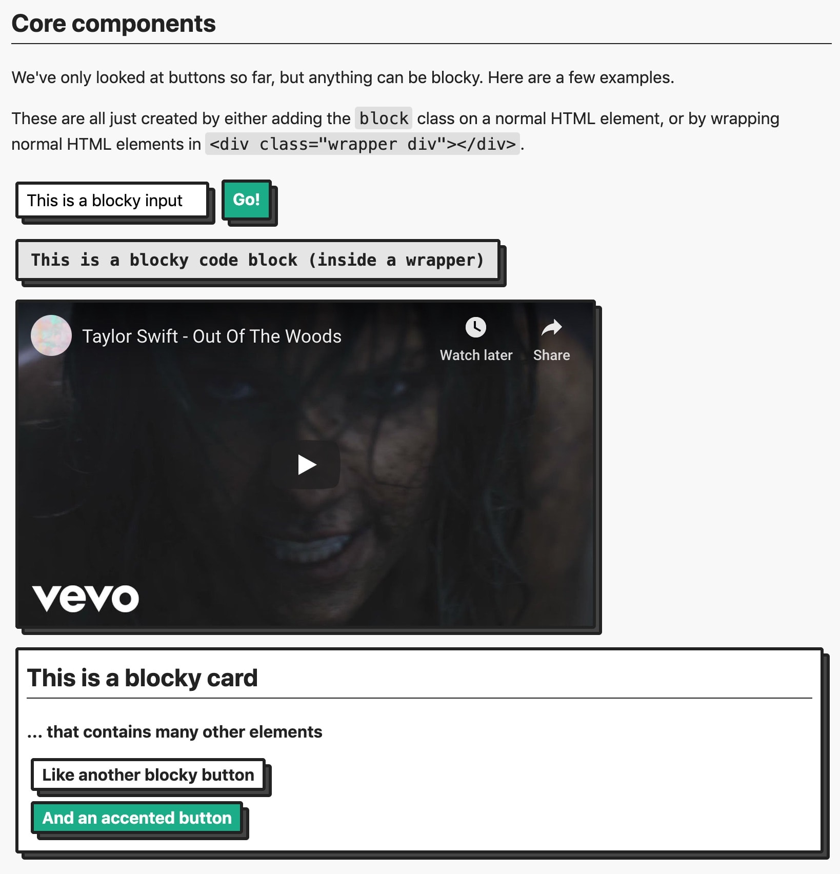
Add some dimension to your page with blocks 🚀
You can check out examples and get started with blocks.css at the GitHub Page 📖. Here's what blocks.css UI looks like, from the documentation.
Start by adding the blocks.css stylesheet to your page's <head>:
<link rel="stylesheet" href="https://unpkg.com/blocks.css/dist/blocks.min.css" />
Summary
blocks.css is the core of styles used in my projects like Codeframe, Zero to Code, and Lyrics.rip. Lots of people asked for the styles, so I've pulled the button styles out into a separate package right here.
Theming
blocks.css supports theming. By default, Blocks are turquoise-green. (Why? because it's my favorite color.) But you can use CSS custom properties to modify the color and add things like a dark theme.
Check out the documentation for the full details.
Built with blocks.css
Using blocks.css in your website or app? Make a pull request to add yours to the list!