2 ( Element, none, text, el
3 , row, wrappedRow, column
4 , paragraph, textColumn
5 , Column, table, IndexedColumn, indexedTable
6 , Attribute, width, height, Length, px, shrink, fill, fillPortion, maximum, minimum
8 , padding, paddingXY, paddingEach
9 , spacing, spacingXY, spaceEvenly
10 , centerX, centerY, alignLeft, alignRight, alignTop, alignBottom
11 , transparent, alpha, pointer
12 , moveUp, moveDown, moveRight, moveLeft, rotate, scale
14 , scrollbars, scrollbarX, scrollbarY
15 , layout, layoutWith, Option, noStaticStyleSheet, forceHover, noHover, focusStyle, FocusStyle
16 , link, newTabLink, download, downloadAs
18 , Color, rgba, rgb, rgb255, rgba255, fromRgb, fromRgb255, toRgb
19 , above, below, onRight, onLeft, inFront, behindContent
20 , Attr, Decoration, mouseOver, mouseDown, focused
21 , Device, DeviceClass(..), Orientation(..), classifyDevice
32@docs Element, none, text, el
37When we want more than one child on an element, we want to be _specific_ about how they will be laid out.
39So, the common ways to do that would be `row` and `column`.
41@docs row, wrappedRow, column
46Text layout needs some specific considerations.
48@docs paragraph, textColumn
53@docs Column, table, IndexedColumn, indexedTable
58@docs Attribute, width, height, Length, px, shrink, fill, fillPortion, maximum, minimum
68There's no concept of margin in `elm-ui`, instead we have padding and spacing.
70Padding is the distance between the outer edge and the content, and spacing is the space between children.
72So, if we have the following row, with some padding and spacing.
74 Element.row [ padding 10, spacing 7 ]
80Here's what we can expect:
82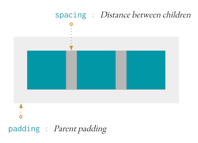
84**Note** `spacing` set on a `paragraph`, will set the pixel spacing between lines.
86@docs padding, paddingXY, paddingEach
88@docs spacing, spacingXY, spaceEvenly
93Alignment can be used to align an `Element` within another `Element`.
95 Element.el [ centerX, alignTop ] (text "I'm centered and aligned top!")
97If alignment is set on elements in a layout such as `row`, then the element will push the other elements in that direction. Here's an example.
100 [ Element.el [] Element.none
101 , Element.el [ alignLeft ] Element.none
102 , Element.el [ centerX ] Element.none
103 , Element.el [ alignRight ] Element.none
106will result in a layout like
110Where there are two elements on the left, one on the right, and one in the center of the space between the elements on the left and right.
112**Note** For text alignment, check out `Element.Font`!
114@docs centerX, centerY, alignLeft, alignRight, alignTop, alignBottom
119@docs transparent, alpha, pointer
124@docs moveUp, moveDown, moveRight, moveLeft, rotate, scale
127# Clipping and Scrollbars
129Clip the content if it overflows.
131@docs clip, clipX, clipY
133Add a scrollbar if the content is larger than the element.
135@docs scrollbars, scrollbarX, scrollbarY
140@docs layout, layoutWith, Option, noStaticStyleSheet, forceHover, noHover, focusStyle, FocusStyle
145@docs link, newTabLink, download, downloadAs
155In order to use attributes like `Font.color` and `Background.color`, you'll need to make some colors!
157@docs Color, rgba, rgb, rgb255, rgba255, fromRgb, fromRgb255, toRgb
162Let's say we want a dropdown menu. Essentially we want to say: _put this element below this other element, but don't affect the layout when you do_.
166 [ Element.below (Element.text "I'm below!")
168 (Element.text "I'm normal!")
176Where `"I'm Below"` doesn't change the size of `Element.row`.
178This is very useful for things like dropdown menus or tooltips.
180@docs above, below, onRight, onLeft, inFront, behindContent
185@docs Attr, Decoration, mouseOver, mouseDown, focused
190The main technique for responsiveness is to store window size information in your model.
192Install the `Browser` package, and set up a subscription for [`Browser.Events.onResize`](https://package.elm-lang.org/packages/elm/browser/latest/Browser-Events#onResize).
194You'll also need to retrieve the initial window size. You can either use [`Browser.Dom.getViewport`](https://package.elm-lang.org/packages/elm/browser/latest/Browser-Dom#getViewport) or pass in `window.innerWidth` and `window.innerHeight` as flags to your program, which is the preferred way. This requires minor setup on the JS side, but allows you to avoid the state where you don't have window info.
196@docs Device, DeviceClass, Orientation, classifyDevice
206@docs map, mapAttribute
211@docs html, htmlAttribute
215import Html exposing (Html)
216import Html.Attributes
217import Internal.Flag as Flag exposing (Flag)
218import Internal.Model as Internal
219import Internal.Style exposing (classes)
227{-| Provide the red, green, and blue channels for the color.
229Each channel takes a value between 0 and 1.
232rgb : Float -> Float -> Float -> Color
234 Internal.Rgba r g b 1
238rgba : Float -> Float -> Float -> Float -> Color
243{-| Provide the red, green, and blue channels for the color.
245Each channel takes a value between 0 and 255.
248rgb255 : Int -> Int -> Int -> Color
249rgb255 red green blue =
252 (toFloat green / 255)
258rgba255 : Int -> Int -> Int -> Float -> Color
259rgba255 red green blue a =
262 (toFloat green / 255)
267{-| Create a color from an RGB record.
294 (toFloat clr.red / 255)
295 (toFloat clr.green / 255)
296 (toFloat clr.blue / 255)
300{-| Deconstruct a `Color` into its rgb channels.
310toRgb (Internal.Rgba r g b a) =
318{-| The basic building block of your layout.
322 Element.el [] (Element.text "Howdy!")
325type alias Element msg =
329{-| An attribute that can be attached to an `Element`
331type alias Attribute msg =
332 Internal.Attribute () msg
335{-| This is a special attribute that counts as both a `Attribute msg` and a `Decoration`.
337type alias Attr decorative msg =
338 Internal.Attribute decorative msg
343type alias Decoration =
344 Internal.Attribute Never Never
348html : Html msg -> Element msg
354htmlAttribute : Html.Attribute msg -> Attribute msg
360map : (msg -> msg1) -> Element msg -> Element msg1
366mapAttribute : (msg -> msg1) -> Attribute msg -> Attribute msg1
382{-| Shrink an element to fit its contents.
389{-| Fill the available space. The available space will be split evenly between elements that have `width fill`.
396{-| Similarly you can set a minimum boundary.
406 (text "I will stop at 300px")
409minimum : Int -> Length -> Length
414{-| Add a maximum to a length.
422 (text "I will stop at 300px")
425maximum : Int -> Length -> Length
430{-| Sometimes you may not want to split available space evenly. In this case you can use `fillPortion` to define which elements should have what portion of the available space.
432So, two elements, one with `width (fillPortion 2)` and one with `width (fillPortion 3)`. The first would get 2 portions of the available space, while the second would get 3.
434**Also:** `fill == fillPortion 1`
437fillPortion : Int -> Length
442{-| This is your top level node where you can turn `Element` into `Html`.
444layout : List (Attribute msg) -> Element msg -> Html msg
446 layoutWith { options = [] }
450layoutWith : { options : List Option } -> List (Attribute msg) -> Element msg -> Html msg
451layoutWith { options } attrs child =
452 Internal.renderRoot options
460 :: (Internal.rootStyle ++ attrs)
470{-| Elm UI embeds two StyleSheets, one that is constant, and one that changes dynamically based on styles collected from the elements being rendered.
472This option will stop the static/constant stylesheet from rendering.
474If you're embedding multiple elm-ui `layout` elements, you need to guarantee that only one is rendering the static style sheet and that it's above all the others in the DOM tree.
477noStaticStyleSheet : Option
479 Internal.RenderModeOption Internal.NoStaticStyleSheet
484 { borderColor : Maybe Color
485 , backgroundColor : Maybe Color
489 , offset : ( Int, Int )
495 Internal.focusDefaultStyle
499type alias FocusStyle =
500 { borderColor : Maybe Color
501 , backgroundColor : Maybe Color
505 , offset : ( Int, Int )
513focusStyle : FocusStyle -> Option
515 Internal.FocusStyleOption
518{-| Disable all `mouseOver` styles.
522 Internal.HoverOption Internal.NoHover
525{-| Any `hover` styles, aka attributes with `mouseOver` in the name, will be always turned on.
527This is useful for when you're targeting a platform that has no mouse, such as mobile.
532 Internal.HoverOption Internal.ForceHover
535{-| When you want to render exactly nothing.
542{-| Create some plain text.
544 text "Hello, you stylish developer!"
546**Note** text does not wrap by default. In order to get text to wrap, check out `paragraph`!
549text : String -> Element msg
551 Internal.Text content
554{-| The basic building block of your layout.
556You can think of an `el` as a `div`, but it can only have one child.
558If you want multiple children, you'll need to use something like `row` or `column`
560 import Element exposing (Element, rgb)
561 import Element.Background as Background
562 import Element.Border as Border
564 myElement : Element msg
567 [ Background.color (rgb 0 0.5 0)
568 , Border.color (rgb 0 0.7 0)
570 (Element.text "You've made a stylish element!")
573el : List (Attribute msg) -> Element msg -> Element msg
582 (Internal.Unkeyed [ child ])
586row : List (Attribute msg) -> List (Element msg) -> Element msg
591 (Internal.htmlClass (classes.contentLeft ++ " " ++ classes.contentCenterY)
596 (Internal.Unkeyed children)
600column : List (Attribute msg) -> List (Element msg) -> Element msg
601column attrs children =
608 ++ classes.contentLeft
614 (Internal.Unkeyed children)
617{-| Same as `row`, but will wrap if it takes up too much horizontal space.
619wrappedRow : List (Attribute msg) -> List (Element msg) -> Element msg
620wrappedRow attrs children =
623 Internal.extractSpacingAndPadding attrs
633 ++ classes.contentCenterY
641 (Internal.Unkeyed children)
643 Just (Internal.Spaced spaceName x y) ->
647 Just (Internal.Padding name t r b l) ->
648 if r >= (toFloat x / 2) && b >= (toFloat y / 2) then
663 Internal.StyleClass Flag.padding
664 (Internal.PaddingStyle
665 (Internal.paddingNameFloat
691 ++ classes.contentCenterY
700 (Internal.Unkeyed children)
703 -- Not enough space in padding to compensate for spacing
706 negate (toFloat x / 2)
709 negate (toFloat y / 2)
722 ++ classes.contentCenterY
727 (Html.Attributes.style "margin"
728 (String.fromFloat halfY
731 ++ String.fromFloat halfX
736 (Html.Attributes.style "width"
743 (Html.Attributes.style "height"
749 :: Internal.StyleClass Flag.spacing (Internal.SpacingStyle spaceName x y)
752 (Internal.Unkeyed children)
757{-| This is just an alias for `Debug.todo`
763{-| Highlight the borders of an element and it's children below. This can really help if you're running into some issue with your layout!
765**Note** This attribute needs to be handed `Debug.todo` in order to work, even though it won't do anything with it. This is a safety measure so you don't accidently ship code with `explain` in it, as Elm won't compile with `--optimize` if you still have a `Debug` statement in your code.
768 [ Element.explain Debug.todo
770 (text "Help, I'm being debugged!")
773explain : Todo -> Attribute msg
775 Internal.htmlClass "explain"
779type alias Column record msg =
780 { header : Element msg
782 , view : record -> Element msg
786{-| Show some tabular data.
788Start with a list of records and specify how each column should be rendered.
790So, if we have a list of `persons`:
797 persons : List Person
799 [ { firstName = "David"
802 , { firstName = "Florence"
807We could render it using
812 [ { header = Element.text "First Name"
816 Element.text person.firstName
818 , { header = Element.text "Last Name"
822 Element.text person.lastName
827**Note:** Sometimes you might not have a list of records directly in your model. In this case it can be really nice to write a function that transforms some part of your model into a list of records before feeding it into `Element.table`.
833 { data : List records
834 , columns : List (Column records msg)
841 List.map InternalColumn config.columns
846type alias IndexedColumn record msg =
847 { header : Element msg
849 , view : Int -> record -> Element msg
853{-| Same as `Element.table` except the `view` for each column will also receive the row index as well as the record.
858 { data : List records
859 , columns : List (IndexedColumn records msg)
862indexedTable attrs config =
866 List.map InternalIndexedColumn config.columns
871type alias InternalTable records msg =
872 { data : List records
873 , columns : List (InternalTableColumn records msg)
878type InternalTableColumn record msg
879 = InternalIndexedColumn (IndexedColumn record msg)
880 | InternalColumn (Column record msg)
883tableHelper : List (Attribute msg) -> InternalTable data msg -> Element msg
884tableHelper attrs config =
887 Internal.getSpacing attrs ( 0, 0 )
891 InternalIndexedColumn colConfig ->
894 InternalColumn colConfig ->
899 InternalIndexedColumn colConfig ->
902 InternalColumn colConfig ->
906 List.map columnHeader config.columns
908 if List.all ((==) Internal.Empty) headers then
912 Just (List.indexedMap (\col header -> onGrid 1 (col + 1) header) headers)
916 Internal.StyleClass Flag.gridTemplate <|
917 Internal.GridTemplateStyle
918 { spacing = ( px sX, px sY )
919 , columns = List.map columnWidth config.columns
920 , rows = List.repeat (List.length config.data) Internal.Content
923 onGrid rowLevel columnLevel elem =
927 [ Internal.StyleClass Flag.gridPosition
928 (Internal.GridPosition
936 (Internal.Unkeyed [ elem ])
938 add cell columnConfig cursor =
940 InternalIndexedColumn col ->
946 (if maybeHeaders == Nothing then
955 , column = cursor.column + 1
958 InternalColumn col ->
960 onGrid cursor.row cursor.column (col.view cell)
962 , column = cursor.column + 1
966 build columns rowData cursor =
969 List.foldl (add rowData)
973 { elements = newCursor.elements
974 , row = cursor.row + 1
979 List.foldl (build config.columns)
982 if maybeHeaders == Nothing then
999 (case maybeHeaders of
1003 Just renderedHeaders ->
1004 renderedHeaders ++ List.reverse children.elements
1009{-| A paragraph will layout all children as wrapped, inline elements.
1011 import Element exposing (el, paragraph, text)
1012 import Element.Font as Font
1016 [ text "lots of text ...."
1017 , el [ Font.bold ] (text "this is bold")
1018 , text "lots of text ...."
1021This is really useful when you want to markup text by having some parts be bold, or some be links, or whatever you so desire.
1023Also, if a child element has `alignLeft` or `alignRight`, then it will be moved to that side and the text will flow around it, (ah yes, `float` behavior).
1025This makes it particularly easy to do something like a [dropped capital](https://en.wikipedia.org/wiki/Initial).
1027 import Element exposing (alignLeft, el, padding, paragraph, text)
1028 import Element.Font as Font
1037 , text "o much text ...."
1040Which will look something like
1042
1044**Note** `spacing` on a paragraph will set the pixel spacing between lines.
1047paragraph : List (Attribute msg) -> List (Element msg) -> Element msg
1048paragraph attrs children =
1050 Internal.asParagraph
1052 (Internal.Describe Internal.Paragraph
1057 (Internal.Unkeyed children)
1060{-| Now that we have a paragraph, we need some way to attach a bunch of paragraph's together.
1062To do that we can use a `textColumn`.
1064The main difference between a `column` and a `textColumn` is that `textColumn` will flow the text around elements that have `alignRight` or `alignLeft`, just like we just saw with paragraph.
1066In the following example, we have a `textColumn` where one child has `alignLeft`.
1068 Element.textColumn [ spacing 10, padding 10 ]
1069 [ paragraph [] [ text "lots of text ...." ]
1070 , el [ alignLeft ] none
1071 , paragraph [] [ text "lots of text ...." ]
1074Which will result in something like:
1076
1079textColumn : List (Attribute msg) -> List (Element msg) -> Element msg
1080textColumn attrs children =
1082 Internal.asTextColumn
1091 (Internal.Unkeyed children)
1094{-| Both a source and a description are required for images.
1096The description is used for people using screen readers.
1098Leaving the description blank will cause the image to be ignored by assistive technology. This can make sense for images that are purely decorative and add no additional information.
1100So, take a moment to describe your image as you would to someone who has a harder time seeing.
1103image : List (Attribute msg) -> { src : String, description : String } -> Element msg
1104image attrs { src, description } =
1114 Internal.Height _ ->
1124 (Internal.htmlClass classes.imageContainer
1130 (Internal.NodeName "img")
1131 ([ Internal.Attr <| Html.Attributes.src src
1132 , Internal.Attr <| Html.Attributes.alt description
1136 (Internal.Unkeyed [])
1144 { url = "http://fruits.com"
1145 , label = text "A link to my favorite fruit provider."
1150 List (Attribute msg)
1153 , label : Element msg
1156link attrs { url, label } =
1159 (Internal.NodeName "a")
1160 (Internal.Attr (Html.Attributes.href url)
1161 :: Internal.Attr (Html.Attributes.rel "noopener noreferrer")
1164 :: Internal.htmlClass
1165 (classes.contentCenterX
1167 ++ classes.contentCenterY
1173 (Internal.Unkeyed [ label ])
1178 List (Attribute msg)
1181 , label : Element msg
1184newTabLink attrs { url, label } =
1187 (Internal.NodeName "a")
1188 (Internal.Attr (Html.Attributes.href url)
1189 :: Internal.Attr (Html.Attributes.rel "noopener noreferrer")
1190 :: Internal.Attr (Html.Attributes.target "_blank")
1193 :: Internal.htmlClass
1194 (classes.contentCenterX
1196 ++ classes.contentCenterY
1202 (Internal.Unkeyed [ label ])
1205{-| A link to download a file.
1208 List (Attribute msg)
1211 , label : Element msg
1214download attrs { url, label } =
1217 (Internal.NodeName "a")
1218 (Internal.Attr (Html.Attributes.href url)
1219 :: Internal.Attr (Html.Attributes.download "")
1222 :: Internal.htmlClass classes.contentCenterX
1223 :: Internal.htmlClass classes.contentCenterY
1226 (Internal.Unkeyed [ label ])
1229{-| A link to download a file, but you can specify the filename.
1232 List (Attribute msg)
1234 { label : Element msg
1239downloadAs attrs { url, filename, label } =
1242 (Internal.NodeName "a")
1243 (Internal.Attr (Html.Attributes.href url)
1244 :: Internal.Attr (Html.Attributes.download filename)
1247 :: Internal.htmlClass classes.contentCenterX
1248 :: Internal.htmlClass classes.contentCenterY
1251 (Internal.Unkeyed [ label ])
1258createNearby : Internal.Location -> Element msg -> Attribute msg
1259createNearby loc element =
1262 Internal.NoAttribute
1265 Internal.Nearby loc element
1269below : Element msg -> Attribute msg
1271 createNearby Internal.Below element
1275above : Element msg -> Attribute msg
1277 createNearby Internal.Above element
1281onRight : Element msg -> Attribute msg
1283 createNearby Internal.OnRight element
1287onLeft : Element msg -> Attribute msg
1289 createNearby Internal.OnLeft element
1292{-| This will place an element in front of another.
1294**Note:** If you use this on a `layout` element, it will place the element as fixed to the viewport which can be useful for modals and overlays.
1297inFront : Element msg -> Attribute msg
1299 createNearby Internal.InFront element
1302{-| This will place an element between the background and the content of an element.
1304behindContent : Element msg -> Attribute msg
1305behindContent element =
1306 createNearby Internal.Behind element
1310width : Length -> Attribute msg
1316height : Length -> Attribute msg
1322scale : Float -> Attr decorative msg
1324 Internal.TransformComponent Flag.scale (Internal.Scale ( n, n, 1 ))
1327{-| Angle is given in radians. [Here are some conversion functions if you want to use another unit.](https://package.elm-lang.org/packages/elm/core/latest/Basics#degrees)
1329rotate : Float -> Attr decorative msg
1331 Internal.TransformComponent Flag.rotate (Internal.Rotate ( 0, 0, 1 ) angle)
1335moveUp : Float -> Attr decorative msg
1337 Internal.TransformComponent Flag.moveY (Internal.MoveY (negate y))
1341moveDown : Float -> Attr decorative msg
1343 Internal.TransformComponent Flag.moveY (Internal.MoveY y)
1347moveRight : Float -> Attr decorative msg
1349 Internal.TransformComponent Flag.moveX (Internal.MoveX x)
1353moveLeft : Float -> Attr decorative msg
1355 Internal.TransformComponent Flag.moveX (Internal.MoveX (negate x))
1359padding : Int -> Attribute msg
1365 Internal.StyleClass Flag.padding (Internal.PaddingStyle ("p-" ++ String.fromInt x) f f f f)
1368{-| Set horizontal and vertical padding.
1370paddingXY : Int -> Int -> Attribute msg
1377 Internal.StyleClass Flag.padding (Internal.PaddingStyle ("p-" ++ String.fromInt x) f f f f)
1387 Internal.StyleClass Flag.padding
1388 (Internal.PaddingStyle
1389 ("p-" ++ String.fromInt x ++ "-" ++ String.fromInt y)
1397{-| If you find yourself defining unique paddings all the time, you might consider defining
1408 paddingEach { edges | right = 5 }
1411paddingEach : { top : Int, right : Int, bottom : Int, left : Int } -> Attribute msg
1412paddingEach { top, right, bottom, left } =
1413 if top == right && top == bottom && top == left then
1418 Internal.StyleClass Flag.padding
1419 (Internal.PaddingStyle ("p-" ++ String.fromInt top)
1427 Internal.StyleClass Flag.padding
1428 (Internal.PaddingStyle
1429 (Internal.paddingName top right bottom left)
1438centerX : Attribute msg
1440 Internal.AlignX Internal.CenterX
1444centerY : Attribute msg
1446 Internal.AlignY Internal.CenterY
1450alignTop : Attribute msg
1452 Internal.AlignY Internal.Top
1456alignBottom : Attribute msg
1458 Internal.AlignY Internal.Bottom
1462alignLeft : Attribute msg
1464 Internal.AlignX Internal.Left
1468alignRight : Attribute msg
1470 Internal.AlignX Internal.Right
1474spaceEvenly : Attribute msg
1476 Internal.Class Flag.spacing Internal.Style.classes.spaceEvenly
1480spacing : Int -> Attribute msg
1482 Internal.StyleClass Flag.spacing (Internal.SpacingStyle (Internal.spacingName x x) x x)
1485{-| In the majority of cases you'll just need to use `spacing`, which will work as intended.
1487However for some layouts, like `textColumn`, you may want to set a different spacing for the x axis compared to the y axis.
1490spacingXY : Int -> Int -> Attribute msg
1492 Internal.StyleClass Flag.spacing (Internal.SpacingStyle (Internal.spacingName x y) x y)
1495{-| Make an element transparent and have it ignore any mouse or touch events, though it will stil take up space.
1497transparent : Bool -> Attr decorative msg
1500 Internal.StyleClass Flag.transparency (Internal.Transparency "transparent" 1.0)
1503 Internal.StyleClass Flag.transparency (Internal.Transparency "visible" 0.0)
1506{-| A capped value between 0.0 and 1.0, where 0.0 is transparent and 1.0 is fully opaque.
1508Semantically equivalent to html opacity.
1511alpha : Float -> Attr decorative msg
1520 Internal.StyleClass Flag.transparency <| Internal.Transparency ("transparency-" ++ Internal.floatClass transparency) transparency
1525-- hidden : Bool -> Attribute msg
1528-- Internal.class "hidden"
1530-- Internal.NoAttribute
1534scrollbars : Attribute msg
1536 Internal.Class Flag.overflow classes.scrollbars
1540scrollbarY : Attribute msg
1542 Internal.Class Flag.overflow classes.scrollbarsY
1546scrollbarX : Attribute msg
1548 Internal.Class Flag.overflow classes.scrollbarsX
1554 Internal.Class Flag.overflow classes.clip
1558clipY : Attribute msg
1560 Internal.Class Flag.overflow classes.clipY
1564clipX : Attribute msg
1566 Internal.Class Flag.overflow classes.clipX
1569{-| Set the cursor to be a pointing hand when it's hovering over this element.
1571pointer : Attribute msg
1573 Internal.Class Flag.cursor classes.cursorPointer
1578 { class : DeviceClass
1579 , orientation : Orientation
1597{-| Takes in a Window.Size and returns a device profile which can be used for responsiveness.
1599If you have more detailed concerns around responsiveness, it probably makes sense to copy this function into your codebase and modify as needed.
1602classifyDevice : { window | height : Int, width : Int } -> Device
1603classifyDevice window =
1604 -- Tested in this ellie:
1605 -- https://ellie-app.com/68QM7wLW8b9a1
1609 max window.width window.height
1612 min window.width window.height
1614 if shortSide < 600 then
1617 else if longSide <= 1200 then
1620 else if longSide > 1200 && longSide <= 1920 then
1626 if window.width < window.height then
1634{-| When designing it's nice to use a modular scale to set spacial rythms.
1637 Element.modular 16 1.25
1639A modular scale starts with a number, and multiplies it by a ratio a number of times.
1640Then, when setting font sizes you can use:
1642 Font.size (scaled 1) -- results in 16
1644 Font.size (scaled 2) -- 16 * 1.25 results in 20
1646 Font.size (scaled 4) -- 16 * 1.25 ^ (4 - 1) results in 31.25
1648We can also provide negative numbers to scale below 16px.
1650 Font.size (scaled -1) -- 16 * 1.25 ^ (-1) results in 12.8
1653modular : Float -> Float -> Int -> Float
1654modular normal ratio rescale =
1655 if rescale == 0 then
1658 else if rescale < 0 then
1659 normal * ratio ^ toFloat rescale
1662 normal * ratio ^ (toFloat rescale - 1)
1666mouseOver : List Decoration -> Attribute msg
1668 Internal.StyleClass Flag.hover <|
1669 Internal.PseudoSelector Internal.Hover
1670 (Internal.unwrapDecorations decs)
1674mouseDown : List Decoration -> Attribute msg
1676 Internal.StyleClass Flag.active <|
1677 Internal.PseudoSelector Internal.Active
1678 (Internal.unwrapDecorations decs)
1682focused : List Decoration -> Attribute msg
1684 Internal.StyleClass Flag.focus <|
1685 Internal.PseudoSelector Internal.Focus
1686 (Internal.unwrapDecorations decs)
keysesc to close
- j k
- move down, up
- enter
- open
- esc
- back, or up a level
- 1 2 3 4
- readme, files, commits, refs
- /
- filter
- y
- copy the clone command
- c
- compare the chosen commit with another (or shift-click both)
- ?
- show or hide this list