mirror of
https://github.com/Orasund/elm-ui-widgets.git
synced 2024-10-04 01:27:21 +03:00
181 lines
6.9 KiB
Markdown
181 lines
6.9 KiB
Markdown
# Elm-Ui-Widgets
|
|
|
|
This package contains **independent** widgets (no components) written for [Elm-Ui](https://package.elm-lang.org/packages/mdgriffith/elm-ui/latest/). These widgets have no dependencies to other parts of this package. So you can just use as much as you need.
|
|
|
|
* [Examples of all widgets can be found here](https://orasund.github.io/elm-ui-widgets/3.0.0/).
|
|
* It has a [Material Design Theme](Widget-Material) ready to use. Additionally, it also supports custom themes.
|
|
* It is highly customizable. Checkout [Widget.Customize](Widget-Customize) for more information.
|
|
|
|
Feel free to start an [issue on the repository](https://github.com/Orasund/elm-ui-widgets/issues) if you have any questions.
|
|
|
|
[](https://orasund.github.io/elm-ui-widgets/3.0.0/)
|
|
|
|
## Table of Contents
|
|
|
|
* [Example](#example)
|
|
* [Style Type](#style-type)
|
|
* [Styles](#styles)
|
|
* [Reusable Views vs. Components](#reusable-views-vs-components)
|
|
* [Alternatives](#alternatives)
|
|
* [Motivation](#motivation)
|
|
* [Changelog](#changelog)
|
|
|
|
## Example
|
|
|
|
Each widget comes with a _Widget Type_ and a _Style Type_.
|
|
* The Widget Type is an abstract representation of the widget. They can be used as building Blocks for more complicated Widgets.
|
|
* Style Type has all styling attributes (similar to Element.Attribute).
|
|
|
|
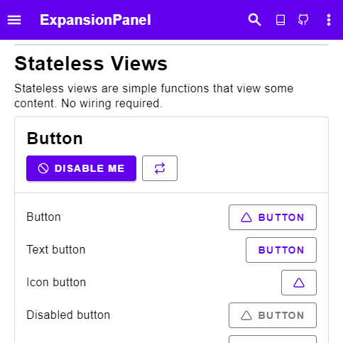
As example, consider the button widget.
|
|
|
|
### Style Type
|
|
|
|
```elm
|
|
button: ButtonStyle msg
|
|
->
|
|
{ text : String
|
|
, icon : Icon
|
|
, onPress : Maybe msg
|
|
}
|
|
-> Element msg
|
|
```
|
|
|
|
In comparison to Elm-Ui's button, we see that `List (Attribute msg)` has changed into a _Style Type_. If we look into the Style type, we see that it mirrors the implementation.
|
|
```
|
|
type alias ButtonStyle msg =
|
|
{ elementButton : List (Attribute msg)
|
|
, ifDisabled : List (Attribute msg)
|
|
, ifActive : List (Attribute msg)
|
|
, otherwise : List (Attribute msg)
|
|
, content :
|
|
{ elementRow : List (Attribute msg)
|
|
, content :
|
|
{ text : { contentText : List (Attribute msg) }
|
|
, icon : IconStyle
|
|
}
|
|
}
|
|
}
|
|
}
|
|
```
|
|
|
|
So the resulting Elm-Ui code looks like this:
|
|
|
|
```
|
|
button style { onPress, text, icon } =
|
|
Input.button
|
|
(style.elementButton
|
|
++ (if onPress == Nothing then
|
|
style.ifDisabled
|
|
|
|
else
|
|
style.otherwise
|
|
)
|
|
)
|
|
{ onPress = onPress
|
|
, label =
|
|
Element.row style.content.elementRow
|
|
[ icon
|
|
(if onPress == Nothing then
|
|
style.content.content.icon.ifDisabled
|
|
|
|
else
|
|
style.content.content.icon.otherwise
|
|
)
|
|
, Element.text text |> Element.el style.content.content.text.contentText
|
|
]
|
|
}
|
|
```
|
|
|
|
### Styles
|
|
|
|
For actually displaying the button we have a few different implementations:
|
|
|
|
``` elm
|
|
containedButton : Palette -> ButtonStyle msg
|
|
containedButton =
|
|
Button.containedButton
|
|
|
|
outlinedButton : Palette -> ButtonStyle msg
|
|
outlinedButton =
|
|
Button.outlinedButton
|
|
|
|
textButton : Palette -> ButtonStyle msg
|
|
textButton =
|
|
Button.textButton
|
|
```
|
|
|
|
** Widget Type **
|
|
|
|
We also have a `Widget Type` for the button:
|
|
|
|
```
|
|
type alias Button msg =
|
|
{ text : String
|
|
, icon : Icon
|
|
, onPress : Maybe msg
|
|
}
|
|
```
|
|
|
|
We can use it to build more complex widgets, for example a select button:
|
|
|
|
```
|
|
type alias Select msg =
|
|
{ selected : Maybe Int
|
|
, options :
|
|
List
|
|
{ text : String
|
|
, icon : Icon
|
|
}
|
|
, onSelect : Int -> Maybe msg
|
|
}
|
|
|
|
select :
|
|
Select msg
|
|
-> List ( Bool, Button msg )
|
|
|
|
selectButton :
|
|
ButtonStyle msg
|
|
-> ( Bool, Button msg )
|
|
-> Element msg
|
|
```
|
|
|
|
Checkout the examples in [Widget](Widget) for more details.
|
|
|
|
## Reusable Views vs. Components
|
|
|
|
In Elm we like to use reusable views instead of components.
|
|
At first this packages had a few components, but they where more complicated in comparison. They got slowly turned into reusable views one by one. Most have been reduced even further into _view functions_: Reusable views without a model. All function in [Widget](Widget) are view functions.
|
|
|
|
## Alternatives
|
|
|
|
For comparison, here are some alternative packages for creating UIs:
|
|
|
|
* **Using Elm-Ui**
|
|
* [lucamug/style-framework](https://dark.elm.dmy.fr/packages/lucamug/style-framework/latest/) - Full customization requires the cloning of the package.
|
|
* [jxxcarlson/elm-widget](https://dark.elm.dmy.fr/packages/jxxcarlson/elm-widget/latest/Widget-Button) - Uses a Builder pattern. Has some redefined customizations.
|
|
* [QiTASC/hatchinq](https://dark.elm.dmy.fr/packages/QiTASC/hatchinq/latest/) - Similar Arroach but still in experimental phase
|
|
* **Using Elm/Html**
|
|
* [nathanjohnson320/elm-ui-components](https://dark.elm.dmy.fr/packages/nathanjohnson320/elm-ui-components/latest/) - Uses the elm/html way of styling.
|
|
* [NoRedInk/noredink-ui](https://dark.elm.dmy.fr/packages/NoRedInk/noredink-ui/latest/) - Similar Approach but no customization options.
|
|
* [peterszerzo/elm-natural-ui](https://dark.elm.dmy.fr/packages/peterszerzo/elm-natural-ui/latest) - Uses custom Attributes with some customization.
|
|
* **Ui Frameworks**
|
|
* [aforemny/material-components-web-elm](https://dark.elm.dmy.fr/packages/aforemny/material-components-web-elm/latest/) - Wrapper of Material design using custom elements.
|
|
* [afidegnum/elm-tailwind](https://dark.elm.dmy.fr/packages/afidegnum/elm-tailwind/latest/) - Wrapper of Tailwind by including the tailwind stylesheet.
|
|
* [surprisetalk/elm-bulma](https://dark.elm.dmy.fr/packages/surprisetalk/elm-bulma/latest/) - Wrapper for Bulma by including the bulma stylesheet.
|
|
* [rundis/elm-bootstrap](https://dark.elm.dmy.fr/packages/rundis/elm-bootstrap/latest/) - Wrapper for Bootstrap by including the bootstrap stylesheet.
|
|
* [supermacro/elm-antd](https://package.elm-lang.org/packages/supermacro/elm-antd/latest/) - Implementation of Ant Design in Elm
|
|
|
|
## Motivation
|
|
|
|
After looking at the current packages that implement various reusable views (and components) I noticed two things:
|
|
|
|
* There are (nearly) no widgets for Elm-Ui, and that's a problem because while going from `Element` to `Html` is easy, the opposite is not always possible (as a lot of styling in Elm-Ui would not be adapted to the `Html` element.)
|
|
* There is no collection of widgets, all in one place. A lot of components get reimplemented over and over again. It's hard to keep track of what package is currently the best.
|
|
|
|
This package tries to solve both of these problems.
|
|
|
|
## Changelog
|
|
|
|
* **Version 3.0.0** - Reworked Style Types making it easier to customize. Added full icon support.
|
|
* **Version 2.0.0** - Complete rewrite of the package. Now including a material design implementation.
|