mirror of
https://github.com/Orasund/elm-ui-widgets.git
synced 2024-08-16 01:40:34 +03:00
1 line
42 KiB
JSON
1 line
42 KiB
JSON
[{"name":"Widget","comment":" This module contains different stateless view functions. No wiring required.\n\nThese widgets should be used by defining the styling seperately:\n\n Widget.button Material.primaryButton\n { text = \"disable me\"\n , icon =\n FeatherIcons.slash\n |> FeatherIcons.withSize 16\n |> FeatherIcons.toHtml []\n |> Element.html\n |> Element.el []\n , onPress =\n if isButtonEnabled then\n ChangedButtonStatus False\n |> Just\n\n else\n Nothing\n }\n\nEvery widgets comes with a type. You can think of the widgets as building blocks.\nYou can create you own widgets by sticking widgets types together.\n\n\n# Buttons\n\n\n\n[Open in Ellie](https://ellie-app.com/9p5QGZ3hgPLa1)\n\n@docs Button, TextButton, iconButton, textButton, button\n\n\n# Select\n\n\n\n[Open in Ellie](https://ellie-app.com/9p5QSzQDMCca1)\n\n@docs Select, selectButton, select\n\n\n\n[Open in Ellie](https://ellie-app.com/9p5R5crjqfya1)\n\n@docs MultiSelect, multiSelect\n\n\n# Dialog\n\n\n\n[Open in Ellie](https://ellie-app.com/9p5Rdz625TZa1)\n\n@docs DialogV2, modal, dialog\n\n\n# Expansion Panel\n\n\n\n[Open in Ellie](https://ellie-app.com/9p5Rv5jfVdFa1)\n\n@docs ExpansionPanelV2, expansionPanel\n\n\n# List\n\n\n\n[Open in Ellie](https://ellie-app.com/9p5RJnDVVCKa1)\n\n@docs row, column, buttonRow, buttonColumn\n\n\n# Sort Table\n\n\n\n[Open in Ellie](https://ellie-app.com/9p5RXw44B4Ja1)\n\n@docs SortTable, Column, sortTable, floatColumn, intColumn, stringColumn, unsortableColumn\n\n\n# Text Input\n\n\n\n[Open in Ellie](https://ellie-app.com/9p5S6cvWCmBa1)\n\n@docs TextInput, textInput\n\n\n# Tab\n\n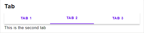\n\n[Open in Ellie](https://ellie-app.com/9p5Sdbvp4jZa1)\n\n@docs Tab, tab\n\n\n# DEPRECATED\n\n@docs Dialog, ExpansionPanel\n\n\n# Progress Indicator\n\n\n\n[Open in Ellie](TODO)\n\n@docs ProgressIndicator, circularProgressIndicator\n\n","unions":[],"aliases":[{"name":"Button","comment":" Button widget type\n","args":["msg"],"type":"{ text : String.String, icon : Element.Element Basics.Never, onPress : Maybe.Maybe msg }"},{"name":"Column","comment":" Column for the Sort Table widget type\n","args":["a"],"type":"Internal.SortTable.Column a"},{"name":"Dialog","comment":" DEPRECATED\n\nUse `DialogV2` instead\n\n","args":["msg"],"type":"{ title : Maybe.Maybe String.String, body : Element.Element msg, accept : Maybe.Maybe (Widget.TextButton msg), dismiss : Maybe.Maybe (Widget.TextButton msg) }"},{"name":"DialogV2","comment":" Dialog widget type\n","args":["msg"],"type":"{ title : Maybe.Maybe String.String, text : String.String, accept : Maybe.Maybe (Widget.TextButton msg), dismiss : Maybe.Maybe (Widget.TextButton msg) }"},{"name":"ExpansionPanel","comment":" DEPRECATED\n\nUse `ExpansionPanelV2` instead\n\n","args":["msg"],"type":"{ onToggle : Basics.Bool -> msg, icon : Element.Element Basics.Never, text : String.String, expandIcon : Element.Element Basics.Never, collapseIcon : Element.Element Basics.Never, content : Element.Element msg, isExpanded : Basics.Bool }"},{"name":"ExpansionPanelV2","comment":" Expansion Panel widget type\n","args":["msg"],"type":"{ onToggle : Basics.Bool -> msg, icon : Element.Element Basics.Never, text : String.String, content : Element.Element msg, isExpanded : Basics.Bool }"},{"name":"MultiSelect","comment":" Multi Select widget type\n\nTechnical Remark:\n\n - A more suitable name would be \"Options\"\n\n","args":["msg"],"type":"{ selected : Set.Set Basics.Int, options : List.List { text : String.String, icon : Element.Element Basics.Never }, onSelect : Basics.Int -> Maybe.Maybe msg }"},{"name":"ProgressIndicator","comment":" Progress Indicator widget type\n\nIf `maybeProgress` is set to `Nothing`, an indeterminate progress indicator (e.g. spinner) will display.\nIf `maybeProgress` is set to `Just Float` (where the `Float` is proportion of completeness between 0 and 1 inclusive), a determinate progress indicator will visualize the progress.\n\n","args":[],"type":"Maybe.Maybe Basics.Float"},{"name":"Select","comment":" Select widget type\n\nTechnical Remark:\n\n - A more suitable name would be \"Choice\"\n\n","args":["msg"],"type":"{ selected : Maybe.Maybe Basics.Int, options : List.List { text : String.String, icon : Element.Element Basics.Never }, onSelect : Basics.Int -> Maybe.Maybe msg }"},{"name":"SortTable","comment":" Sort Table widget type\n","args":["a","msg"],"type":"{ content : List.List a, columns : List.List (Widget.Column a), sortBy : String.String, asc : Basics.Bool, onChange : String.String -> msg }"},{"name":"Tab","comment":" Tab widget type\n","args":["msg"],"type":"{ tabs : Widget.Select msg, content : Maybe.Maybe Basics.Int -> Element.Element msg }"},{"name":"TextButton","comment":" Button widget type with no icon\n","args":["msg"],"type":"{ text : String.String, onPress : Maybe.Maybe msg }"},{"name":"TextInput","comment":" Text Input widget type\n","args":["msg"],"type":"{ chips : List.List (Widget.Button msg), text : String.String, placeholder : Maybe.Maybe (Element.Input.Placeholder msg), label : String.String, onChange : String.String -> msg }"}],"values":[{"name":"button","comment":" A button containing a text and an icon.\n","type":"Widget.Style.ButtonStyle msg -> { text : String.String, icon : Element.Element Basics.Never, onPress : Maybe.Maybe msg } -> Element.Element msg"},{"name":"buttonColumn","comment":" A column of buttons\n","type":"{ list : Widget.Style.ColumnStyle msg, button : Widget.Style.ButtonStyle msg } -> List.List ( Basics.Bool, Widget.Button msg ) -> Element.Element msg"},{"name":"buttonRow","comment":" A row of buttons\n","type":"{ list : Widget.Style.RowStyle msg, button : Widget.Style.ButtonStyle msg } -> List.List ( Basics.Bool, Widget.Button msg ) -> Element.Element msg"},{"name":"circularProgressIndicator","comment":" Displays a circular progress indicator\n","type":"Widget.Style.ProgressIndicatorStyle msg -> Maybe.Maybe Basics.Float -> Element.Element msg"},{"name":"column","comment":" Replacement of `Element.column`\n","type":"Widget.Style.ColumnStyle msg -> List.List (Element.Element msg) -> Element.Element msg"},{"name":"dialog","comment":" A Dialog Window.\n","type":"Widget.Style.DialogStyle msg -> { title : Maybe.Maybe String.String, text : String.String, accept : Maybe.Maybe (Widget.TextButton msg), dismiss : Maybe.Maybe (Widget.TextButton msg) } -> List.List (Element.Attribute msg)"},{"name":"expansionPanel","comment":" An expansion Panel\n","type":"Widget.Style.ExpansionPanelStyle msg -> { onToggle : Basics.Bool -> msg, icon : Element.Element Basics.Never, text : String.String, content : Element.Element msg, isExpanded : Basics.Bool } -> Element.Element msg"},{"name":"floatColumn","comment":" A Column containing a Float\n","type":"{ title : String.String, value : a -> Basics.Float, toString : Basics.Float -> String.String, width : Element.Length } -> Widget.Column a"},{"name":"iconButton","comment":" A button containing only an icon, the text is used for screenreaders.\n","type":"Widget.Style.ButtonStyle msg -> { text : String.String, icon : Element.Element Basics.Never, onPress : Maybe.Maybe msg } -> Element.Element msg"},{"name":"intColumn","comment":" A Column containing a Int\n","type":"{ title : String.String, value : a -> Basics.Int, toString : Basics.Int -> String.String, width : Element.Length } -> Widget.Column a"},{"name":"modal","comment":" A modal.\n\nTechnical Remark:\n\n - To stop the screen from scrolling, set the height of the layout to the height of the screen.\n\n","type":"{ onDismiss : Maybe.Maybe msg, content : Element.Element msg } -> List.List (Element.Attribute msg)"},{"name":"multiSelect","comment":" Selects multible options. This can be used for checkboxes.\n","type":"Widget.MultiSelect msg -> List.List ( Basics.Bool, Widget.Button msg )"},{"name":"row","comment":" Replacement of `Element.row`\n","type":"Widget.Style.RowStyle msg -> List.List (Element.Element msg) -> Element.Element msg"},{"name":"select","comment":" Selects one out of multiple options. This can be used for radio buttons or Menus.\n","type":"Widget.Select msg -> List.List ( Basics.Bool, Widget.Button msg )"},{"name":"selectButton","comment":" A simple button that can be selected.\n","type":"Widget.Style.ButtonStyle msg -> ( Basics.Bool, Widget.Button msg ) -> Element.Element msg"},{"name":"sortTable","comment":" The View\n","type":"Widget.Style.SortTableStyle msg -> { content : List.List a, columns : List.List (Widget.Column a), sortBy : String.String, asc : Basics.Bool, onChange : String.String -> msg } -> Element.Element msg"},{"name":"stringColumn","comment":" A Column containing a String\n\n`value >> toString` field will be used for displaying the content.\n\n`value` will be used for comparing the content\n\nFor example `value = String.toLower` will make the sorting case-insensitive.\n\n","type":"{ title : String.String, value : a -> String.String, toString : String.String -> String.String, width : Element.Length } -> Widget.Column a"},{"name":"tab","comment":" Displayes a list of contents in a tab\n","type":"Widget.Style.TabStyle msg -> { tabs : Widget.Select msg, content : Maybe.Maybe Basics.Int -> Element.Element msg } -> Element.Element msg"},{"name":"textButton","comment":" A button with just text and not icon.\n","type":"Widget.Style.ButtonStyle msg -> { textButton | text : String.String, onPress : Maybe.Maybe msg } -> Element.Element msg"},{"name":"textInput","comment":" A text Input that allows to include chips.\n","type":"Widget.Style.TextInputStyle msg -> { chips : List.List (Widget.Button msg), text : String.String, placeholder : Maybe.Maybe (Element.Input.Placeholder msg), label : String.String, onChange : String.String -> msg } -> Element.Element msg"},{"name":"unsortableColumn","comment":" An unsortable Column, when trying to sort by this column, nothing will change.\n","type":"{ title : String.String, toString : a -> String.String, width : Element.Length } -> Widget.Column a"}],"binops":[]},{"name":"Widget.Layout","comment":" Combines multiple concepts from the [material design specification](https://material.io/components/), namely:\n\n* Top App Bar\n* Navigation Draw\n* Side Panel\n* Dialog\n* Snackbar\n\nIt is responsive and changes view to apply to the [material design guidelines](https://material.io/components/app-bars-top).\n\n# Basics\n\n@docs Layout, Part, init, timePassed, view\n\n# Actions\n\n@docs activate, queueMessage\n\n\n","unions":[{"name":"Part","comment":" The currently visible part: either the left sheet, right sheet or the search bar\n","args":[],"cases":[["LeftSheet",[]],["RightSheet",[]],["Search",[]]]}],"aliases":[{"name":"Layout","comment":" The model of the layout containing the snackbar and the currently active side sheet (or search bar)\n","args":["msg"],"type":"{ snackbar : Widget.Snackbar.Snackbar (Widget.Snackbar.Message msg), active : Maybe.Maybe Widget.Layout.Part }"}],"values":[{"name":"activate","comment":" Open either a side sheet or the search bar.\n","type":"Maybe.Maybe Widget.Layout.Part -> Widget.Layout.Layout msg -> Widget.Layout.Layout msg"},{"name":"init","comment":" The initial state of the layout\n","type":"Widget.Layout.Layout msg"},{"name":"queueMessage","comment":" Queues a message and displayes it as a snackbar once no other snackbar is visible.\n","type":"Widget.Snackbar.Message msg -> Widget.Layout.Layout msg -> Widget.Layout.Layout msg"},{"name":"timePassed","comment":" Update the model, put this function into your subscription.\nThe first argument is the seconds that have passed sice the function was called last.\n","type":"Basics.Int -> Widget.Layout.Layout msg -> Widget.Layout.Layout msg"},{"name":"view","comment":" View the layout. Replacement of `Element.layout`.\n","type":"Widget.Style.LayoutStyle msg -> { window : { height : Basics.Int, width : Basics.Int }, dialog : Maybe.Maybe (List.List (Element.Attribute msg)), layout : Widget.Layout.Layout msg, title : Element.Element msg, menu : Widget.Select msg, search : Maybe.Maybe { onChange : String.String -> msg, text : String.String, label : String.String }, actions : List.List (Widget.Button msg), onChangedSidebar : Maybe.Maybe Widget.Layout.Part -> msg } -> Element.Element msg -> Html.Html msg"}],"binops":[]},{"name":"Widget.ScrollingNav","comment":" The Scrolling Nav is a navigation bar thats updates while you scroll through\nthe page. Clicking on a navigation button will scroll directly to that section.\n\n\n# Basics\n\n@docs ScrollingNav, init, view, current, toSelect\n\n\n# Operations\n\n@docs jumpTo, jumpToWithOffset, syncPositions, getPos, setPos\n\n","unions":[],"aliases":[{"name":"ScrollingNav","comment":" ","args":["section"],"type":"{ toString : section -> String.String, fromString : String.String -> Maybe.Maybe section, positions : IntDict.IntDict String.String, arrangement : List.List section, scrollPos : Basics.Int }"}],"values":[{"name":"current","comment":" Returns the current section\n","type":"(String.String -> Maybe.Maybe section) -> Widget.ScrollingNav.ScrollingNav section -> Maybe.Maybe section"},{"name":"getPos","comment":" Syncs the position of of the viewport\n","type":"Task.Task x (Widget.ScrollingNav.ScrollingNav selection -> Widget.ScrollingNav.ScrollingNav selection)"},{"name":"init","comment":" The intial state include the labels and the arrangement of the sections\n","type":"{ toString : section -> String.String, fromString : String.String -> Maybe.Maybe section, arrangement : List.List section, toMsg : Result.Result Browser.Dom.Error (Widget.ScrollingNav.ScrollingNav section -> Widget.ScrollingNav.ScrollingNav section) -> msg } -> ( Widget.ScrollingNav.ScrollingNav section, Platform.Cmd.Cmd msg )"},{"name":"jumpTo","comment":" Scrolls the screen to the respective section\n","type":"{ section : section, onChange : Result.Result Browser.Dom.Error () -> msg } -> Widget.ScrollingNav.ScrollingNav section -> Platform.Cmd.Cmd msg"},{"name":"jumpToWithOffset","comment":" Scrolls the screen to the respective section with some offset\n","type":"{ offset : Basics.Float, section : section, onChange : Result.Result Browser.Dom.Error () -> msg } -> Widget.ScrollingNav.ScrollingNav section -> Platform.Cmd.Cmd msg"},{"name":"setPos","comment":" sets the position of the viewport to show a specific section\n","type":"Basics.Int -> Widget.ScrollingNav.ScrollingNav section -> Widget.ScrollingNav.ScrollingNav section"},{"name":"syncPositions","comment":" Updates the positions of all sections.\nThis functions should be called regularly if the height of elements on your page can change during time.\n","type":"Widget.ScrollingNav.ScrollingNav section -> Task.Task Browser.Dom.Error (Widget.ScrollingNav.ScrollingNav section -> Widget.ScrollingNav.ScrollingNav section)"},{"name":"toSelect","comment":" Returns a select widget containing all section, with the current section selected.\n","type":"(Basics.Int -> Maybe.Maybe msg) -> Widget.ScrollingNav.ScrollingNav section -> Widget.Select msg"},{"name":"view","comment":" Opinionated way of viewing the section.\n\nThis might be useful at first, but you should consider writing your own view function.\n\n```\nview :\n (section -> Element msg)\n -> Model section\n -> List (Element msg)\nview asElement { toString, arrangement } =\n arrangement\n |> List.map\n (\\header ->\n Element.el\n [ header\n |> toString\n |> Attributes.id\n |> Element.htmlAttribute\n , Element.width <| Element.fill\n ]\n <|\n asElement <|\n header\n )\n```\n\n","type":"(section -> Element.Element msg) -> Widget.ScrollingNav.ScrollingNav section -> List.List (Element.Element msg)"}],"binops":[]},{"name":"Widget.Snackbar","comment":" 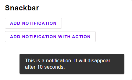\n\nA [snackbar](https://material.io/components/snackbars/) shows notification, one at a time.\n\n[Open in Ellie](https://ellie-app.com/9pz7FqhVW83a1)\n\n\n# Basics\n\n@docs Snackbar, Message, init, current, timePassed, view\n\n\n# Operations\n\n@docs insert, insertFor, dismiss\n\n","unions":[],"aliases":[{"name":"Message","comment":" A message with maybe some action button\n","args":["msg"],"type":"{ text : String.String, button : Maybe.Maybe (Widget.TextButton msg) }"},{"name":"Snackbar","comment":" A snackbar has a queue of Notifications, each with the amount of ms the message should be displayed\n","args":["a"],"type":"{ queue : Queue.Queue ( a, Basics.Int ), current : Maybe.Maybe ( a, Basics.Int ) }"}],"values":[{"name":"current","comment":" Returns the current element.\n","type":"Widget.Snackbar.Snackbar a -> Maybe.Maybe a"},{"name":"dismiss","comment":" Dismiss the current message.\n","type":"Widget.Snackbar.Snackbar a -> Widget.Snackbar.Snackbar a"},{"name":"init","comment":" Inital state\n","type":"Widget.Snackbar.Snackbar a"},{"name":"insert","comment":" Insert a message that will last for 10 seconds.\n","type":"a -> Widget.Snackbar.Snackbar a -> Widget.Snackbar.Snackbar a"},{"name":"insertFor","comment":" Insert a message for a specific amount of milli seconds.\n","type":"Basics.Int -> a -> Widget.Snackbar.Snackbar a -> Widget.Snackbar.Snackbar a"},{"name":"timePassed","comment":" Updates the model. This functions should be called regularly.\nThe first argument is the milli seconds that passed since the last time the function was called.\n","type":"Basics.Int -> Widget.Snackbar.Snackbar a -> Widget.Snackbar.Snackbar a"},{"name":"view","comment":" Views the current Message. (only one at a time)\n","type":"Widget.Style.SnackbarStyle msg -> (a -> Widget.Snackbar.Message msg) -> Widget.Snackbar.Snackbar a -> Maybe.Maybe (Element.Element msg)"}],"binops":[]},{"name":"Widget.Style","comment":" This module contains style types for every widget.\n\n@docs ButtonStyle, ColumnStyle, DialogStyle, ExpansionPanelStyle, LayoutStyle, RowStyle, SnackbarStyle, SortTableStyle, TabStyle, TextInputStyle, ProgressIndicatorStyle\n\n","unions":[],"aliases":[{"name":"ButtonStyle","comment":" ","args":["msg"],"type":"{ container : List.List (Element.Attribute msg), labelRow : List.List (Element.Attribute msg), text : List.List (Element.Attribute msg), ifDisabled : List.List (Element.Attribute msg), ifActive : List.List (Element.Attribute msg), otherwise : List.List (Element.Attribute msg) }"},{"name":"ColumnStyle","comment":" ","args":["msg"],"type":"{ containerColumn : List.List (Element.Attribute msg), element : List.List (Element.Attribute msg), ifFirst : List.List (Element.Attribute msg), ifLast : List.List (Element.Attribute msg), otherwise : List.List (Element.Attribute msg) }"},{"name":"DialogStyle","comment":" ","args":["msg"],"type":"{ containerColumn : List.List (Element.Attribute msg), title : List.List (Element.Attribute msg), buttonRow : List.List (Element.Attribute msg), acceptButton : Widget.Style.ButtonStyle msg, dismissButton : Widget.Style.ButtonStyle msg, text : List.List (Element.Attribute msg) }"},{"name":"ExpansionPanelStyle","comment":" Technical Remark:\n\n - If icons are defined in Svg, they might not display correctly.\n To avoid that, make sure to wrap them in `Element.html >> Element.el []`\n\n","args":["msg"],"type":"{ containerColumn : List.List (Element.Attribute msg), panelRow : List.List (Element.Attribute msg), labelRow : List.List (Element.Attribute msg), content : List.List (Element.Attribute msg), expandIcon : Element.Element Basics.Never, collapseIcon : Element.Element Basics.Never }"},{"name":"LayoutStyle","comment":" Technical Remark:\n\n - If icons are defined in Svg, they might not display correctly.\n To avoid that, make sure to wrap them in `Element.html >> Element.el []`\n\n","args":["msg"],"type":"{ container : List.List (Element.Attribute msg), snackbar : Widget.Style.SnackbarStyle msg, layout : List.List (Element.Attribute msg) -> Element.Element msg -> Html.Html msg, header : List.List (Element.Attribute msg), sheet : List.List (Element.Attribute msg), sheetButton : Widget.Style.ButtonStyle msg, menuButton : Widget.Style.ButtonStyle msg, menuTabButton : Widget.Style.ButtonStyle msg, menuIcon : Element.Element Basics.Never, moreVerticalIcon : Element.Element Basics.Never, spacing : Basics.Int, title : List.List (Element.Attribute msg), searchIcon : Element.Element Basics.Never, search : List.List (Element.Attribute msg), searchFill : List.List (Element.Attribute msg) }"},{"name":"ProgressIndicatorStyle","comment":" ","args":["msg"],"type":"{ containerFunction : Maybe.Maybe Basics.Float -> Element.Element msg }"},{"name":"RowStyle","comment":" ","args":["msg"],"type":"{ containerRow : List.List (Element.Attribute msg), element : List.List (Element.Attribute msg), ifFirst : List.List (Element.Attribute msg), ifLast : List.List (Element.Attribute msg), otherwise : List.List (Element.Attribute msg) }"},{"name":"SnackbarStyle","comment":" ","args":["msg"],"type":"{ containerRow : List.List (Element.Attribute msg), text : List.List (Element.Attribute msg), button : Widget.Style.ButtonStyle msg }"},{"name":"SortTableStyle","comment":" Technical Remark:\n\n - If icons are defined in Svg, they might not display correctly.\n To avoid that, make sure to wrap them in `Element.html >> Element.el []`\n\n","args":["msg"],"type":"{ containerTable : List.List (Element.Attribute msg), headerButton : Widget.Style.ButtonStyle msg, ascIcon : Element.Element Basics.Never, descIcon : Element.Element Basics.Never, defaultIcon : Element.Element Basics.Never }"},{"name":"TabStyle","comment":" ","args":["msg"],"type":"{ button : Widget.Style.ButtonStyle msg, optionRow : List.List (Element.Attribute msg), containerColumn : List.List (Element.Attribute msg), content : List.List (Element.Attribute msg) }"},{"name":"TextInputStyle","comment":" ","args":["msg"],"type":"{ chipButton : Widget.Style.ButtonStyle msg, containerRow : List.List (Element.Attribute msg), chipsRow : List.List (Element.Attribute msg), input : List.List (Element.Attribute msg) }"}],"values":[],"binops":[]},{"name":"Widget.Style.Material","comment":" 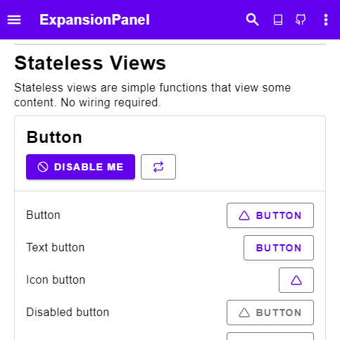\n\nThis module implements a Material design theme for all widgets.\n\nThe stylings are following [the official Material Design guidelines](https://material.io/components) as close as possible.\nPlease use these widgets in combination with the official guidelines.\n\nThe typograpahy is taken from [the material design guidelines](https://material.io/design/typography/the-type-system.html#type-scale).\nIts recommended to use a font size of 16px width and the [Roboto Font](https://fonts.google.com/specimen/Roboto?query=Ro).\n\nThe style are not opaque, so you can change every styling to your needs.\n\nIf you have any suggestions or improvements, be sure to leave a PR or a Issue over at the github repos.\n\nYou can use the theme by copying the following code:\n\n type alias Style msg =\n { dialog : DialogStyle msg\n , expansionPanel : ExpansionPanelStyle msg\n , button : ButtonStyle msg\n , primaryButton : ButtonStyle msg\n , tab : TabStyle msg\n , textInput : TextInputStyle msg\n , chipButton : ButtonStyle msg\n , row : RowStyle msg\n , buttonRow : RowStyle msg\n , column : ColumnStyle msg\n , cardColumn : ColumnStyle msg\n , sortTable : SortTableStyle msg\n , selectButton : ButtonStyle msg\n , progressIndicator : ProgressIndicatorStyle msg\n , layout : LayoutStyle msg\n }\n\n sortTable : Palette -> SortTableStyle msg\n sortTable palette =\n { containerTable = []\n , headerButton = Material.textButton palette\n , ascIcon = Icons.chevronUp |> Element.html |> Element.el []\n , descIcon = Icons.chevronDown |> Element.html |> Element.el []\n , defaultIcon = Element.none\n }\n\n style : Palette -> Style msg\n style palette =\n { sortTable = sortTable palette\n , row = Material.row\n , buttonRow = Material.buttonRow\n , cardColumn = Material.cardColumn palette\n , column = Material.column\n , button = Material.outlinedButton palette\n , primaryButton = Material.containedButton palette\n , selectButton = Material.toggleButton palette\n , tab = Material.tab palette\n , textInput = Material.textInput palette\n , chipButton = Material.chip palette\n , expansionPanel = Material.expansionPanel palette\n , dialog = Material.alertDialog palette\n , progressIndicator = Material.progressIndicator palette\n , layout = Material.layout palette\n }\n\n\n# Palette\n\n@docs Palette, defaultPalette, darkPalette\n\n\n# Button\n\nDifferent styles for buttons have different meanings.\n\n - Use `textButton` as your default button\n - Use `containedButton` for any important action\n - Use `outlinedButton` if you have more then one important action.\n Use `containedButton` for **the most** important action of the group.\n\n@docs containedButton, outlinedButton, textButton\n\n@docs iconButton, toggleButton, buttonRow\n\n\n# Card\n\nIn the material design specification the card is not really specified at all.\nIm practice the List seams more useful then a own card widget.\nThus for now we only provide a card containing a list.\n\n@docs cardColumn\n\n\n# Chip\n\n@docs chip, textInput\n\n\n# Dialog\n\n@docs alertDialog\n\n\n# Expansion Panel\n\n@docs expansionPanel\n\n\n# List\n\nThe [List widget](https://material.io/components/lists) is a very complex widget that sadly only particially made it into this package.\n\n@docs row, column\n\n\n# Progress Indicator\n\n@docs progressIndicator\n\n\n# Snackbar\n\n@docs snackbar\n\n\n# Tab\n\n@docs tab, tabButton\n\n\n# Layout\n\n@docs layout\n\n","unions":[],"aliases":[{"name":"Palette","comment":" The material design comes with customizable color palettes.\n\nCheck out [the official documentation about the color system](https://material.io/design/color/the-color-system.html#color-theme-creation) to see how these colors are used.\n\nFor the `-on` colors you can use white, for transitions into white, or black,for transitions into black. Other colors are also possible, but i've not seen any website acutally using a different color.\n\n","args":[],"type":"{ primary : Color.Color, secondary : Color.Color, background : Color.Color, surface : Color.Color, error : Color.Color, on : { primary : Color.Color, secondary : Color.Color, background : Color.Color, surface : Color.Color, error : Color.Color } }"}],"values":[{"name":"alertDialog","comment":" An alert dialog for important decisions. Use a snackbar for less important notification.\n\n\n\n_Image taken from [material.io](https://material.io/develop/android/components/buttons/)_\n\n","type":"Widget.Style.Material.Palette -> Widget.Style.DialogStyle msg"},{"name":"buttonRow","comment":" a Row of buttons.\n\nOnly use in combination with `toggleButton`\n\n","type":"Widget.Style.RowStyle msg"},{"name":"cardColumn","comment":" A List styled like a card.\n\nTechnical Remark:\n\nThis is a simplification of the [Material Design Card\n](https://material.io/components/cards) and might get replaced at a later date.\n\n","type":"Widget.Style.Material.Palette -> Widget.Style.ColumnStyle msg"},{"name":"chip","comment":" Chips have the same behaviour as buttons but are visually less important.\n\nIn the [official documentation](https://material.io/components/chips#types) chips have different names depending on where they are used:\n\n - **Input Chips** are used inside a text field. Use `textInput` for this feature.\n - **Choice Chips** are used for selcting an option.\n The material design guidelines recommend using `toggleButton` for icons with no text and chips for text with no icons.\n - **Filter Chips** are used for selecting multiple options. They typically have a done-icon when selected.\n - **Action chips** are like button. Make sure to include an icon when using action chips.\n\nTechnical Remark:\n\n - Desided against the implementation of an outlined chip.\n Please open a new issue or a PR if you want to have it implemented.\n\n","type":"Widget.Style.Material.Palette -> Widget.Style.ButtonStyle msg"},{"name":"column","comment":" A simple styling for a column.\n","type":"Widget.Style.ColumnStyle msg"},{"name":"containedButton","comment":" A contained button representing the most important action of a group.\n\n\n\n_Image taken from [material.io](https://material.io/develop/android/components/buttons/)_\n\n","type":"Widget.Style.Material.Palette -> Widget.Style.ButtonStyle msg"},{"name":"darkPalette","comment":" The offical dark theme of google.\n\n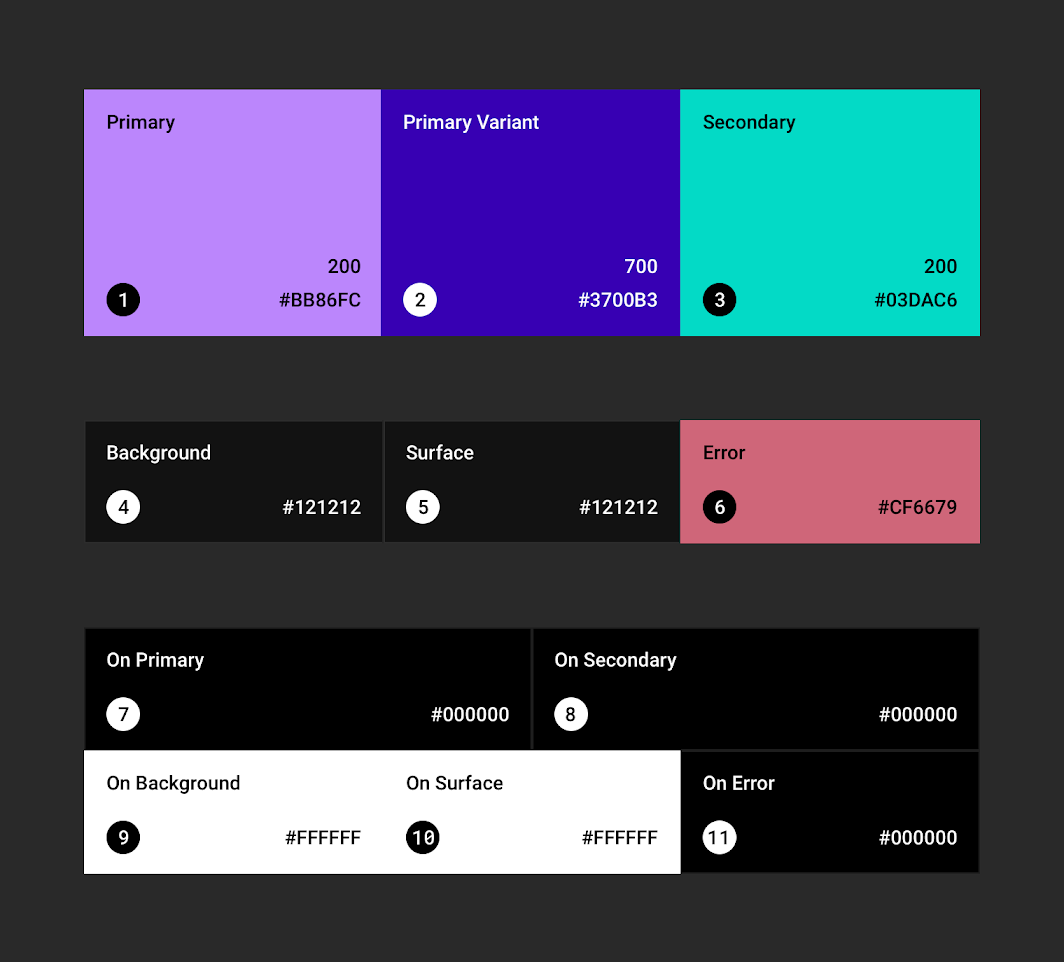\n\n_Image take from [material.io](https://material.io/design/color/dark-theme.html#ui-application)_\n\n","type":"Widget.Style.Material.Palette"},{"name":"defaultPalette","comment":" The default color theme.\n\n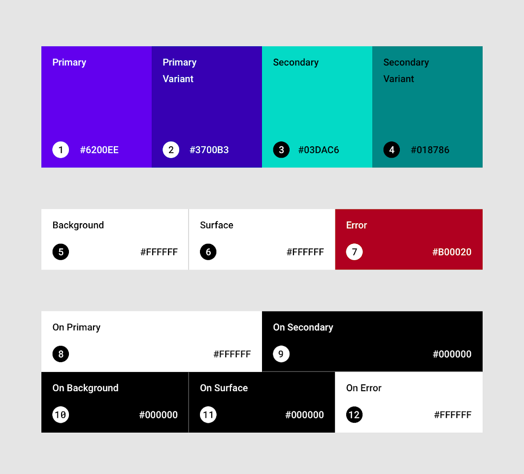\n\n_Image take from [material.io](https://material.io/design/color/the-color-system.html#color-theme-creation)_\n\n","type":"Widget.Style.Material.Palette"},{"name":"expansionPanel","comment":" The expansion Panel is an outdated part of the material design specification.\nIn modern implementation it gets replaced with a very sophisticated list widget.\n\nTechnical Remarks:\n\n - The expansion panel is part of an [older version](https://material.io/archive/guidelines/components/expansion-panels.html) of the Material Design.\n The newer version is part of the List component.\n The styling is taken from the [new specification](https://material.io/components/lists#specs).\n - The Icons are taken from [danmarcab/material-icons](https://dark.elm.dmy.fr/packages/danmarcab/material-icons/latest/).\n\n","type":"Widget.Style.Material.Palette -> Widget.Style.ExpansionPanelStyle msg"},{"name":"iconButton","comment":" An single selectable icon.\n\n\n\n_Image taken from [material.io](https://material.io/develop/android/components/buttons/)_\n\nTechnical Remark:\n\n - Could not find any specification details\n\n","type":"Widget.Style.Material.Palette -> Widget.Style.ButtonStyle msg"},{"name":"layout","comment":" The Layout Widget combines the following Material design concepts:\n\n - Top bar\n - Navigation drawer\n - Side Sheet\n - Dialog\n - Snackbar\n\nFuture updates might try to seperate them into there own widgets.\nBut for now they are only available as an all-in-one solution.\n\nTechnical Remark:\n\n - The Icons are taken from [danmarcab/material-icons](https://dark.elm.dmy.fr/packages/danmarcab/material-icons/latest/).\n - The drawer button as not taken from the specification (This will been to be added later)\n\n","type":"Widget.Style.Material.Palette -> Widget.Style.LayoutStyle msg"},{"name":"outlinedButton","comment":" A outlined button representing an important action within a group.\n\n\n\n_Image taken from [material.io](https://material.io/develop/android/components/buttons/)_\n\n","type":"Widget.Style.Material.Palette -> Widget.Style.ButtonStyle msg"},{"name":"progressIndicator","comment":" A circular progress indicator\n","type":"Widget.Style.Material.Palette -> Widget.Style.ProgressIndicatorStyle msg"},{"name":"row","comment":" A simple styling for a row.\n","type":"Widget.Style.RowStyle msg"},{"name":"snackbar","comment":" A typical snackbar\n\n\n\n_Image take from [material.io](https://material.io/develop/android/components/snackbar/)_\n\nTechnical Remark:\n\n - The text color of the button was not given in the specification. This implementation\n adujsts the luminance of the color to fit the [w3 accessability standard](https://www.w3.org/TR/WCAG20/#Contrast)\n\n","type":"Widget.Style.Material.Palette -> Widget.Style.SnackbarStyle msg"},{"name":"tab","comment":" A Tab bar meant for only the upper most level. Do not use a tab within a tab.\n","type":"Widget.Style.Material.Palette -> Widget.Style.TabStyle msg"},{"name":"tabButton","comment":" A single Tab button.\n\nTechnical Remark:\n\n - The official specification states that the background color should be the surface color,\n but the pictures and actuall implementations all have no background color.\n So here the background color is also not set.\n\n","type":"Widget.Style.Material.Palette -> Widget.Style.ButtonStyle msg"},{"name":"textButton","comment":" A text button representing a simple action within a group.\n\n\n\n_Image taken from [material.io](https://material.io/develop/android/components/buttons/)_\n\n","type":"Widget.Style.Material.Palette -> Widget.Style.ButtonStyle msg"},{"name":"textInput","comment":" A text input style that is included only to support input chips.\n\nTechnical Remark:\n\n - This is just a temporary implementation. It will soon be replaced with the official implementation.\n\n","type":"Widget.Style.Material.Palette -> Widget.Style.TextInputStyle msg"},{"name":"toggleButton","comment":" A ToggleButton. Only use as a group in combination with `buttonRow`.\n\n\n\n_Image taken from [material.io](https://material.io/develop/android/components/buttons/)_\n\nToggle buttons should only be used with the `iconButton` widget, else use chips instead.\n\nTechnical Remark:\n\n - Border color was not defined in the [specification](https://material.io/components/buttons#toggle-button)\n - There are two different versions, one where the selected color is gray and another where the color is primary.\n I noticed the gray version was used more often, so i went with that one.\n\n","type":"Widget.Style.Material.Palette -> Widget.Style.ButtonStyle msg"}],"binops":[]},{"name":"Widget.Style.Template","comment":" 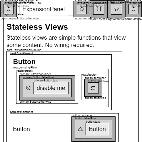\n\nThis package contains mockups designed for writing your own style.\n\nStart by copying the following code and then replace the fields one by one.\n\n```\ntype alias Style msg =\n { dialog : DialogStyle msg\n , expansionPanel : ExpansionPanelStyle msg\n , button : ButtonStyle msg\n , primaryButton : ButtonStyle msg\n , tab : TabStyle msg\n , textInput : TextInputStyle msg\n , chipButton : ButtonStyle msg\n , row : RowStyle msg\n , buttonRow : RowStyle msg\n , column : ColumnStyle msg\n , cardColumn : ColumnStyle msg\n , sortTable : SortTableStyle msg\n , selectButton : ButtonStyle msg\n , layout : LayoutStyle msg\n }\n\nstyle : Style msg\nstyle =\n { sortTable = Template.sortTable <| \"sortTable\"\n , row = Template.row <| \"row\"\n , buttonRow = Template.row <| \"buttonRow\"\n , cardColumn = Template.column <| \"cardRow\"\n , column = Template.column <| \"column\"\n , button = Template.button <| \"button\"\n , primaryButton = Template.button <| \"primaryButton\"\n , tab = Template.tab <| \"tab\"\n , textInput = Template.textInput <| \"textInput\"\n , chipButton = Template.button <| \"chipButton\"\n , expansionPanel = Template.expansionPanel \"expansionPanel\"\n , selectButton = Template.button \"selectButton\"\n , dialog = Template.dialog \"dialog\"\n , layout = Template.layout \"layout\"\n }\n```\n\n\n# Base Elements\n\n@docs box, decoration, icon\n\n\n# Mockups\n\n@docs button, column, dialog, expansionPanel, layout, row, snackbar, sortTable, tab, textInput, progressIndicator\n\n","unions":[],"aliases":[],"values":[{"name":"box","comment":" A box representing an element\n","type":"String.String -> List.List (Element.Attribute msg)"},{"name":"button","comment":"\n\n```\nbutton : String -> ButtonStyle msg\nbutton string =\n { container = box <| string ++ \":container\"\n , labelRow = box <| string ++ \":labelRow\"\n , text = box <| string ++ \":text\"\n , ifDisabled = decoration <| string ++ \":ifDisabled\"\n , ifActive = decoration <| string ++ \":ifActive\"\n , otherwise = decoration <| string ++ \":otherwise\"\n }\n```\n\n","type":"String.String -> Widget.Style.ButtonStyle msg"},{"name":"column","comment":"\n\n```\ncolumn : String -> ColumnStyle msg\ncolumn string =\n { containerColumn = box <| string ++ \":containerColumn\"\n , element = box <| string ++ \":element\"\n , ifFirst = decoration <| string ++ \":ifFirst\"\n , ifLast = decoration <| string ++ \":ifLast\"\n , otherwise = decoration <| string ++ \":otherwise\"\n }\n```\n\n","type":"String.String -> Widget.Style.ColumnStyle msg"},{"name":"decoration","comment":" An additional attribute representing a state change.\n","type":"String.String -> List.List (Element.Attribute msg)"},{"name":"dialog","comment":"\n\n```\ndialog : String -> DialogStyle msg\ndialog string =\n { containerColumn = box <| string ++ \":containerColumn\"\n , title = box <| string ++ \":title\"\n , text = box <| string ++ \":text\"\n , buttonRow = box <| string ++ \":buttonRow\"\n , acceptButton = button <| string ++ \":acceptButton\"\n , dismissButton = button <| string ++ \":dismissButton\"\n }\n```\n\n","type":"String.String -> Widget.Style.DialogStyle msg"},{"name":"expansionPanel","comment":"\n\n```\nexpansionPanel : String -> ExpansionPanelStyle msg\nexpansionPanel string =\n { containerColumn = box <| string ++ \":containerColumn\"\n , panelRow = box <| string ++ \":panelRow\"\n , labelRow = box <| string ++ \":labelRow\"\n , content = box <| string ++ \":content\"\n , expandIcon = icon <| string ++ \":expandIcon\"\n , collapseIcon = icon <| string ++ \":collapseIcon\"\n }\n\n```\n\n","type":"String.String -> Widget.Style.ExpansionPanelStyle msg"},{"name":"icon","comment":" A circle representing an icon\n","type":"String.String -> Element.Element msg"},{"name":"layout","comment":"\n\n```\nlayout : String -> LayoutStyle msg\nlayout string =\n { container = box <| string ++ \":container\"\n , snackbar = snackbar <| string ++ \":snackbar\"\n , layout = Element.layout\n , header = box <| string ++ \":header\"\n , menuButton = button <| string ++ \":menuButton\"\n , sheetButton = button <| string ++ \":sheetButton\"\n , menuTabButton = button <| string ++ \":menuTabButton\"\n , sheet = box <| string ++ \":sheet\"\n , menuIcon = icon <| string ++ \":menuIcon\"\n , moreVerticalIcon = icon <| string ++ \":moreVerticalIcon\"\n , spacing = 8\n , title = box <| string ++ \":title\"\n , searchIcon = icon <| string ++ \":searchIcon\"\n , search = box <| string ++ \":search\"\n , searchFill = box <| string ++ \":searchFill\"\n }\n```\n\n","type":"String.String -> Widget.Style.LayoutStyle msg"},{"name":"progressIndicator","comment":"\n\n```\nprogressIndicator : String -> ProgressIndicatorStyle msg\nprogressIndicator string =\n { icon = (\\_ -> icon <| string ++ \":icon\")\n }\n```\n\n","type":"String.String -> Widget.Style.ProgressIndicatorStyle msg"},{"name":"row","comment":"\n\n```\nrow : String -> RowStyle msg\nrow string =\n { containerRow = box <| string ++ \":containerRow\"\n , element = box <| string ++ \":element\"\n , ifFirst = decoration <| string ++ \":ifFirst\"\n , ifLast = decoration <| string ++ \":ifLast\"\n , otherwise = decoration <| string ++ \":otherwise\"\n }\n```\n\n","type":"String.String -> Widget.Style.RowStyle msg"},{"name":"snackbar","comment":"\n\n```\nsnackbar : String -> SnackbarStyle msg\nsnackbar string =\n { containerRow = box <| string ++ \":containerRow\"\n , button = button <| string ++ \":button\"\n , text = box <| string ++ \":text\"\n }\n```\n\n","type":"String.String -> Widget.Style.SnackbarStyle msg"},{"name":"sortTable","comment":"\n\n```\nsortTable : String -> SortTableStyle msg\nsortTable string =\n { containerTable = box <| string ++ \":containerTable\"\n , headerButton = button <| string ++ \":headerButton\"\n , ascIcon = icon <| string ++ \":ascIcon\"\n , descIcon = icon <| string ++ \":descIcon\"\n , defaultIcon = icon <| string ++ \":defaultIcon\"\n }\n```\n\n","type":"String.String -> Widget.Style.SortTableStyle msg"},{"name":"tab","comment":"\n\n```\ntab : String -> TabStyle msg\ntab string =\n { button = button <| string ++ \":button\"\n , optionRow = box <| string ++ \":optionRow\"\n , containerColumn = box <| string ++ \":containerColumn\"\n , content = box <| string ++ \":content\"\n }\n```\n\n","type":"String.String -> Widget.Style.TabStyle msg"},{"name":"textInput","comment":"\n\n```\ntextInput : String -> TextInputStyle msg\ntextInput string =\n { chipButton = button <| string ++ \":chipButton\"\n , chipsRow = box <| string ++ \":chipsRow\"\n , containerRow = box <| string ++ \":containerRow\"\n , input = box <| string ++ \":input\"\n }\n\n```\n\n","type":"String.String -> Widget.Style.TextInputStyle msg"}],"binops":[]}] |