mirror of
https://github.com/jxnblk/mdx-deck.git
synced 2024-09-20 19:37:27 +03:00
337 lines
9.0 KiB
Markdown
337 lines
9.0 KiB
Markdown
# MDX Deck
|
||
|
||
|
||
|
||
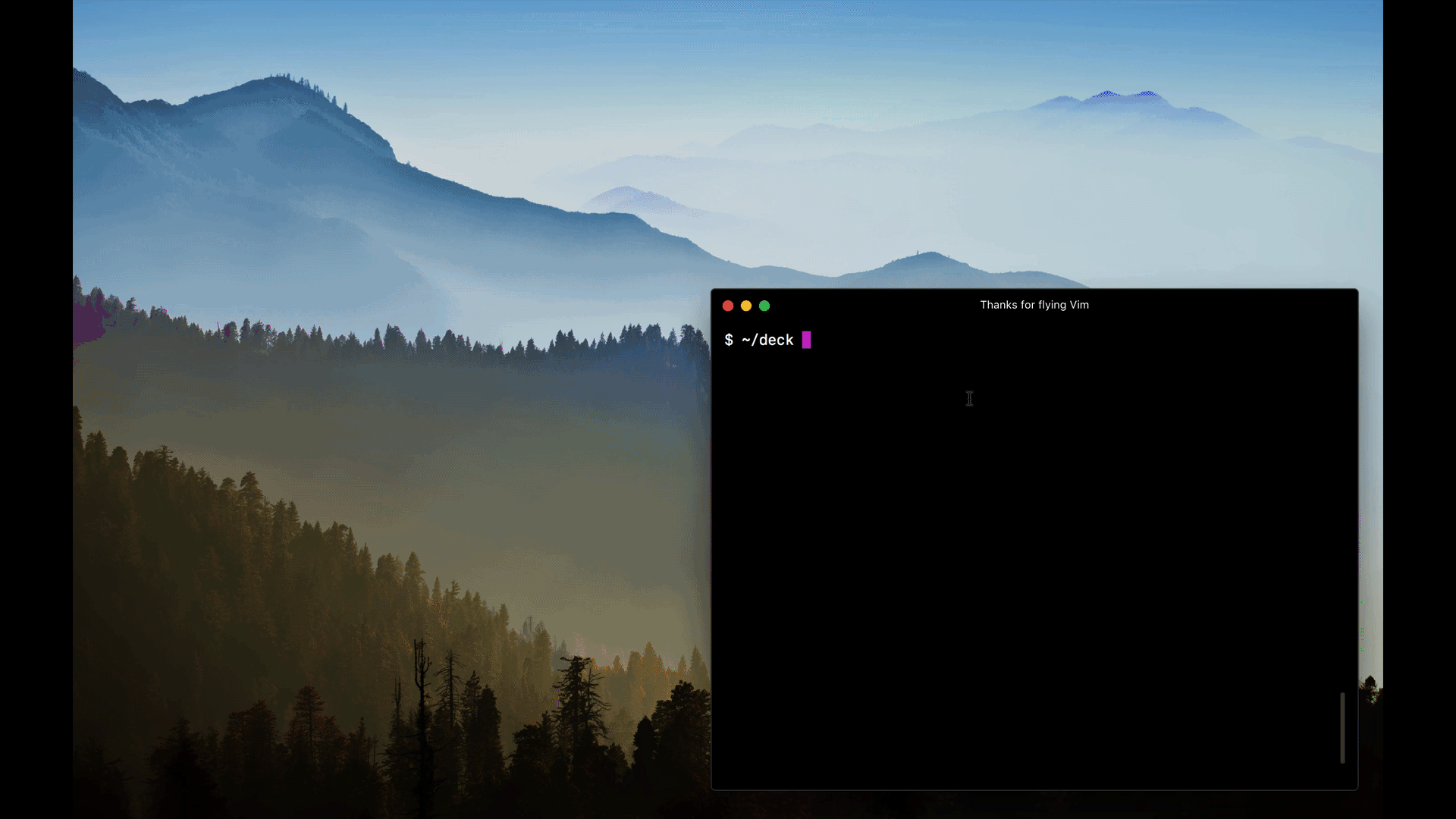
[MDX][]-based presentation decks
|
||
|
||
[![Build Status][badge]][travis]
|
||
[![Version][version-badge]][npm]
|
||
[![Downloads][downloads-badge]][npm]
|
||
|
||
[badge]: https://img.shields.io/travis/jxnblk/mdx-deck.svg?style=flat-square
|
||
[travis]: https://travis-ci.org/jxnblk/mdx-deck
|
||
[version-badge]: https://img.shields.io/npm/v/mdx-deck.svg?style=flat-square
|
||
[downloads-badge]: https://img.shields.io/npm/dw/mdx-deck.svg?style=flat-square
|
||
[npm]: https://npmjs.com/package/mdx-deck
|
||
|
||
```sh
|
||
npm i -D mdx-deck@next
|
||
```
|
||
|
||
- :memo: Write presentations in markdown
|
||
- :atom_symbol: Import and use [React components](#imports)
|
||
- :nail_care: Customizable [themes](#theming) and components
|
||
- :zero: Zero-config CLI
|
||
- :tipping_hand_woman: [Presenter mode](#presenter-mode)
|
||
- :notebook: [Speaker notes](#speaker-notes)
|
||
|
||
[View demo](https://jxnblk.com/mdx-deck)
|
||
|
||
## Getting Started
|
||
|
||
Create an [MDX][] file and separate each slide with `---`.
|
||
|
||
````mdx
|
||
# This is the title of my deck
|
||
|
||
---
|
||
|
||
# About Me
|
||
|
||
---
|
||
|
||
```jsx
|
||
<CodeSnippet />
|
||
```
|
||
|
||
---
|
||
|
||
import Demo from './components/Demo'
|
||
|
||
## <Demo />
|
||
|
||
# The end
|
||
````
|
||
|
||
Add a run script to your `package.json` with the MDX Deck CLI
|
||
pointing to the `.mdx` file to start the dev server:
|
||
|
||
```json
|
||
"scripts": {
|
||
"start": "mdx-deck deck.mdx"
|
||
}
|
||
```
|
||
|
||
Start the dev server:
|
||
|
||
```sh
|
||
npm start
|
||
```
|
||
|
||
## Videos & Articles
|
||
|
||
- [Egghead Tutorial][egghead] by [Andrew Del Prete](https://github.com/andrewdelprete).
|
||
- [mdx-deck: slide decks powered by markdown and react][kcd-medium] by [Kent C. Dodds][]
|
||
- [Make Fast & Beautiful Presentations with MDX-Deck][hw-video] by [Harry Wolff][] ([Demo][hw-demo])
|
||
- [What is MDX][kcd-video] by [Kent C. Dodds][]
|
||
- [Build a Custom Provider Component for MDX-Deck](ks-egghead) by [Kyle Shevlin][]
|
||
|
||
[egghead]: https://egghead.io/lessons/react-build-a-slide-deck-with-mdx-deck-using-markdown-react
|
||
[kent c. dodds]: https://mobile.twitter.com/kentcdodds
|
||
[kcd-video]: http://youtu.be/d2sQiI5NFAM?a
|
||
[kcd-medium]: https://blog.kentcdodds.com/mdx-deck-slide-decks-powered-by-markdown-and-react-bfc6d6af20da
|
||
[hw-video]: https://www.youtube.com/watch?v=LvP2EqCiQMg&feature=youtu.be
|
||
[hw-demo]: https://github.com/hswolff/mdx-deck-demo
|
||
[harry wolff]: https://mobile.twitter.com/hswolff
|
||
[ks-egghead]: https://egghead.io/lessons/javascript-build-a-custom-provider-component-for-mdx-deck
|
||
[kyle shevlin]: https://twitter.com/kyleshevlin
|
||
|
||
## Quick Start
|
||
|
||
To create a new presentation with zero-configuration, run the following command to generate a presentation deck in a new folder:
|
||
|
||
```sh
|
||
npm init deck my-presentation-name
|
||
```
|
||
|
||
## Using MDX
|
||
|
||
MDX can use Markdown syntax and render React components with JSX.
|
||
|
||
### Imports
|
||
|
||
To import components, use ES import syntax separated with empty lines between any markdown or JSX syntax.
|
||
|
||
```mdx
|
||
import { Box } from 'grid-styled'
|
||
|
||
<Box color="tomato">Hello</Box>
|
||
```
|
||
|
||
Read more about MDX syntax in the [MDX Docs][mdx].
|
||
|
||
## Theming
|
||
|
||
MDX Deck uses [emotion][] for styling, making practically any part of the presentation themeable.
|
||
|
||
### Built-in Themes
|
||
|
||
<div>
|
||
<img src='docs/images/future.png' width='256' />
|
||
<img src='docs/images/comic.png' width='256' />
|
||
<img src='docs/images/yellow.png' width='256' />
|
||
</div>
|
||
|
||
MDX Deck includes several built-in themes to change the look and feel of the presentation.
|
||
Export `theme` from your MDX file to enable a theme.
|
||
|
||
```mdx
|
||
export { dark as theme } from 'mdx-deck/themes'
|
||
|
||
# Dark Theme
|
||
```
|
||
|
||
MDX uses [exports](https://github.com/mdx-js/mdx#exports) as a way for files to communicate with their parent components.
|
||
For a list of available themes see the [Themes Docs](docs/themes.md).
|
||
|
||
### Custom Themes
|
||
|
||
A custom theme can be provided by exporting `theme` from the MDX file.
|
||
|
||
```mdx
|
||
export { default as theme } from './theme'
|
||
|
||
# Hello
|
||
```
|
||
|
||
The theme should be an object with fields for fonts, colors, and CSS for individual components.
|
||
|
||
```js
|
||
// example theme.js
|
||
export default {
|
||
// add a custom font
|
||
font: 'Roboto, sans-serif',
|
||
// custom colors
|
||
colors: {
|
||
text: '#f0f',
|
||
background: 'black',
|
||
link: '#0ff',
|
||
},
|
||
}
|
||
```
|
||
|
||
Read more about theming in the [Theming docs](docs/theming.md)
|
||
|
||
### Components
|
||
|
||
MDX Deck includes built-in components to help with creating presentations, including a full screen Image component, the Appear component that allows stepping through parts of a single slide, and the Notes component for adding speaker notes.
|
||
|
||
Read more in the [components docs](docs/components.md).
|
||
|
||
### Libraries
|
||
|
||
These third-party libraries are great for use with MDX Deck.
|
||
|
||
- [CodeSurfer][]: React component for scrolling, zooming and highlighting code.
|
||
- [mdx-code][]: Runnable code playgrounds for MDX Deck.
|
||
- [mdx-deck-live-code][]: Live React and JS coding in slides.
|
||
|
||
_Note: please check with version compatibility when using these libraries._
|
||
|
||
[codesurfer]: https://github.com/pomber/code-surfer
|
||
[mdx-code]: https://github.com/pranaygp/mdx-code
|
||
[mdx-deck-live-code]: https://github.com/JReinhold/mdx-deck-live-code
|
||
|
||
### Layouts
|
||
|
||
Each slide can include a custom layout around its content.
|
||
This can be used as a substitute for slide templates found in other presentation apps and libraries.
|
||
|
||
```js
|
||
// example Layout.js
|
||
import React from 'react'
|
||
|
||
export default ({ children }) => (
|
||
<div
|
||
style={{
|
||
width: '100vw',
|
||
height: '100vw',
|
||
backgroundColor: 'tomato',
|
||
}}
|
||
>
|
||
{children}
|
||
</div>
|
||
)
|
||
```
|
||
|
||
```mdx
|
||
import Layout from './Layout'
|
||
|
||
# No Layout
|
||
|
||
---
|
||
|
||
export default Layout
|
||
|
||
# Custom Layout
|
||
```
|
||
|
||
The layout component will wrap the MDX elements within that slide,
|
||
which means you can use a nested ThemeProvider or target elements with CSS-in-JS.
|
||
|
||
### Built-in Layouts
|
||
|
||
MDX Deck includes some built-in layouts for inverting theme colors and changing the layout of a slide.
|
||
Read more about [built-in layouts](docs/components.md#layouts).
|
||
|
||
## Presenter Mode
|
||
|
||
MDX Deck includes a built-in _Presenter Mode_, with a preview of the next slide and a timer.
|
||
|
||

|
||
|
||
To use presenter mode:
|
||
|
||
1. Open your presentation and enter _Presenter Mode_
|
||
2. Click on the link in the bottom to open the presentation in another tab
|
||
3. Move the other window to the screen for the audience to see
|
||
4. Control the presentation from your window using the left and right arrow keys – the other window should stay in sync
|
||
5. Be sure to move your cursor so that it doesn't drive anyone in the audience crazy
|
||
|
||
### Speaker Notes
|
||
|
||
Notes that only show in presenter mode can be added to any slide.
|
||
Speaker notes can be added using the `<Notes />` component.
|
||
|
||
```mdx
|
||
import { Notes } from 'mdx-deck'
|
||
|
||
# Slide Content
|
||
|
||
<Notes>Only visible in presenter mode</Notes>
|
||
```
|
||
|
||
## Overview Mode
|
||
|
||

|
||
|
||
When editing a slide deck, toggle overview mode with `Option + O`.
|
||
This shows a list of all slides on the left and a preview of the current slide on the right.
|
||
|
||
## Keyboard Shortcuts
|
||
|
||
| Key | Description |
|
||
| ----------- | -------------------------------------------- |
|
||
| Left Arrow | Go to previous slide (or step in [Appear][]) |
|
||
| Right Arrow | Go to next slide (or step in [Appear][]) |
|
||
| Space | Go to next slide (or step in [Appear][]) |
|
||
| Option + P | Toggle [Presenter Mode](#presenter-mode) |
|
||
| Option + O | Toggle [Overview Mode](#overview-mode) |
|
||
|
||
### URL Query String
|
||
|
||
The alternative modes in MDX Deck can also be set with query strings: `?mode=presenter` or `?mode=overview`
|
||
|
||
[appear]: docs/components.md#appear
|
||
|
||
## Exporting
|
||
|
||
Add a `build` script to your `package.json` to export a presentation as HTML with a JS bundle.
|
||
|
||
```json
|
||
"scripts": {
|
||
"build": "mdx-deck build deck.mdx"
|
||
}
|
||
```
|
||
|
||
See more exporting options in the [Exporting Documentation](docs/exporting.md)
|
||
|
||
## CLI Options
|
||
|
||
```
|
||
-p --port Dev server port
|
||
-h --host Host the dev server listens to
|
||
--no-open Prevent from opening in default browser
|
||
-d --out-dir Output directory for exporting
|
||
--webpack Path to custom webpack config file
|
||
```
|
||
|
||
## Docs
|
||
|
||
- [Theming](docs/theming.md)
|
||
- [Built-in Themes](docs/themes.md)
|
||
- [Layouts](docs/layouts.md)
|
||
- [Components](docs/components.md)
|
||
- [Exporting](docs/exporting.md)
|
||
- [Advanced Usage](docs/advanced.md)
|
||
|
||
## Examples
|
||
|
||
- [Design Systems & React][design-systems-react] by [Diana Mount](https://mobile.twitter.com/broccolini)
|
||
- [Bringing Brazil to the Cloud, Now][brazil-now] by [Guillermo Rauch](https://mobile.twitter.com/rauchg/)
|
||
- [Simplify React][simplify-react] by [Kent C. Dodds](https://mobile.twitter.com/kentcdodds)
|
||
- [I Got 99 Problems but GraphQL Ain't One][99-problems] by [Sara Vieira](https://mobile.twitter.com/NikkitaFTW)
|
||
- [Stop de #divFest][stop-div-fest] by [Sara Vieira](https://mobile.twitter.com/NikkitaFTW)
|
||
|
||
---
|
||
|
||
### Related
|
||
|
||
- [MDX][]
|
||
- [emotion][]
|
||
- [Spectacle][]
|
||
|
||
[MIT License](LICENSE.md)
|
||
|
||
[mdx]: https://mdxjs.com/
|
||
[spectacle]: https://github.com/FormidableLabs/spectacle
|
||
[emotion]: https://emotion.sh
|
||
|
||
<!-- examples -->
|
||
|
||
[design-systems-react]: https://github-ds.now.sh/#0
|
||
[brazil-now]: https://braziljs.now.sh
|
||
[simplify-react]: https://simply-react.netlify.com/#0
|
||
[99-problems]: https://99-problems-graphql-aint-one.now.sh/#0
|
||
[stop-div-fest]: https://stop-div-fest.now.sh/
|