 47b81ee086
This PR was auto generated by the bump-mdc-deps GitHub action.

PiperOrigin-RevId: 391621612
17 KiB
<mwc-select> 
IMPORTANT: The Material Web Components are a work in progress and subject to major changes until 1.0 release.
Selects display a list of choices on temporary surfaces.

Material Design Guidelines: exposed dropdown menus
Installation
npm install @material/mwc-select
NOTE: The Material Web Components are distributed as ES2017 JavaScript Modules, and use the Custom Elements API. They are compatible with all modern browsers including Chrome, Firefox, Safari, Edge, and IE11, but an additional tooling step is required to resolve bare module specifiers, as well as transpilation and polyfills for IE11. See here for detailed instructions.
Example usage
Basic (filled)
Note, mwc-select internally uses
mwc-list, so
its main slot has the same interface as the main slot of a mwc-list.


<mwc-select label="filled">
  <mwc-list-item></mwc-list-item>
  <mwc-list-item value="0">Item 0</mwc-list-item>
  <mwc-list-item value="1">Item 1</mwc-list-item>
  <mwc-list-item value="2">Item 2</mwc-list-item>
  <mwc-list-item value="3">Item 3</mwc-list-item>
</mwc-select>

<script type="module">
  import '@material/mwc-select';
  import '@material/mwc-list/mwc-list-item';
</script>
Outlined


<mwc-select outlined label="outlined">
  <mwc-list-item></mwc-list-item>
  <mwc-list-item value="0">Item 0</mwc-list-item>
  <mwc-list-item value="1">Item 1</mwc-list-item>
  <mwc-list-item value="2">Item 2</mwc-list-item>
  <mwc-list-item value="3">Item 3</mwc-list-item>
</mwc-select>
Preselected


<mwc-select label="preselected">
  <mwc-list-item></mwc-list-item>
  <mwc-list-item selected value="0">Item 0</mwc-list-item>
  <mwc-list-item value="1">Item 1</mwc-list-item>
  <mwc-list-item value="2">Item 2</mwc-list-item>
  <mwc-list-item value="3">Item 3</mwc-list-item>
</mwc-select>
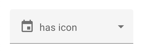
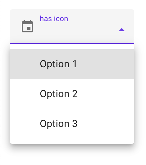
Icon
Icon is a material-icons font name. Additionally, all options must have
graphic="icon" defined to enable proper spacing.
<mwc-select label="has icon" icon="event">
  <mwc-list-item graphic="icon" value="1">Option 1</mwc-list-item>
  <mwc-list-item graphic="icon" value="2">Option 2</mwc-list-item>
  <mwc-list-item graphic="icon" value="3">Option 3</mwc-list-item>
</mwc-select>
Required (error, validation message)
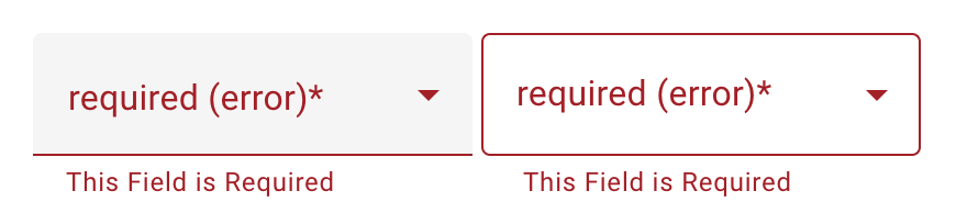
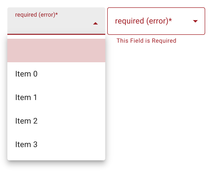
<mwc-select
    required
    validationMessage="This Field is Required"
    label="required (error)">
  <mwc-list-item selected></mwc-list-item>
  <mwc-list-item value="0">Item 0</mwc-list-item>
  <mwc-list-item value="1">Item 1</mwc-list-item>
  <mwc-list-item value="2">Item 2</mwc-list-item>
  <mwc-list-item value="3">Item 3</mwc-list-item>
</mwc-select>
<mwc-select
    required
    validationMessage="This Field is Required"
    outlined
    label="required (error)">
  <mwc-list-item selected></mwc-list-item>
  <mwc-list-item value="0">Item 0</mwc-list-item>
  <mwc-list-item value="1">Item 1</mwc-list-item>
  <mwc-list-item value="2">Item 2</mwc-list-item>
  <mwc-list-item value="3">Item 3</mwc-list-item>
</mwc-select>
Helper Text

focused:
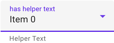

<mwc-select
    label="has helper text"
    helper="Helper Text">
  <mwc-list-item></mwc-list-item>
  <mwc-list-item selected value="0">Item 0</mwc-list-item>
  <mwc-list-item value="1">Item 1</mwc-list-item>
  <mwc-list-item value="2">Item 2</mwc-list-item>
  <mwc-list-item value="3">Item 3</mwc-list-item>
</mwc-select>
Styled

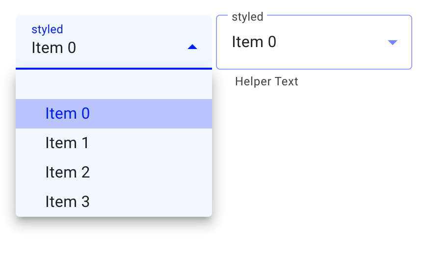
<style>
  mwc-select {
    --mdc-theme-primary: blue;
    --mdc-select-fill-color: aliceblue;
    --mdc-select-label-ink-color: rgba(0, 0, 0, 0.75);
    --mdc-select-dropdown-icon-color: blue;

    --mdc-select-idle-line-color: rgba(0, 0, 255, 0.42);
    --mdc-select-hover-line-color: rgba(0, 0, 255, 0.87);

    --mdc-select-outlined-idle-border-color: rgba(0, 0, 255, 0.42);
    --mdc-select-outlined-hover-border-color: rgba(0, 0, 255, 0.87);

    /* inherits the styles of mwc-menu internally */
    --mdc-menu-item-height: 30px;
    --mdc-theme-surface: aliceblue;

    /* inherits the styles of mwc-list internally */
    --mdc-list-vertical-padding: 0px;
    --mdc-list-side-padding: 30px;
  }
</style>
<mwc-select helper="Helper Text" label="styled">
  <mwc-list-item></mwc-list-item>
  <mwc-list-item selected value="0">Item 0</mwc-list-item>
  <mwc-list-item value="1">Item 1</mwc-list-item>
  <mwc-list-item value="2">Item 2</mwc-list-item>
  <mwc-list-item value="3">Item 3</mwc-list-item>
</mwc-select>
<mwc-select outlined helper="Helper Text" label="styled">
  <mwc-list-item></mwc-list-item>
  <mwc-list-item selected value="0">Item 0</mwc-list-item>
  <mwc-list-item value="1">Item 1</mwc-list-item>
  <mwc-list-item value="2">Item 2</mwc-list-item>
  <mwc-list-item value="3">Item 3</mwc-list-item>
</mwc-select>
API
Slots
| Name | Description |
|---|---|
| default | Content to display in the selects internal <mwc-menu> element. |
mwc-select internally uses
mwc-list, so
the default slot has the same interface as the default slot of mwc-list.
Properties/Attributes
| Name | Type | Default | Description |
|---|---|---|---|
value |
string |
"" |
The select control's value determined by the value property of the currently selected list item. Setting value will attempt to select a list-item with the same value. If one does not match, it will set itself to "" and the index to -1. Setting value before the list item is attached will not select the item. |
label |
string |
"" |
Sets floating label value. NOTE: The label will not float if the selected item has a falsey value property. |
naturalMenuWidth |
string |
false |
Sets the dropdown menu's width to auto. |
fixedMenuPosition |
boolean |
false |
Sets the dropdown menu's position to fixed. This is useful when the select is inside of a stacking context e.g. inside of an mwc-dialog. Note, that --mdc-menu-min-width or --mdc-menu-max-width may have to be set to resize the menu to the width anchor. |
icon |
string |
"" |
Leading icon to display in select. See mwc-icon. Note: for proper list spacing, each list item must have graphic="icon" or graphic="avatar" to be set. |
disabled |
boolean |
false |
Whether or not the select should be disabled. |
outlined |
boolean |
false |
Whether or not to show the material outlined variant. |
helper |
string |
"" |
Helper text to display below the select. Always displays by default. |
required |
boolean |
false |
Displays error state if value is empty and select is blurred. |
validationMessage |
string |
"" |
Message to show in the error color when the select is invalid. (Helper text will not be visible) |
selected |
ListItemBase|null |
null |
Selected list item element. |
items |
ListItemBase[] |
[] |
List of selectable items. |
index |
number |
-1 |
Index of selected list item. |
validity |
ValidityState (readonly) |
DefaultValidity* |
The ValidityState of the select. |
validityTransform |
ValidityTransform**|null |
null |
Callback called before each validation check. See the mwc-textfield's validation section for more details. |
validateOnInitialRender |
boolean |
false |
Runs validation check on initial render. |
* DefaultValidity is: ts { badInput: false, customError: false, patternMismatch: false, rangeOverflow: false, rangeUnderflow: false, stepMismatch: false, tooLong: false, tooShort: false, typeMismatch: false, valid: true, valueMissing: false, }
** See
mwc-textfield's properties section
for more info.
Methods
| Name | Description |
|---|---|
checkValidity() => boolean |
Returns true if the select passes validity checks. Returns false and fires an invalid event on the select otherwise. NOTE: When accessing any property or function that checks validity at select initial boot up, you may have to await <mwc-select>.updateComplete. |
reportValidity() => boolean |
Runs checkValidity() method, and if it returns false, then it reports to the user that the input is invalid. |
setCustomValidity(message:string) => void |
Sets a custom validity message (also overwrites validationMessage). If this message is not the empty string, then the element is suffering from a custom validity error and does not validate. |
select(index: number) => void |
Selects the element at the given index. |
layout(updateItems = true) => Promise<void> |
Resets tabindex on all items and will update items model if provided true. It may be required to call layout if selectability of an element is dynamically changed. e.g. [mwc-list-item] attribute is removed from a list item or noninteractive is dynamically set on a list item. Also re-calculates layout. If a select is styled with display:none before it is first rendered, and it has a label that is floating, then you must call layout() the first time you remove display:none, or else the notch surrounding the label will not render correctly. |
layoutOptions() => Promise<void> |
Synchronizes the list of options with the model of the component and updates the selected text. Call this if the selected item is dynamically updated in value or text. |
Events
| Event Name | Target | Detail | Description |
|---|---|---|---|
opened |
mwc-select-surface |
none | Fired menu opens. |
closed |
mwc-select-surface |
none | Fired menu closes. |
selected |
mwc-list |
SelectedDetail* |
Fired when a selection has been made. Property index is the selected index (will be of type number) |
* See
mwc-list's Events section
for more details.
CSS Custom Properties
mwc-select internally uses both mwc-menu and mwc-list, so all custom
properties from mwc-menu and mwc-list propagate through mwc-select.
| Name | Default | Description |
|---|---|---|
--mdc-select-error-color |
--mdc-theme-error |
Applies where --mdc-theme-error applies. |
--mdc-select-idle-line-color |
 rgba(0, 0, 0, 0.42) |
Color of the filled select's bottom line when idle. |
--mdc-select-hover-line-color |
 rgba(0, 0, 0, 0.87) |
Color of the filled select's bottom line when hovering. |
--mdc-select-outlined-idle-border-color |
 rgba(0, 0, 0, 0.38) |
Color of the outlined select's outline when idle. |
--mdc-select-outlined-hover-border-color |
rgba(0, 0, 0, 0.87) |
Color of the outlined select's outline when hovering. |
--mdc-select-outlined-disabled-border-color |
 rgba(0, 0, 0, 0.16) |
Color of the outlined select's outline when disabled. |
--mdc-select-fill-color |
 rgb(245, 245, 245) |
Color of the select's background fill (non-outlined). |
--mdc-select-disabled-fill-color |
 rgb(250, 250, 250) |
Color of the select's background fill (non-outlined) when disabled. |
--mdc-select-ink-color |
rgba(0, 0, 0, 0.87) |
Color of the selected text in default and error states. |
--mdc-select-label-ink-color |
 rgba(0, 0, 0, 0.6) |
Color of the non-focused floating label, helper text, and placeholder. |
--mdc-select-focused-label-color |
--mdc-theme-primary |
Color of the focused floating label, helper text, and placeholder. |
--mdc-select-disabled-ink-color |
 rgba(0, 0, 0, 0.37) |
Color of the input text, the floating label, helper text, and placeholder of a disabled select. |
--mdc-select-dropdown-icon-color |
rgba(0, 0, 0, 0.54) |
Color of the dropdown icon when select is not activated. |
--mdc-select-focused-dropdown-icon-color |
--mdc-theme-primary |
Color of the dropdown icon when select is activated. |
--mdc-select-disabled-dropdown-icon-color |
rgba(0, 0, 0, 0.38) |
Opacity of the dropdown icon when disabled. |
--mdc-select-error-dropdown-icon-color |
--mdc-select-error-color |
Color of the dropdown icon when select is invalid. |
mwc-select internally uses
mwc-list,
see the
styling documentation
for further details.
Global Custom Properties
This component exposes the following global theming custom properties.
| Name | Description |
|---|---|
--mdc-theme-primary |
Color when active of the underline ripple, the outline, the caret, the dropdown-icon, and the focused and activatd list items. |
--mdc-theme-error |
Color when errored of the underline ripple, the outline, the caret, the dropdown-icon, and the focused and activatd list items. |
--mdc-typography-subtitle1-<PROPERTY> |
Styles the typography of the selected text. |