 cc26ef6c02
BREAKING CHANGE: Rename "md-tonal-button" elements, imports, and tokens to "md-filled-tonal-button"

PiperOrigin-RevId: 552600206
18 KiB
Buttons
This documentation is fully rendered on the Material Web catalog.
Buttons help people initiate actions, from sending an email, to sharing a document, to liking a post.
There are five types of common buttons: elevated, filled, filled tonal, outlined, and text.

- Design article
- API Documentation (coming soon)
- Source code
Types

Usage
Buttons have label text that describes the action that will occur if a user taps a button.

<md-outlined-button>Back</md-outlined-button>
<md-filled-button>Complete</md-filled-button>
Icon
An icon may optionally be added to a button to help communicate the button's action and help draw attention.
<md-filled-tonal-button>
  Send
  <svg slot="icon" viewBox="0 0 48 48"><path d="M6 40V8l38 16Zm3-4.65L36.2 24 9 12.5v8.4L21.1 24 9 27Zm0 0V12.5 27Z"/></svg>
</md-filled-tonal-button>

<md-text-button trailingicon>
  Open
  <svg slot="icon" viewBox="0 0 48 48"><path d="M9 42q-1.2 0-2.1-.9Q6 40.2 6 39V9q0-1.2.9-2.1Q7.8 6 9 6h13.95v3H9v30h30V25.05h3V39q0 1.2-.9 2.1-.9.9-2.1.9Zm10.1-10.95L17 28.9 36.9 9H25.95V6H42v16.05h-3v-10.9Z"/></svg>
</md-text-button>
Accessibility
Add an
aria-label
attribute to buttons whose labels need a more descriptive label.
<md-elevated-button aria-label="Add a new contact">Add</md-elevated-button>
Elevated button
Elevated buttons are essentially filled tonal buttons with a shadow. To prevent shadow creep, only use them when absolutely necessary, such as when the button requires visual separation from a patterned background.
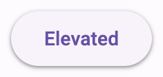
<md-elevated-button>Elevated</md-elevated-button>
Filled button
Filled buttons have the most visual impact after the FAB, and should be used for important, final actions that complete a flow, like Save, Join now, or Confirm.
<md-filled-button>Filled</md-filled-button>
Filled tonal button
A filled tonal button is an alternative middle ground between filled and outlined buttons. They're useful in contexts where a lower-priority button requires slightly more emphasis than an outline would give, such as "Next" in an onboarding flow.
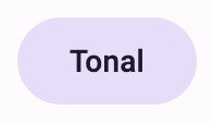
<md-filled-tonal-button>Tonal</md-filled-tonal-button>
Outlined button
Outlined buttons are medium-emphasis buttons. They contain actions that are important, but aren’t the primary action in an app.
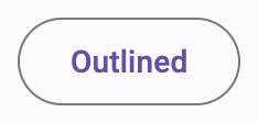
<md-outlined-button>Outlined</md-outlined-button>
Text button
Text buttons are used for the lowest priority actions, especially when presenting multiple options.
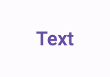
<md-text-button>Text</md-text-button>
Theming
Button supports Material theming and can be customized in terms of color, typography, and shape.
Elevated button tokens
| Token | Default value |
|---|---|
--md-elevated-button-container-color |
--md-sys-color-surface |
--md-elevated-button-container-shape |
9999px |
--md-elevated-button-label-text-color |
--md-sys-color-on-surface |
--md-elevated-button-label-text-type |
500 0.875rem/1.25rem "Roboto" |
Elevated button example

<style>
:root {
  --md-elevated-button-container-shape: 0px;
  --md-elevated-button-label-text-type: 500 0.875rem/1.25rem system-ui;
  --md-sys-color-surface-container-low: #FAFDFC;
  --md-sys-color-primary: #191C1C;
}
</style>

<md-elevated-button>Elevated</md-elevated-button>
Filled button tokens
| Token | Default value |
|---|---|
--md-filled-button-container-color |
--md-sys-color-primary |
--md-filled-button-container-shape |
9999px |
--md-filled-button-label-text-color |
--md-sys-color-on-primary |
--md-filled-button-label-text-type |
500 0.875rem/1.25rem "Roboto" |
Filled button example

<style>
:root {
  --md-filled-button-container-shape: 0px;
  --md-filled-button-label-text-type: 500 0.875rem/1.25rem system-ui;
  --md-sys-color-primary: #006A6A;
  --md-sys-color-on-primary: #FFFFFF;
}
</style>

<md-filled-button>Filled</md-filled-button>
Filled tonal button tokens
| Token | Default value |
|---|---|
--md-filled-tonal-button-container-color |
--md-sys-color-secondary-container |
--md-filled-tonal-button-container-shape |
9999px |
--md-filled-tonal-button-label-text-color |
--md-sys-color-on-secondary-container |
--md-filled-tonal-button-label-text-type |
500 0.875rem/1.25rem "Roboto" |
Filled tonal button example

<style>
:root {
  --md-filled-tonal-button-container-shape: 0px;
  --md-filled-tonal-button-label-text-type: 500 0.875rem/1.25rem system-ui;
  --md-sys-color-secondary-container: #CCE8E7;
  --md-sys-color-on-secondary-container: #051F1F;
}
</style>

<md-filled-tonal-button>Tonal</md-filled-tonal-button>
Outlined button tokens
| Token | Default value |
|---|---|
--md-outlined-button-outline-color |
--md-sys-color-outline |
--md-outlined-button-container-shape |
9999px |
--md-outlined-button-label-text-color |
--md-sys-color-primary |
--md-outlined-button-label-text-type |
500 0.875rem/1.25rem "Roboto" |
Outlined button example

<style>
:root {
  --md-outlined-button-container-shape: 0px;
  --md-outlined-button-label-text-type: 500 0.875rem/1.25rem system-ui;
  --md-sys-color-primary: #006A6A;
  --md-sys-color-outline: #6F7979;
}
</style>

<md-outlined-button>Outlined</md-outlined-button>
Text button tokens
| Token | Default value |
|---|---|
--md-text-button-label-text-color |
--md-sys-color-primary |
--md-text-button-label-text-type |
500 0.875rem/1.25rem "Roboto" |
Text button example

<style>
:root {
  --md-text-button-label-text-type: 500 0.875rem/1.25rem system-ui;
  --md-sys-color-primary: #006A6A;
}
</style>

<md-text-button>Text</md-text-button>