mirror of
https://github.com/material-components/material-web.git
synced 2024-09-22 02:57:46 +03:00
3.1 KiB
3.1 KiB
Divider
A divider is a thin line that groups content in lists and containers.
Dividers can reinforce tapability, such as when used to separate list items or define tappable regions in an accordion.
- Design article
- API Documentation (coming soon)
- Source code
Usage
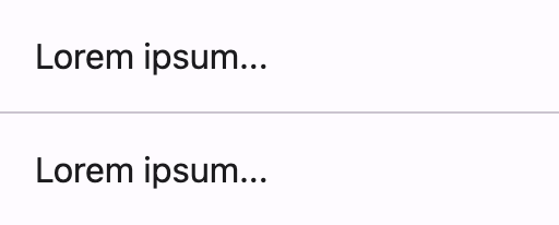
Use full width dividers to separate larger sections of unrelated content.
<section>
  <p>Lorem ipsum...</p>
  <md-divider></md-divider>
  <p>Lorem ipsum...</p>
</section>
Inset dividers
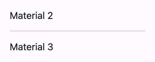
Use inset dividers to separate related content within a section.
<section>
  <p>Material 2</p>
  <md-divider inset></md-divider>
  <p>Material 3</p>
</section>
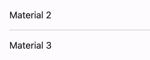
Inset dividers are equally indented from both sides of the screen by default.
Use inset-start or inset-end to change this.
<section>
  <p>Material 2</p>
  <md-divider inset-start></md-divider>
  <p>Material 3</p>
</section>
Accessibility
Dividers are decorative by default and not announced by assistive technology.
Add a
role="separator"
attribute to non-decorative dividers that should be announced.
<ul>
  <li>Item one</li>
  <md-divider inset></md-divider>
  <li>Item two</li>
  <md-divider role="separator"></md-divider>
  <li>Item three</li>
  <md-divider inset></md-divider>
  <li>Item four</li>
</ul>
Theming
Divider supports theming and can be customized with CSS custom property tokens.
Tokens
| Token | Default value |
|---|---|
--md-divider-color |
--md-sys-color-outline-variant |
--md-divider-thickness |
1px |
Example
<style>
:root {
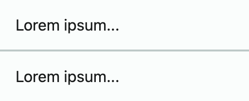
  --md-sys-color-outline-variant: #BEC9C8;
  --md-divider-thickness: 2px;
}
</style>

<section>
  <p>Lorem ipsum...</p>
  <md-divider></md-divider>
  <p>Lorem ipsum...</p>
</section>


