12 KiB
Contributing to the Inter font project
First off, thank you for considering contributing to Inter. It's people like you that make the Internet such a great place.
Following these guidelines helps to communicate that you respect the time of the people managing and developing this open source project. In return, they should reciprocate that respect in addressing your issue or suggestion.
By contributing work to the Inter font project you agree to have all work contributed becoming the intellectual property of the Inter font project as described by SIL Open Font License, Version 1.1
Types of contributions this project is looking for
-
Reporting issues like bad kerning pairs or variable-font interpolation bugs.
-
Fixes to issues tagged "help wanted" provided as either GitHub pull requests or comments in the issue.
-
Improvements to the Display subfamily...
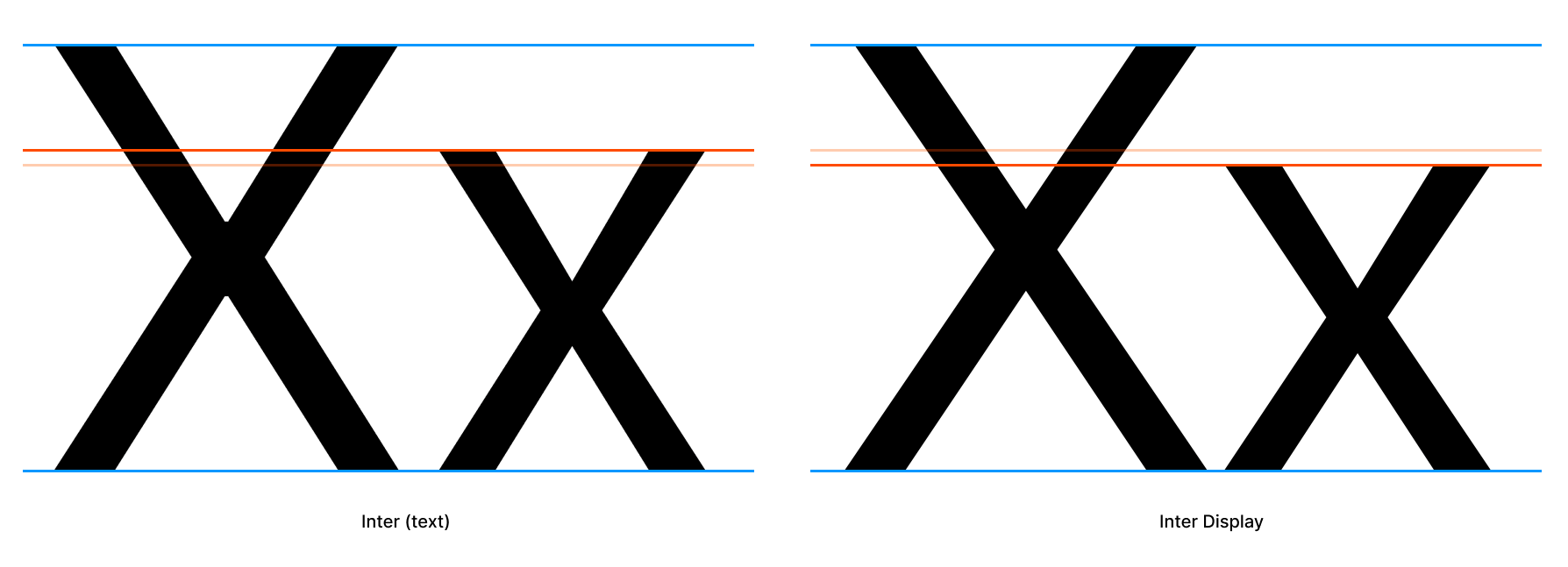
Improvements to the Display subfamily
Source file: (src/InterDisplay.glyphs)
The Display subfamily was derived from the text family ("Inter") and scaled to a different UPM (2048). It also had all of its kerning reduced.
Inter Display has a lower x-height compared to the text subfamily — this is the biggest difference in terms of work needed.
The contributions wanted for Inter Display are as follows:
-
Diacritic glyph improvements. In most cases you should import the corresponding glyph from Inter (text) and scale it to 2048 UPM as Inter (text) has seen a lot of improvements to diacritic designs since it was forked into Inter Display.
-
Diacritic anchor placement
-
Glyph design. Keep the following in mind:
- Raise/fix x-height for "low" glyghs.
- If fixing up an existing glyph, reduce optical tricks for small scale like tapered diagonal stems and ink traps/bridges.
- If makin a glyph from scratch, use a minimum (or no) optical tricks like tapered diagonal stems and ink traps/bridges.
- Stems should all have 90° or 0° terminals (Inter text has variable angles.) Compare /a of Inter (text) and Inter Display for an example of what this means.
- Kerning (use kerning groups!)
Please do not email Rasmus with issues and contributions but use GitHub 🙏
Master fonts and interpolated derivatives
This project uses "master styles" (or "key styles") which are combined using some clever math to generate other styles that are "mixed" from two masters. Because of this, there are some very important rules you must stick to:
- When adding or removing a glyph, you must add or remove the same glyph in all master fonts. If you're using Glyphs.app, this is automatically taken care of, but not with RoboFont or some other font tools.
- When editing glyphs we must make sure:
- all masters have the same amount of paths, nodes and handles, as well as components.
- all components, paths, nodes and handles are in the same order across all masters.
- all masters have the same set of anchors.
If these rules are not followed, generated styles will fail to build.
Multiple Masters: Keeping Your Outlines Compatible is a great article on this topic.
Compiling font files
The Inter toolchain is a collection of programs setup to build everything in a high-quality and reliable way. It can be fully automated and requires no paid software.
TL;DR: to make & test everything:
make -j test
Currently the toolchain has only been tested on macOS and Linux. All you need to have preinstalled is Python 3.
The first step is to initialize the toolchain itself:
./init.sh
This will fetch, setup and configure everything needed to build and test Inter.
When running in a git repository,
init.shinstalls git hooks to automate running itself when you pull in new changes or switch branches.
We can now run make to build all font files:
$ make -j Regular SemiBoldItalic
This may take a long time (a few minutes) the first time as it generates "font instances" (i.e. all styles that are derived through interpolation from the master styles) in addition to compiling the actual font files (OTF, TTF, etc.)
The toolchain comes with a few other useful actions, one of them is test which runs some checks on the compiled font files to make sure they behave as intended:
$ make -j test
Try & sample as you go
When making changes to the typeface and its source files, it's a good idea to sample your changes not only in a font editor or graphics editor, but also in real-world scenarios.
There are two things in particular that will help you with this:
make -j STYLE_FORMATto quickly compile only a particular style- Interactive "Lab"
You can invoke make with either names of styles, names of styles and file formats, or even specific filenames. Here are a few examples:
make -j Regular BoldItalic    # Regular and Bold Italic
make -j all_ttf               # All styles but only TTF files
make -j MediumItalic_web      # Medium Italic as TTF, WOFF and WOFF2
make -j build/hinted/Bold.ttf # Bold TTF with autohints
All resulting font files are written to the build directory with Inter- as the filename prefix. The Makefile file contains information about more possibilities of make.
The interactive Lab is a great tool for quickly exploring your font files. It's a web-based tool which you start in a terminal by running:
python docs/lab/serve.py
Open up the URL printed on the screen and you can now explore your font files. Simply make -j STYLE_web (or make -j all_web for all styles) and reload the web page to try a new build.
See Interactive Lab for more details.
Editing source files
This font is stored and authored primarily in a unified Glyphs .glyphs file. However, if you prefer to use a different font editor, the master styles are also maintained as UFO (Unified Font Object) files and can be edited by lots of font software, like the free and open-source FontForge or commercial apps like RoboFont.
—Important— The UFO source files are generated from the Glyphs source file. Editing the Glyphs file will cause the UFO files to be over-written. You have to commit to editing either the .glyphs file or the .ufo files.
To make life easier for you, configure your editor as follows:
- Set the grid to 128 units. This means that each grid square equals one pixel at 2x scale.
- Set "Snap points to" to a reasonably high number that's a power-of-two, like 8.
- Set "SHIFT increment" to 16
- Set "CMD SHIFT increment" to 128
Note: If you're using Glyphs, this will already be the case as this information is stored in the .glyphs file.
Interactive Lab
This project comes with a simple web-based application for debugging and previewing the font. It's a very useful tool to have when working on the font.
- Comes with a large body of sample text data (which is also editable.)
- Provides samples of the most common latin-script pairs, useful for kerning.
- Provides samples of words ordered by commonality in latin scripts with a preference for English (accessible via common-pair samples.)
- Can show the complete repertoire of the fonts, with correct glyph order and even RoboFont color labels ("marks").
- Controls for basic font properties like family, weight, italic, size, line-height, letter-spacing, etc.
- Controls for a lot of font features like ligature sets, contextual alternates, alternate numerics, etc.
- Controls for web-browser text features like
capitalize,uppercase,lowercase, etc. - Ability to compare Inter side-by-side with other fonts.
To start the lab, simply run this in a terminal (and keep the terminal running.)
python docs/lab/serve.py
You can now visit the URL printed on the screen to use the lab. Simply make -j STYLE_web (or make -j all_web for all styles) and reload the web page to try a new build.
An online version of the lab is available at https://rsms.me/inter/lab/ with the most recent official release of the Inter font files.
Kerning
Kerning is the concept of harmony in the pace of characters, defined as a set of distances between specific character pairs, like "A" & "c". Good kerning makes words more readable. Oftentimes this means that when adjusting kerning, you have to look at whole words and sentences when adjusting the kerning of a pair, since the spacing between two characters should work in harmony with the spacing of all other characters.
All major font editors provide user interfaces for previewing and adjusting kerning. There is even dedicated software specifically for working with kerning.
When adding kerning, use kerning groups rather than specific pairs.
- If you're using Glyphs, read more about kerning and how the "padlock" icon affects kerning specific pairs vs groups here: https://glyphsapp.com/tutorials/kerning
- If you're editing the UFO files, the groups can be found in the
groups.plistfiles.
If a glyphname is missing in kerning groups, define a new group for it. Group name should reflect the most prominent or common glyph that belongs to the group. For example, "V" for a group containing "Y", "Ÿ", "V" and "W". A kerning group is specific to one "side" of a glyph (left or right) and therefore the name should reflect a glyph which side is the most relevant one. For instance, consider the character "D" which on the left side looks like "M" and "L" but on the right side looks like "O" and "C". It belongs to the "O left" group and the "M right" group. Similarly for "g" ("o left", "m right"), "p" ("m left", "o right") and many other glyphs.
Kerning groups is a really simple but incredibly time-saving way of kerning a font.
Tip: Include sample images of kerning adjustments with code pull requests that affect kerning.
The script misc/tools/kernsample.py is helpful in generating samples for all existing right-hand side characters given a left-hand side glyphname.
$ misc/kernsample.py src/Inter-Black.ufo P -suffix MOR
PAMOR P/AE MOR PJMOR PXMOR PYMOR PZMOR P/ae mor P/ampersand mor
P/backslash mor P/dzcaron mor P/eightsub mor P/ellipsis mor Pfmor
P/four mor P/guilsinglleft mor P/idieresisacute mor P/periodcentered
mor P/quotedblbase mor Psmor P/seven mor P/slash mor Ptmor P/two
mor P/underscore mor Pymor
Type misc/tools/kernsample.py -h for help on how to use the program.
This only includes existing kerning and is thus only useful for adjustments. Additions must still be done manually.
Performance profiling
fontbuild has a --profile=<file> option built in which when provided profiles the execution
and writes a pstat file. Example:
misc/fontbuild --profile=build/tmp/1.pstat compile -o build/tmp/f.otf build/ufo/Inter-Regular.ufo
You can print pstat files with the fmtprofile.py tool:
misc/tools/fmtprofile.py -n 20 build/tmp/1.pstat
You can inspect pstat files interactively with the pstats module:
python3 -m pstats build/tmp/1.pstat
For profiling Python programs that are not fontbuild, you can do this:
python -m cProfile -o 1.pstats -s time script.py
See https://docs.python.org/3/library/profile.html for more information about profiling Python programs.
Miscellaneous tools
There are several tools included with Inter to help "wrangle" metrics, generate glyphs, create PDFs and so on. You can find these tools in the misc/tools directory. They are all command-line tools and their usage can be queried by providing the help flag -h.
For example, the fontinfo tool can be used to generate a JSON description of all metadata and merics of a TTF or OTF file:
misc/tools/fontinfo.py -h
FAQ
Do I need Glyphs or RoboFont to build font files?
No, you don't. To build font files, all you need is Python. To edit the font files, you need something that can edit .glyphs or UFO files.
I'm getting errors when running
makein my terminal
This probably means that you need to run ./init.sh